Renderings vs. Reality: A Roundup of 2021s Most Egregious Development Illustrations
Check out these artist renderings of projects from across the United States. They’re all from developments that were conceived of, constructed, advertised, or celebrated in 2021.
If a picture can say a thousand words, it can probably also tell at least 100 lies—which is why a savvy community member should take even the most well-intentioned renderings and illustrations with a grain of salt. Every one of these images, which were commissioned by planners and developers to give the public a picture of a future they could aspire to, makes promises that won’t be delivered on.
Here’s a brief summary of where each goes wrong, and how you can stay focused on the important factors that will determine whether a given project will help strengthen your community.
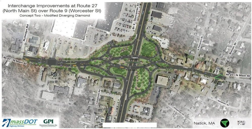
A MassDOT Diverging Diamond Project in Boston
From: “The ‘Diverging Diamond’: Greenwashing Auto Infrastructure,” by Joe Cortright.
MassDOT commissioned this illustration of a proposed diverging diamond intersection in Boston, which features more than 100 little people-dots meandering among the trees between a tangle of high-speed roads. We have some questions.
Where are the 110 people-dots going? Are they travelling on foot between the car dealership, muffler shop, oil change station, and U-haul store? Does this pedestrian infrastructure support pathways people already express a desire to travel on?
Just because you incorporate footpaths in your design doesn’t make it safe for people to walk there. There are more than 30 crosswalks to navigate in this design, most of which put people in the same space as traffic that is now able to travel at deadly speeds.
Pedestrian unfriendliness aside, Strong Towns advocates should consider another important factor when faced with an illustration like this: Transportation projects should help build wealth for the community, and this ain’t it. The diverging diamond helps move people in cars quickly through the area, rather than encouraging them to stop and spend time in the area. It’s not just costly in the initial funding of the construction; it will also make the area surrounding the interchange less financially productive, contributing to the decline of the city.
(Source: Energy Corridor District.)
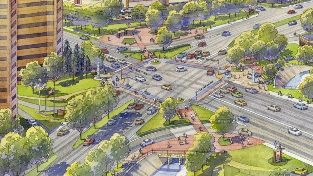
Houston’s First “Protected Intersection”
From: “Most ‘Pedestrian Infrastructure’ Is Really Car Infrastructure,” by Joe Cortright.
This proposal for a protected intersection in Houston came with a lovely illustration depicting a few dozen pedestrians (and even some cyclists) making their way across six lanes of highway traffic. But if you check out the pictures of the intersection after it was completed, you’ll notice…no one is walking there.
“A quick glance at Google maps shows that within a block or two of the intersection you have a single bank, a convenience store, a CVS drug store, and a lone Chinese restaurant—and almost no other retail or service businesses,” Cortright observes.
That’s not to mention the slip lanes—righthand-turn lanes that don’t require motorists to slow down or stop in order to continue through an intersection—which pose a threat to those on foot.
(Source: Daniel Herriges.)
This Pedestrian Corridor in a Florida Downtown Development
From: “Leaving Value on the Table,” by Daniel Herriges.
The Mark is a new mixed-use building in Florida that was built over an existing public street. Renderings of what the project would look like promised a lively, active corridor where people could congregate or navigate through to shop and dine. But the finished product fell a bit short of these expectations.
What stood between the illustration and reality was the size of the retail spaces offered at The Mark. A nearby street bustling with activity features a fine-grained mix of stores and services, with an entrance to a new business every few steps.
The Mark, on the other hand, is holding out spaces of a few thousand square feet. This simply isn’t feasible for most of the local small business owners that could enrich the corridor. Daniel Herriges explains some of the factors that lead developers to make this sort of decision in his piece.
(Source: Joe Cortright.)
Oregon’s Rose Quarter Highway Expansion
From: “Freeway-Widening Grifters: Woke-Washing, Fraud, and Incompetence,” by Joe Cortright.
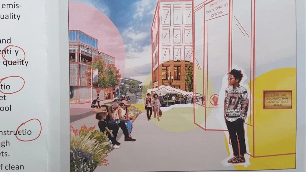
In September of 2021, the Oregon Department of Transportation sent a glossy newsletter to thousands of state residents promoting its proposed Rose Quarter highway expansion project near Portland.
“...their new brochure sets a new bar for illusion, showing a fictitious streetscape of North Vancouver Avenue, with three imaginary buildings. In the lower right hand side of the frame, a young Black man stands in front of a building labeled a ‘Career Development Center,’ carrying a plaque stating: ‘This building constructed by Black artisans in 2022’,” writes Cortright. “It’s a nice thought, but such a building is not part of what ODOT will build or pay for. Nor, in fact, are any of these buildings.”
The advertising executives at ODOT aren’t just selling the highway widening project; they’re selling a vision for the future that they’re not going to deliver on.
Chances are, something like this has happened in your place and left people in your community feeling short-shifted or bamboozled. But you don’t have to be the fool in this scenario. Here is a simple guide from the 2021 Strong Towns Local-Motive Tour that explains how to determine whether a proposal is a good investment for your place.


In this episode Chuck is joined by urban designer Victor Dover. They discuss the work and legacy of Dr. Donald Shoup, an engineer and professor of urban planning who revolutionized the fields of urban planning and parking reform with his book “The High Cost of Free Parking.” (Transcript included.)