The Fight for Pedestrian Safety
Getting even modest pedestrian improvements can be an uphill battle. We have a design bias and process that is inherently unfriendly to pedestrians and bicycles. While we've made great strides in the last decade, it's still a constant (and frustrating) battle.
Take a recent incident in Minneapolis as an example; a simple concrete median that protects pedestrians and bicycles is about to be removed. It comes after a dozen communities meetings, a lengthy engagement process, broad-based community support, and the backing of local City Council members.
Why is it being removed? Because a guy in Public Works doesn't like it. Apparently cars keep hitting it. And therefore, it must be removed? This may seem like a small deal, but it's not. It's an example of the uphill battle that bike and pedestrians advocates are fighting.
The system - as it is currently structured - is designed at every corner to favor the automobile.
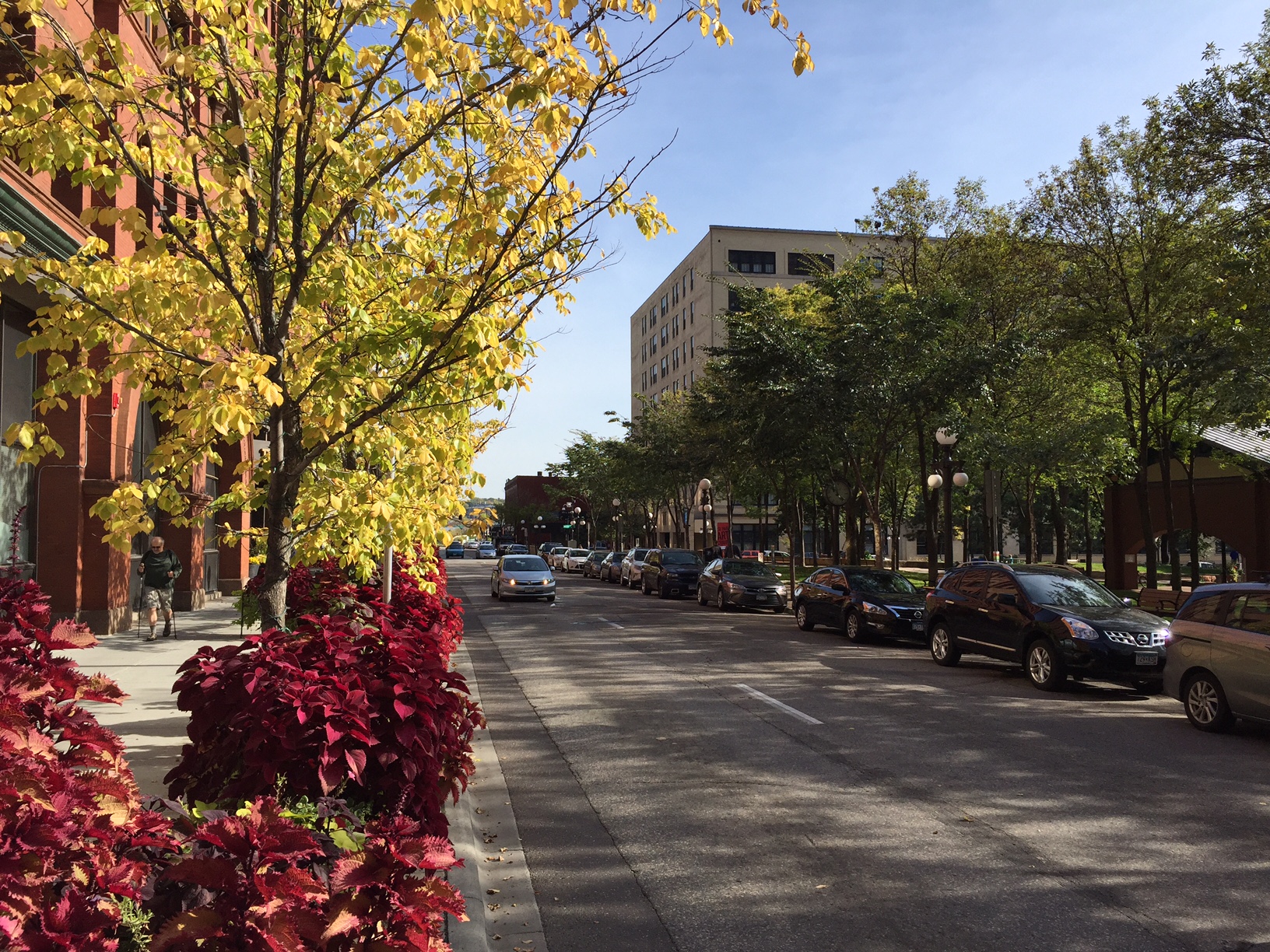
It's so omnipresent that we often forget it exists. I was walking back from the St. Paul Farmer's Market in walkable Lowertown this last weekend and I was stopped in my tracks at the corner of 6th St & Sibley as a car whizzed by.
For those unfamiliar, this is great neighborhood that most any urbanist would love. It's mixed-use, dense, has wide sidewalks, on-street parking, outdoor cafe seating, good public spaces, and plenty of eyes on the street. Yet, despite all these gains, there are still plenty of anti-urban transportation hold-outs present in the design.
Problem 1: The Corner
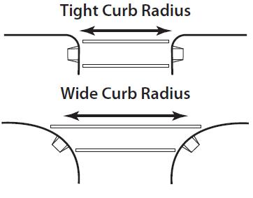
This corner radii was designed not to improve the safety of pedestrians, but to help cars make a right turn without having to slow down. This is a classic example of highway design being imposed on our downtowns and it's omnipresent across America. The goal of a city street should not be to maximize traffic flow.
This is Traffic Calming 101.
When a street has a wider curve, vehicles can move around it much faster. When coupled with one-way streets, this can be even more dangerous. Simply reducing corner radius can have a huge impact. This (cheap) design element improves pedestrian safety.
This is a very simple, cost-effect way to improve walkability downtown. We need to start designing our downtowns for people, and not as thoroughfares for commuter traffic.
Problem 2: One-way Streets
The verdict is out, and it's been out for a long time. Yet, these multi-lane one-way couplings still exist in most of our downtowns.
I don't like writing about this because it's so obvious. One way streets are bad for everyone except speeding cars. The struggle is that most of our American downtowns are held hostage by a commuter culture. Politicians and traffic engineers are hesitant to disrupt that culture. It's a shame, because they should.
Eric Jaffe at CityLab lists the most obvious reasons:
- Livability: vehicles stop less on one-way streets, which is hard for bikers and pedestrians.
- Navigation: one-way street networks are confusing for drivers, which leads to more vehicle-miles traveled; they also make it tough for bus riders to locate stops for a return trip.
- Safety: speeds tend to be higher on one-way streets, and some studies suggest drivers pay less attention to them because there's no conflicting traffic flow.
- Economics: local businesses believe that two-way streets increase visibility.
One-way streets are a transportation relic that needs to be expelled in almost all cases. We need to value livability, navigation, safety, and economics above the desire to travel fast in an automobile.
Problem 3: Unneeded Turn Lanes
Every turn lane imposed on the urban environment where it is not needed does three things:
- Increased crossing distance: pedestrians are in the intersection, where they're most likely to be injured, for 10 to 13 more feet.
- Reduced size of sidewalk: creates less space for people to walk or for a business to have outdoor seating
- Eliminates on-street parking: removes an important safety buffer, and each on-street parking space is one that doesn't need to be expensively built off-street.
Again, this is difficult to write about because it's so obvious. The dynamic needs to shift, and it needs to shift quickly.
The intersection I'm describing is actually okay for walkability - when compared to what most American intersections looks like. This is a problem. We shouldn't have a system where these auto-biases are built so ubiquitously. We shouldn't have a system where - after lots of effort and community support - an infrastructure improvement can be overruled because a person at Public Works doesn't like it.
The American transportation system is designed at every corner to favor the automobile, and it's a system that needs to end.


