Rural by Design
Randall Arendt is a Strong Towns member and author of the book, Rural by Design: Planning for Town and Country. This is the second edition of a planning classic, focusing on infilling neighborhoods, strengthening town centers, and moving development closer to schools, shops, and jobs, and, while the title is Rural by Design, the concepts are relevant for towns of all sizes, located in urban and suburban areas as well as rural. Containing 80 percent new material and nearly 900 color illustrations, it is essentially a new work altogether. The book covers form-based codes, visioning, sustainability, low-impact development, green infrastructure, and more. Today we're sharing two case studies featured in the book, which show how these ideas play out in the real world.
Orchard Gardens: Affordability in a Semi-Rural Setting
by Randall Arendt
Location: 210 South Grove Street, Missoula County, Montana
Site Designer: WonderLand, LLC: Landscape Architects, Missoula, MT
Architect: MacArthur, Means & Wells, Architects (MMW), Missoula, MT
Developers: Homeword, Missoula, MT
Development Period: 2003 - 2006
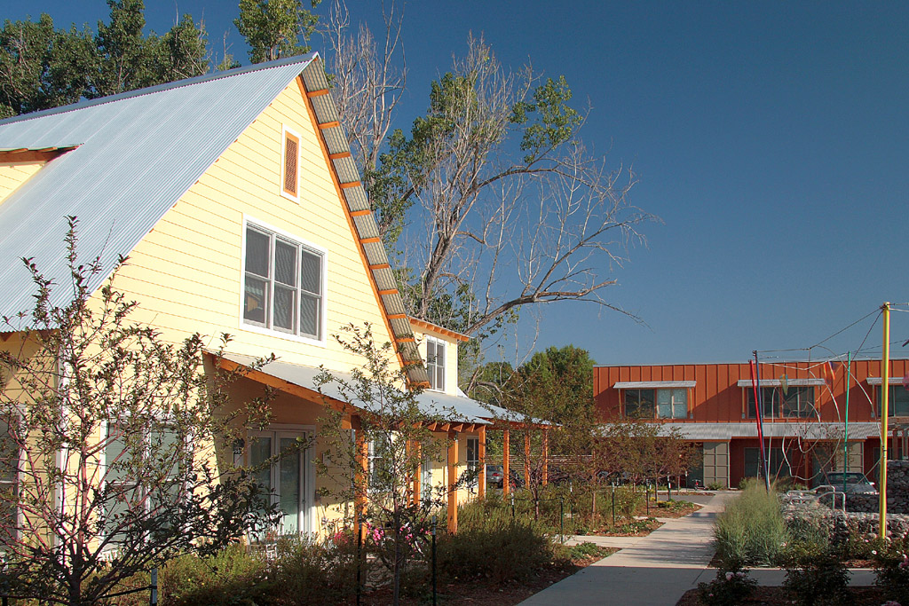
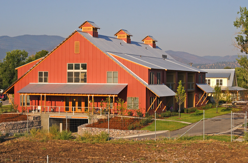
Orchard Gardens provides 35 units of permanently affordable studio, one-bedroom, and two-bedroom apartments for households with incomes below 50 percent of the area median income, arranged around a central courtyard on a 4.6-acre site on the western edge of Missoula. Architecturally, the project’s aesthetic is “contemporary rural vernacular, honest in function and materials yet deeply rooted” (www.homeword.org). Twenty units are located in the two-story main building, six are in the farmhouse, and two rowhouses have four and five units each.
Figure 20-11.1: The farmhouse with six dwellings and one of the two rowhouses with five units are pictured on the left. Designed to resemble a barn, the main building contains 20 dwellings (right). Source: Homeword
Fostering local food security and forging a connection between residents and the land, nearly half (two acres) of the site is reserved for food production in community gardens facilitated by Garden City Harvest, a nonprofit in Missoula (population 66,788) that “builds community through agriculture by growing produce with and for people with low-incomes, offering education and training in ecologically conscious agriculture, and using our sites for the personal restoration of youth and adults” (www.gardencityharvest.org). The community garden at Orchard Gardens is among seven, with 270 plots, administered by Garden City Harvest. (Johnson, Ralph, 2007)
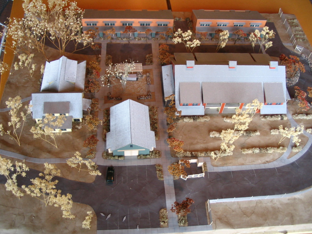
Figure 20-11.2: Clockwise on the model are the farmhouse on the left, two long rowhouses, the large main building, and the community center/barn on the bottom. Community gardens occupy part of the protected open space (right). Source: Homeword
Orchard Gardens, the most innovative of Homeword’s 12 affordable housing projects, features a community barn with a gathering area, kitchen, restrooms, and storage, a “yome” (a structure blending dome and yurt, great for picnics), fruit orchards, and a bike trail linking residents with Missoula’s extensive trail system. The amount of impervious coverage was reduced by locating parking for the main building underground. To reduce costly car ownership and promote sustainable transportation, Orchard Gardens provides everyone with free annual passes to Missoula's Mountain Line bus system and provides covered bike parking. As with other Homeword projects (such as the Gold Dust buildings, described in Chapter 23), a portion of the original construction budget was spent on public art created by local artists.
Among the sustainable features are building orientation on a solar (east/west) axis, a photovoltaic system on the main building for electric and hot water systems, a ground source heat pump utilizing the Missoula aquifer, PVC-free buildings, on-demand water heaters, Low-E windows, sustainably harvested Montana timber, pulverized recycled glass in the road base, and 35 percent fly ash in some building foundations plus a 100 percent fly ash foundation for the community barn (which is constructed of straw bales).
Redeveloping Two Downtown Corners in Davidson, NC
by Randall Arendt
This pair of case examples highlights successful efforts to replace single-story, single-use buildings with multi-story mixed-use buildings in a small southern town. Specifying minimum building heights of 1.5 to two stories serves several purposes. It improves the appearance of new construction and it enables developers to take advantage of the same roof and foundation to increase the building’s efficiency and create an additional story or two, providing opportunities for rental income.
CVS Building
Location: 127 South Main Street, Davidson, NC
Developer: The Stephens Company, Charlotte, NC
Architect: Little & Associates Architects, Charlotte, NC
Development Period: 2002 - 2003
Identifying a redevelopment opportunity in the heart of Davidson (population 10, 547), the Stephens Company of Charlotte first worked with Harris-Teetter to create a small grocery store on this site, which had been occupied for decades by a gasoline station and a historic house. When it became apparent that a new grocery would soon outgrow this 39,000 SF site, CVS approached the developer and suggested they build a pharmacy on this desirable corner property.
When it was first proposed, as a typical single-story structure, the town strongly urged CVS to consider a two-story building with offices above the ground floor retail. Like most chains, CVS prefers to be located in its own single-story structures, and is on record as asserting (in South Kingstown, RI) that the second story desired by planning board members would enable upper-floor tenants to drill down through the floor into the pharmacy below and steal controlled drugs in its prescription section. (One must admire the inventiveness of the fertile minds that are able to imagine such unlikely potential scenarios.) All too often local officials can be swayed by such creative arguments unless they happen to know of situations where the company has operated differently. As the photo of the earlier CVS in the three-story building in Port Jefferson NY shows (Fig. 10-27), this chain’s policy toward occupying lower floors of multi-story buildings has not always been followed, and is more flexible than company representatives usually admit in public meetings.
Although CVS disliked that idea, it ultimately acquiesced because Davidson had had the foresight to adopt a minimum two-story height requirement in its zoning for the downtown district, where variances are very difficult to obtain. (Gainesville FL also struggled with CVS on this issue, but also ultimately prevailed due to its strong and clear codes, as described in Chapter 11 on highway corridors.)
The company, the developer, the original property owner (Davidson College), and town staff and officials engaged in a multi-day charette process, as prescribed by the town’s regulations, which were described by the developer as “very collaborative” (telephone call with Louis Stephens, 8.16.11). The resulting design, a 24,000 SF contemporary brick building, with broad segmental arches over large second-floor windows, has enhanced the town center, architecturally. The upper floor is occupied by offices. Davidson has since amended its zoning to require minimum two-story construction for all new commercial buildings in the municipality, and further requires that the second story be functional (to avoid faux upper floors, as described in Chapter 23.3: the Camden Rite-Aid).
In order to retain a historic structure and also make way for the new building with its rear parking (also required by the town), an 1841 Greek Revival residence known as the Blake House was moved from the parcel frontage to a nearby lane, where it continues to serve as a single-family dwelling and part of the neighborhood townscape.
Figure 23-15.1: Both CVS (left) and Stowe’s (right) replaced filling stations at a principal downtown intersection, shown in the center photo. Davidson has gradually transformed itself since it began requiring two-and three-story buildings in its business districts, a very simple and effective remedy. (Source: Kris Krider)
Stowe’s Corner
Location: 215 South Main Street, Davidson, NC
Developer: David Stewart, Davidson, NC
Architect: Urbana, Charlotte, NC
Development Period: 2008-09
Several years after CVS had completed its two-story building, developer David Stewart negotiated with the owner of an Exxon gasoline station (and tire and wheel alignment center) on another corner of the same intersection to purchase and redevelop that property in a similar, more vertical manner appropriate to this central downtown location.
Originally proposed as a four-story building, with the top floor stepped back to reduce its apparent massing, the height was reduced to three stories for several reasons, including resistance from town officials and residents, a shortage of parking space on the property, the cost of installing additional sprinklers, and concern from residential neighbors on two sides.
The review process required no variances or conditional zoning, as the developer applied under the town’s relatively straight-forward, by-right zoning for new three story buildings, a form that it wants to encourage.
The original design, which had a more contemporary look with larger expanses of plate glass, was revised twice at the request of the town to incorporate the proportions and rhythms of windows on traditional early 20th century buildings nearby. A strong cornice line with contrasting materials, just below the parapet, caps the building at the more compatible three-story height. The developer notes that several early critics complimented him on the building’s appearance after it was finished.
The ground floor is occupied by a 4500 SF restaurant (“The Flatiron”) and an ATM, with 5000 SF of the space behind used for parking, due to a shortage of land for all the required parking. The second floor is occupied by offices and retail, while professional offices occupy the third floor. Altogether Stowe’s Corner contains 22,000 SF of leasable space, and the site area is 19,000 SF. Completed in August 2009, the building was entirely let by October 2010.
Grab your copy of Rural by Design today. You can also find reviews of the book here and get free downloadable resources here.
These case studies are published with permission from Randall Arendt and the APA. All photos used with permission.


Immokalee, FL, sits 30 miles from glitzy Naples, yet it’s one of the most rent-burdened places in the state. Local nonprofits are teaming up to change that by planning a new community for Immokalee’s agricultural workers.