6 Mapping Tools to Help Understand Your City
I think maps are beautiful. Sometimes they shock us. Sometimes they confirm what we already know. And sometimes they just help us get where we're trying to go. We at Strong Towns use maps a lot, and we're privileged to have a lot of fantastic members and supporters who have created mapping tools to help us better understand our cities and towns. Here are 6 that we encourage you to check out:
Map courtesy of TrackStateDollars.com
1. Map Your State's Transportation Spending
TrackStateDollars.com is a fascinating, educational and free tool, created by the Tri-State Transportation Campaign, that you can use to compare transportation spending in all fifty states. Here's a description of the project, from the Track State Dollars website:
How are states spending transportation construction dollars? Are states prioritizing creating new roads or maintaining their existing roadway network? Are states developing bicycle and pedestrian projects or building new transit lines? [...] In many states, basic answers to these questions are surprisingly hard to find. The goal of the Tri-State Transportation Campaign’s 50-state analysis, Tracking State Transportation Dollars, was to begin to answer these questions so the public can better understand transportation priorities.
You can choose to view data in Map format, looking at the whole country and comparing the different percentages of total transportation spending that each state devotes to certain types of projects, or you can view specific information on each state in its own page.
2. Map the Removal of Parking Minimums Across the Country
The fight to end parking minimums is happening all over the country from California to New Hampshire. Back in November, as part of our annual #BlackFridayParking event, we crowdsourced a map identifying towns that had removed or lowered their parking minimums. This map gives us hope that the tide is turning and towns are realizing the economic and community benefits of removing parking minimums.
Click on each pin to read about what's going on in that particular city with regards to parking minimums:
If you'd like to add your city's information to this map, please fill out this brief survey.
Map courtesy of Urban3
3. Map the Effects of Parking Minimums
Our friends at Urban3 have created some incredible tools and graphics to map the effect of parking minimums in towns like Des Moines, IA. They show how traditional downtowns with little surface parking and lower parking minimums have a higher tax productivity per acre. Conversely, these maps also show how little tax revenue is produced per acre in edge developments with copious parking and high parking minimums.
4. Map Distressed Communities Across the Country
The Economic Innovation Group created the Distressed Communities Index based on factors including poverty, unemployment, housing status, and level of education. This index is then filtered across zip codes throughout the United States to create an interactive map that highlights the most distressed communities in our nation. View data for every zip code, or look at the map as a whole.
h/t CityLab
5. Map Walkability and Street Design
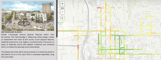
Jon Larsen, a Strong Towns member, shared this mapping tool with us in February, based on Measuring Urban Design: Metrics for Livable Places by Otto Clemente and Reid Ewing, which outlines a procedure for quantifying the urban design, and therefore, the walkability of a street. This methodology breaks urban design into five elements that have been proven to impact one’s willingness to walk: Imageability, Enclosure, Human Scale, Transparency, and Complexity. Each of these elements is measured, rated, and aggregated into an overall urban design score for the block. Jon's organization created a storymap to help understand street design in their community.
6. Map Anything You Want
MySidewalk is an online program that you can use to map countless data sets--everything from health insurance coverage rates to registered voter numbers to crime statistics. It's easy to use and creates beautiful interactive maps. Strong Towns Communications Specialist, Rachel Quednau just used it to compare the cost of commuting in three cities throughout the country.
Bonus: A HIstory of Women in Cartography
This week, CityLab is exploring women's historic and current involvement in map making, including profiles of female mapmakers from as far back as the 17th century. Women have mapped tribal movements, local demographics and much more. Read all about it.


