Best of 2015: A Statistically Inevitable Outcome
We spent a fair amount of time this year talking about the reasons tragedy occurs on our streets. It's not a lack of enforcement. It's not poor signage. It's not speed limits that are too high or a lack of public awareness. The problem is that our streets are designed to facilitate traffic at speeds that are not safe for people outside of an automobile.
I've enunciated a simple equation:
High Speeds + Complexity = Tragedy
When you have vehicles traveling at speeds high enough where a collision with a person will cause serious injury or death -- anything over 15-20 mph -- and you add the complexity of an urban environment -- even in a modest form -- you are going to have tragedy. People will be maimed and killed. It is statistically inevitable.
We have a certain level of attrition on our local streets. It is really heartening to see large groups of people pushing back on this. And they are doing it not just in response to an individual tragedy but in response to a greater awareness of how despotic these environments are. The "20-is-plenty" crowd has my support.
To an extent.
With #SlowtheCars thinking we are trying to raise an awareness that these are design issues, not issues of enforcement or awareness. When we apply the same basic principles to our design of city streets that we apply to highways -- which is exactly what we do in most instances -- we are going to continue to build dangerous places, regardless of our commitment to policing or public service announcements.
The added tragedy is that we build things in this despotic way because of our cultural belief that auto mobility is the key to economic prosperity. While this has validity on our roads that connect our cities to each other, it is the exact opposite on our city streets. When we build places for cars to pass through, our wealth declines. When we build places for people, our wealth accumulates. We make this tradeoff -- increased fatality rates for economic growth -- on a tragically false premise.
It was a year ago that just another pedestrian was killed in Springfield, MA. Let's make 2016 the year we commit to building strong towns.
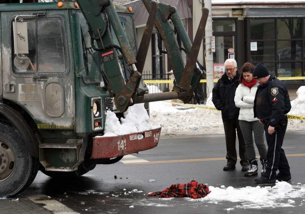
The light turned signaling it was safe to walk. A four-year-old boy took his mother's hand. Together they stepped out into the crosswalk on their way to a pre-kindergarten class at the Philip Schuyler Achievement Academy in Albany, NY. A garbage truck came around the corner and they were run down. The boy was killed, the mother's life horribly changed forever.
This particular incident happened last Friday, but something like it will happen somewhere else today. This kind of tragedy happens again and again, day after day, because our streets are not safe. Imagine this scene from the article replayed thousands of times each year here in America.
Passerby Gerron Zeigler saw the aftermath of the crash and recalled a woman screaming, "They took my son! They took my son!" after the child was put in an ambulance.
The anguish of this family is too painful to think about.
I don't know what happened in this particular case, but from reading the article I can tell that we're taking in all the wrong lessons. The first -- labeling this an "accident" -- comes from a woman identified as an "educator and administrator" ostensibly from the school this family was trying to reach. Here is her statement:
As an educator and administrator, Vanden Wyngaard admitted that she never stops worrying about student safety and their abilities to get home, but she doesn't think this should be a deterrent to students walking to school.
Instead, she said, Thursday was a tragic reminder that accidents happen.
Let's be clear: this isn't an accident. An accident is defined as, "an event that happens by chance without an apparent cause." While there is certainly an element of chance here -- just as with Russian Roulette -- there is obviously an underlying, preventable cause. This intersection is really dangerous for people outside of a vehicle. Serious injury is statistically inevitable. The design of this space induces high vehicle speeds in a complex environment not conducive to high speeds. There is only superficial protection for pedestrians and bikers. Indeed, the reporter on the scene was able to speak to someone who had seen a similar incident in the recent past.
Linda McClean, who has worked the morning shift at the Subway sandwich shop across Central Avenue from the crash for four years, said the intersection with Quail Street as seen through the store's wall of windows is busy with traffic and can be dangerous to pedestrians. She saw a person get hit in the same intersection last summer.
Let's look at the ways in which this design is deadly for people outside of a vehicle.
THE APPROACH
Here's the approach to the intersection. Note the sedan in the right lane. It's about six feet wide. Discounting the unused parking lane, based on the car we can say that there is at least twelve feet of width in that right lane. This is a highway dimension being incorrectly applied to this street by the design engineers. Their false belief is that a wide lane gives recovery area for the driver and is thus safer. It might serve that function on a highway, but on a city street it gives the driver a false sense of a safety margin and, in doing so, encourages speeds beyond what is safe in such an environment.
That sense of a safety margin is enhanced by the lack of any vertical element such as street trees or lighting (there are street trees further down the street, but not here). In this particular instance, the long, vacant wall Subway presents signals no activity (i.e. nothing to be concerned with) to the driver. All the messages presented to the driver here say: wide open stretch, no inherent danger. That's by design.
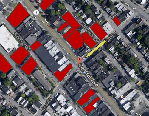
Red is available off-street parking. The yellow arrow identifies the travel direction of the garbage truck.
Also note that there's nobody parked here, which is also by design. While you are allowed to park here, the parking appears to be metered. You have to pay. Now I'm not against paid parking, but the supply/demand necessities to fill these spots is obviously not present.
The graphic to the right shows the available surface parking in the area. It's not clear whether or not the off-street parking is metered, but from Google maps, it doesn't appear to be in heavy use. This kind of thing happens all the time. The city demands parking, the neighborhood demands parking and the businesses want parking, so off street parking is provided. In addition to facilitating (sometimes even requiring) this really destructive practice, the city also lacks the sophistication to adjust the pricing of on-street parking to make it competitive. The spots then go unfilled and the protective barrier of parked cars is absent.
This makes the engineers of this street happy because that extra space not being used by a parked car means a greater safety margin for the driver. The driver now has an extra nine feet to play with as a recovery area. By the standard logic of the engineering profession, this is safer for everyone, even though the result is higher speeds.
THE INTERSECTION
So now we have fast-moving vehicles approaching the intersection just a couple blocks from a school where we anticipate pedestrians -- particularly small children -- and cyclists may be present. The street should have been designed to slow cars and trucks down before they reached the intersection, but the industry's standard approach worries primarily about the free flow of traffic. This value system is also apparent within the intersection.
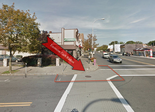
The picture to the right shows the street corner where the boy and his mom were standing waiting to cross. Note the curve of the curb where the arrow is pointing. This is called the curb radius. The larger the radius, the more gradual the curve and the easier it is for a vehicle to take the corner without slowing down. In a paradigm where traffic flow is the primary concern and the safety of drivers is the secondary concern (with the safety of those outside a vehicle being a far distant concern by comparison), the standard industry practice is to have as large of a radius as possible.
I drew in the red lines on the pavement to mark the area that exists solely to allow drivers to move their vehicle through the intersection more quickly. Note that on both streets this is the parking area so it is not part of the oncoming traffic lanes, yet it is left open for turning traffic to occupy. In a properly designed intersection -- where the safety of people outside of their vehicles was a primary concern -- this area should be devoted to people. It should be a bike/ped safety zone, not an auto acceleration zone.
For pedestrians and cyclists, intersections are really dangerous places. Slowing cars heading into the intersection and then keeping auto movements slow and deliberate within an intersection are key safety strategies, but in a segregated environment -- one where we expect everyone to stay in their place and we handle overlaps by giving priority with a signal -- there are two important things that need to happen.
First, we need to limit the amount of time and space that pedestrians and cyclists are exposed to cross traffic. Second, when pedestrians enter an intersection, they need to be given exclusive use of it. In other words, vehicles need to have all red lights. We cannot ethically expect people to dodge vehicles; the mismatch between a four-year-old and a garbage truck is too great.
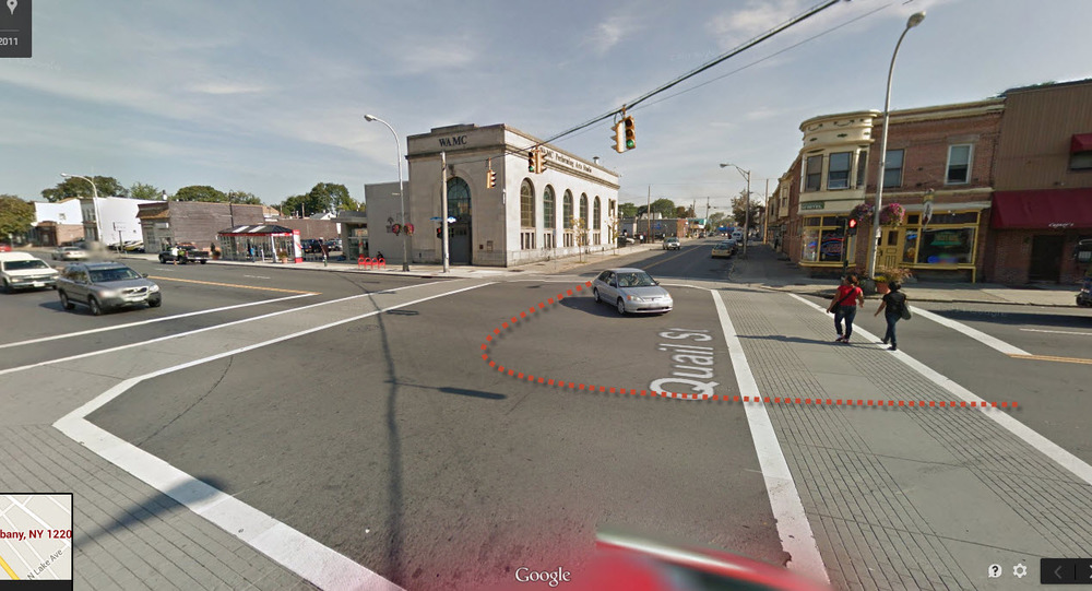
The image below shows the crossing (left) where the accident took place. On the right are two people attempting to cross. Note the huge width they need to traverse where they are completely exposed. I estimate it is 70 feet. These two people look relatively young and healthy, yet they've only made it halfway across when the pedestrian signal is telling them they are running out of time. The car -- which has the same inducements as the garbage truck to enter the intersection at high speeds without anticipating any complications -- is pressing in on the vulnerable people. In some places such activity may be illegal, but it should not be unexpected given the design. The driver here is taking advantage of the wide open intersection to cut the corner (the same way the garbage truck did). The dotted red line shows a safer path, one that could be engineered into the intersection with some type of obstacle in the center of the street to keep drivers in their lane. Alas, most engineers believe this would slow the flow of traffic (as if the signal doesn't already do that) and present a danger to vehicles and so they would oppose this logical safety measure.
MORE ENFORCEMENT?
I'm sympathetic to people who suggest that more enforcement is needed. I'm sympathetic, but I don't agree. I also don't agree that this is a matter of driver education or awareness. While it seems barbaric to have a driver speeding in a garbage truck take the life of an innocent child standing in a crosswalk, how much can we really blame the driver? Every signal this design gives is that it is safe to drive fast. In fact, if the speed limit here is 30 mph, the driver may not have even been breaking any laws. He had a green light, after all. I'm sure it all looked and felt safe.
Time and time again, driving through this intersection in the exact same way, the result is no harm to anyone. That's why we're comfortable calling this tragedy an accident. It seems like a random event.
Only it's not.
This and the thousands of similar tragedies that happen every year on America's streets are the statistically inevitable outcome of designing for fast-moving traffic within a complex urban environment. This is what will always happen when we mash together simple and powerful with random and vulnerable. Our street designs do not account for the randomness of humanity. To be safe, they must.
It is no longer acceptable to design our urban streets to forgive the mistakes of drivers. Our designs must forgive the mistakes of the most vulnerable: those outside of a vehicle.
"They took my son! They took my son!"
#SlowtheCars


