Washington Street Fantasy Redesign
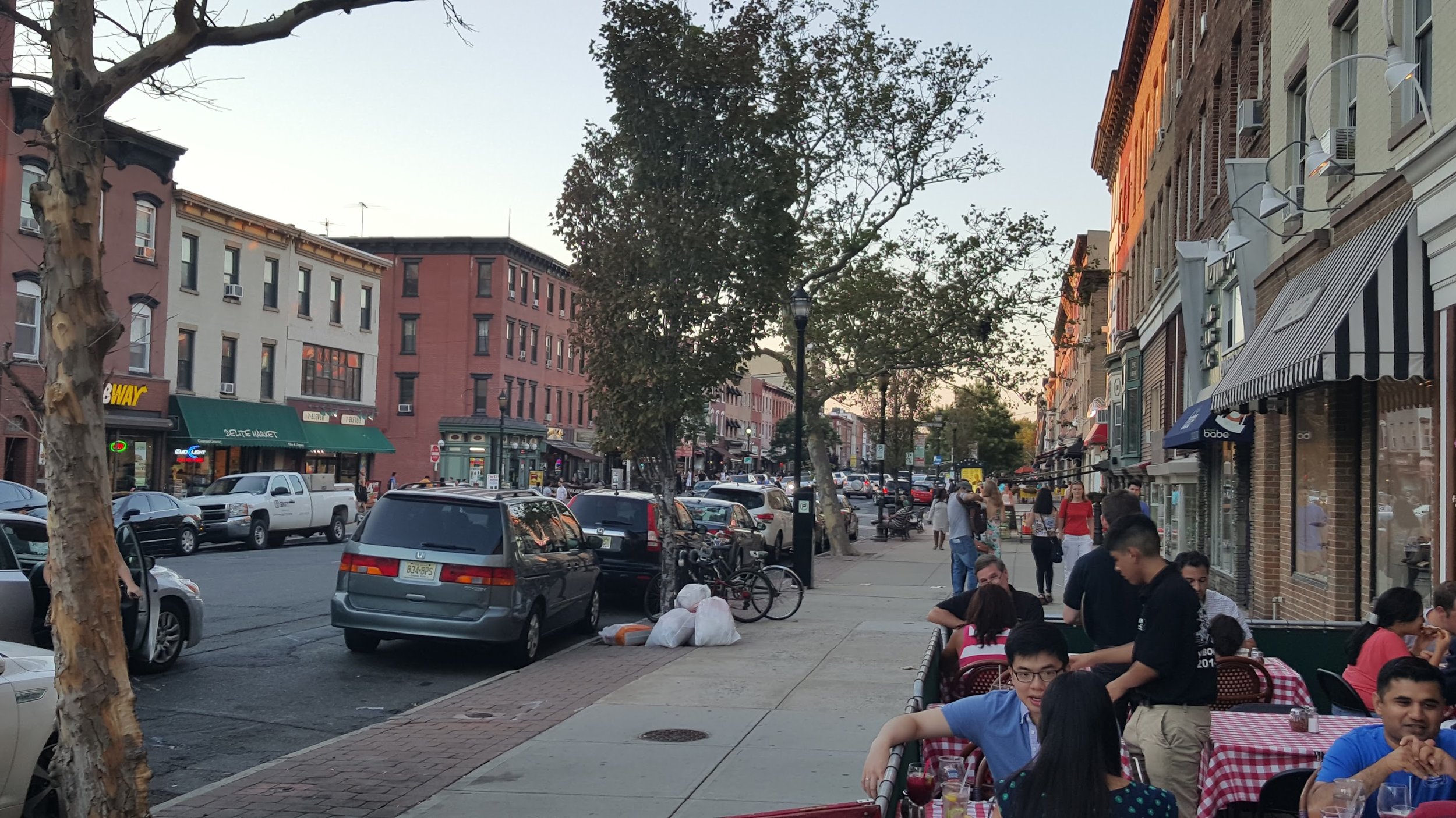
Hoboken, New Jersey is undertaking a massive redesign of Washington Street, our Main Street. Here is what Washington Street looks like today;
Here's what the engineering firm came up with in its plan to redesign Washington Street:
Click to view larger
The city voted to take out the bike lanes because the people wanted space to double park for quick errands, so essentially we are back to exactly what we have now, just with a few crossing bulb-outs at the corners, and our traffic lights brought 'up to code' (which I later found out meant that they will have countdown timers), and some lighting. Small improvements, but I don't know if it would be worth tens of millions of dollars of grants and bonds.
When I hear the word 'redesign' (especially for that amount of money), I was assuming a full-on redesign. Disappointed with what was presented to us, I am taking it on myself to design my ideal Washington Street. Now, I am not a traffic engineer or urban designer, just a creative citizen with an idea.
Let's come up with some requirements for our ideal Washington Street:
- Safety is a priority. The street needs to be jaywalkable.
- There needs to be short-term grab-and-go parking spots.
- We should avoid bringing traffic to a complete stop at intersections.
- It needs to be a pleasant, people-first environment with plenty of amenities for people—like lighting, shade, and seating.
- We need a clearance for emergency vehicles, even during peak capacity.
- We must accommodate buses without impeding traffic, people, or emergency vehicles.
Without further ado, here is a top down view of a segment of my fantasy Washington Street design (created using Unity, a game engine):
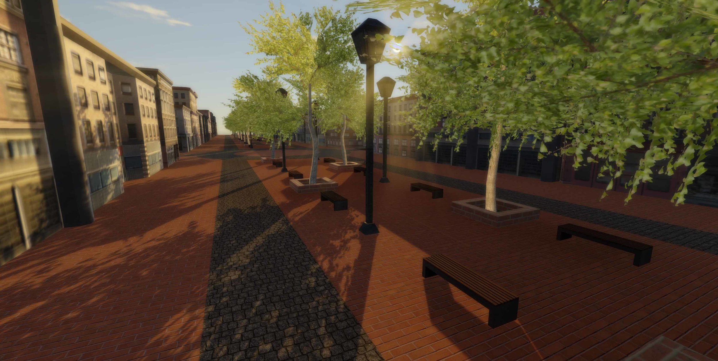
Here it is looking down the middle at street level:
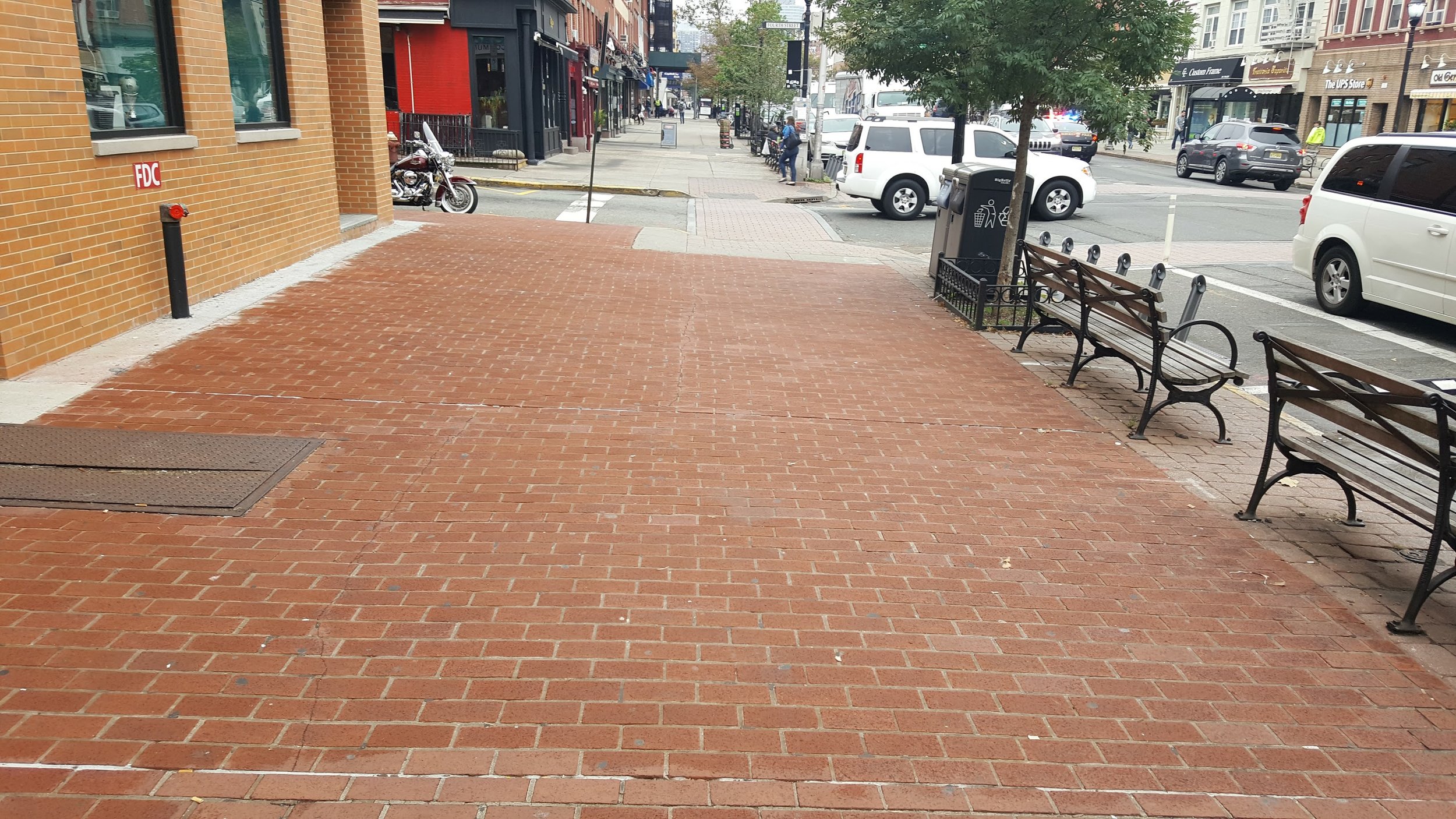
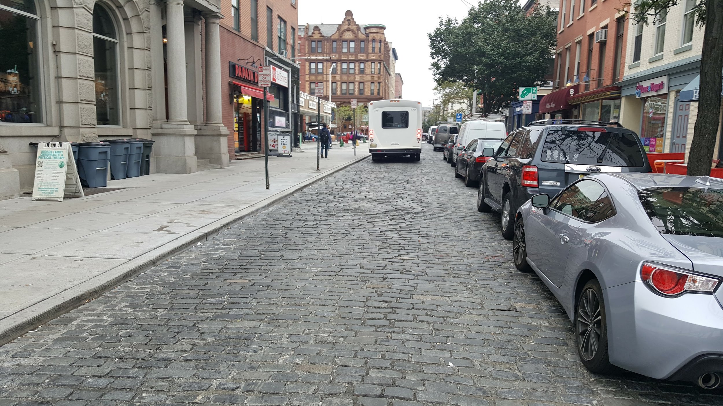
Instead of asphalt and concrete - which is monotonous and overused in our cities, I chose brick and Belgian block for aesthetics; these are both materials we have used in Hoboken.
A recently paved brick sidewalk along Washington Street.
A recently paved segment of Newark Avenue in Belgian block.
A street is the living room of the community. A street is not a road, which is a tool to get from A to B, but a platform for building wealth, culture, and community. People should come first, with transportation accommodated on top. So the first obvious feature about my design is that the middle of the street is dedicated to people. What better way to tell the dominant species that it belongs here than by giving it the most prominent spot in the street?
Here is a cross section:
Cross section of my Washington Street design created in StreetMix.
Washington Street is 100 feet wide. The 20 foot sidewalks on either side are the same size as they are now, with enough room for one lane of traffic on either side, creating a 40 foot wide island for people in the middle.
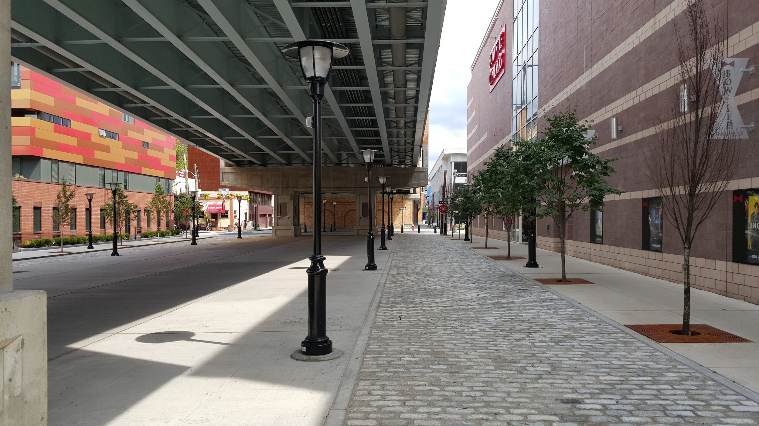
This basic layout is not new, unique, or innovative. 14th Street under the viaduct in Hoboken is already laid out in this format.
14th Street under the viaduct has two cars lanes separated by either side. Note the Belgian block car lanes and the lack of curbs.
Let's take this basic layout, add in in some trees, lamps, and benches so we have plenty of spaces to rest and loiter to let the street function as the community's living room.
In order to encourage crossing the street at any given point, there are no curbs. Curbs create artificial obstacles for anyone in a wheelchair, pushing a stroller, or rolling a suitcase. There are much better ways to handle water drainage - such as building actual drains.
In The Case for One-Way Streets, I argued that there are two things that make streets unsafe:
- The risk of a vehicle sneaking up behind you, as our heads can only be turned in one direction at a time.
- An excessively wide 'danger zone' that you must cross, as you will end up spending more time in the path of danger (increasing your risk of getting hit), while also creating a clearance zone that is too comfortable to drive on that encourages faster speeds, and creating a feeling of disconnection from the other side of the street.
Intersection of 4th Street and Bloomfield Street in Hoboken. Incredibly safe because bulb-outs reduce the distance of the 'danger zone', and there is only one direction to watch for traffic as you cross.
To minimize the amount space occupied by cars, my first instinct for intersections was to simply intersect the travel lanes:
Unfortunately, we have to accommodate cars, trucks, and buses - none of which can make right turns on the spot, and instead have a turning radius. I smoothed out the intersection into circles, which lead to a roundabout design
I wanted to avoid traffic lights because they frustrate me. I have written about how traffic lights act as synchronization barriers which cause vehicles to cluster together, creating congestion. Whether you are a driver or a bus-rider, traffic lights are frustrating, because often they cycle when there is very little traffic in the perpendicular direction, so you spend time waiting, wondering what you are waiting on. Roundabouts, in contrast, keep traffic free-flowing by not bringing any direction to a complete stop and have a greater overall capacity than traffic lights. Also remember that the street is designed to be safe to cross on foot at any point, not just at the intersections.
Let's see the intersection in action:
I left the middle of the street clear for emergency vehicles, so even at full traffic capacity there would be enough room for a clear run through. No more waiting for cars to pull out of the way, and any people that are out walking can easily scoot to the side by the trees and benches.
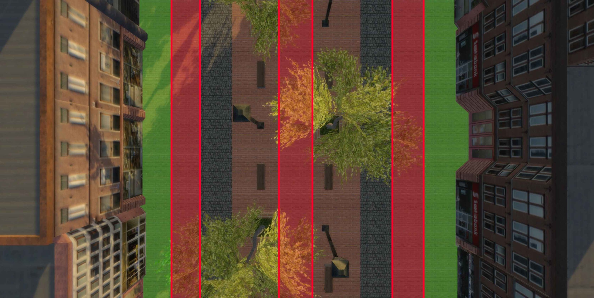
For the once a year catastrophe when two emergency vehicles have to pass each other, there is plenty of extra space for this around the edge. In the following diagram, I could imagine the red areas - each 10 feet wide - kept clear for emergencies (as well as the middle of the roundabouts to accommodate even the widest turning fire truck), while still leaving 10 feet at the very edge for property owners to do what they wish with - such as setting out tables, chairs, signs, and fences.
Red zones must kept clear for emergencies, while property owners are free to do what they wish with the green zones.
Washington Street is an important bus thoroughfare. I wanted the buses to be as minimally intrusive to other traffic and people as much as possible. This means that the bus is not allowed to come to a complete stop while in the traffic lanes as that would hold up traffic. My first idea was to have a bus loading zone bumped out to the right of the travel lane;
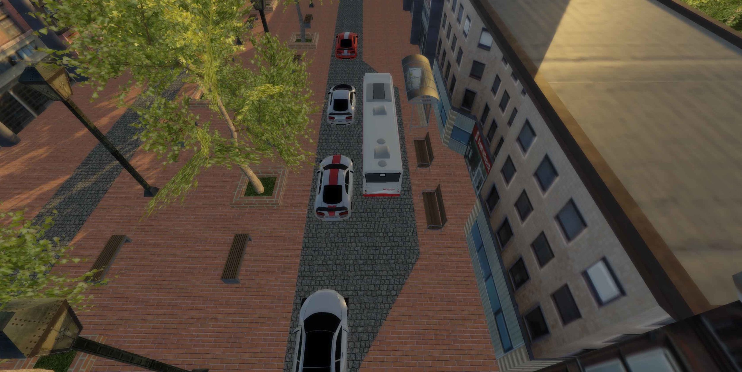
But, that seems a little cramped, as well as intrusive to the property owners who's front door would be blocked by the bus shelter! Instead, I decided to bump the bus out into the middle of the street.
During emergencies, the bus can pull into the diagonal lanes (or the emergency vehicle could travel along the side of the street where there are no vehicles):
Parking is a concern for many residents. It is actually a myth that we have a parking shortage (every city believes they have a parking problem!) There is plenty of parking in Hoboken. I once heard the operator of a parking garage say that it is very rare for his garage to be more than one third full. Yet at every city hall meeting you will hear somebody complain about parking. If you listen careful, they never complain that they cannot find a spot in front of their favorite store while they spend hours out of their car walking around. Instead, the complaints are always about there being a lack of parking spaces to quickly run in and make a delivery or pick something up. People complain about the lack of short term parking.
Washington St (Hoboken's main street) at 5:51am. No shops are open, yet every parking space is full. Clearly not benefiting the businesses.
On-street parking in Hoboken is abused. This is why citizens traded in bike lanes so they would have room to double park. Hoboken is trying to improve the situation with a new pay-by-plate system that will track cars by their license plate. I propose going a step further. I propose that on the side streets that intersect with Washington Street, we should switch to Donald Shoup-style dynamic pricing, whereby we automatically adjust prices based on the demand so that around 15% of on-street parking spaces are likely to be free at any given moment. That way, there will always be a vacant parking space for those quick pick-ups, and ample garage parking for longer term parking.
If we are going to pay tens of millions of dollars to massively redesign Washington Street, let's massively redesign it! This is my fantasy design. I'm not saying it is the best design for Washington Street, but I feel it is a significant improvement from the design proposed by the engineers that looks very similar to how Washington Street is today. Let me know what you think.


