Big Boxing the City
Big-box stores are often associated with suburbia, but big-box stores can trace their roots to department stores that are often anchors of retail life in a city. There is nothing inherently suburban about large scale retail. I am going to show some examples of how very large retailers have adapted to a densely populated, foot-oriented urban area.
Macy's flagship building in midtown Manhattan. 2,200,000 square feet of retail. A 260,000 square foot Walmart superstore is small potatoes.
There is nothing evil, bad, or anti-urban about large retail. If large retailers are the only ones that are able to survive in your city, then you have problems (since a constant influx of new players into the market is an essential requirement to keep capitalism functioning.) A functional city should welcome both the large retailer and the immigrant with little money that wants to open a deli.
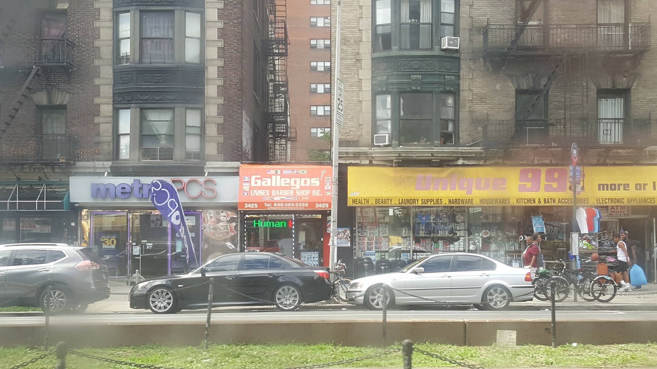
A small store along Broadway in Harlem. A city cannot survive on big capital and big retail alone. It must be equally welcoming to the low cost entrepreneur too.
I'm not going to cover the benefits of shopping local and supporting small businesses over large chains and franchises (you can read more about those here), but rather, how large retailers can fit into an urban area from purely an urban design perspective.
One key to walkability is to have as many destinations as possible within walking distance. In an urban area like Hoboken or Manhattan, a fine grained block can fit over 40 or so destinations. Single destinations - a large retailer, a museum, or a cathedral - that take up an entire city block reduce the number of destinations within that block to one. This isn't necessarily bad and only has a small impact on walkability when done in moderation.
The Macy's flagship store in Manhattan takes up an entire city block (but one small nook), and they make good use of three of the four sides of the block. Three sides feel like the front entrance to the store. Let's compare the 34th Street and 35th Street side of Macy's.
The 34th Street side of Macy's.
Even though it is a single destination spanning the entire length of the block with only a few entrances, Macy's has kept their 34th Street welcoming with interesting and inviting architecture and plenty of windows.
Windows in front of the shops across the street from Macy's.
Activity attracts activity and is visually interesting to look at. I like windows because if there is activity behind those windows, then that activity can feel like it is part of the street, even if it is indoors. This creates a sense of safety (eyes on the street) and intrigue.
Let's compare this to the other side of Macy's.
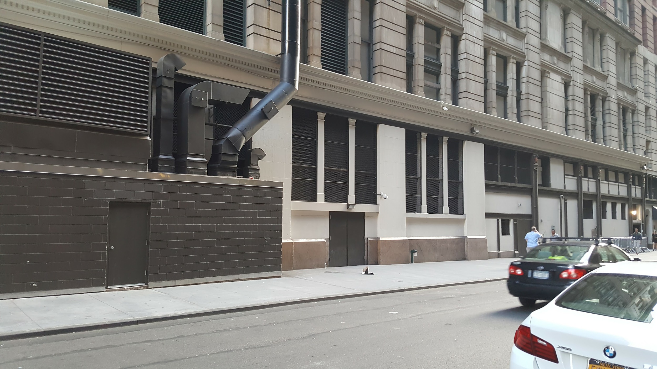
The 35th Street side of Macy's with no doors.
There are significantly less people on this side of Macy's. The blank, featureless walls and lack of destinations repeal people from walking here, even if there is useful stuff to get to on either end of the block. Urban streets with nobody on them are creepy. More could have been done here to keep the 35th Street side of Macy's welcoming
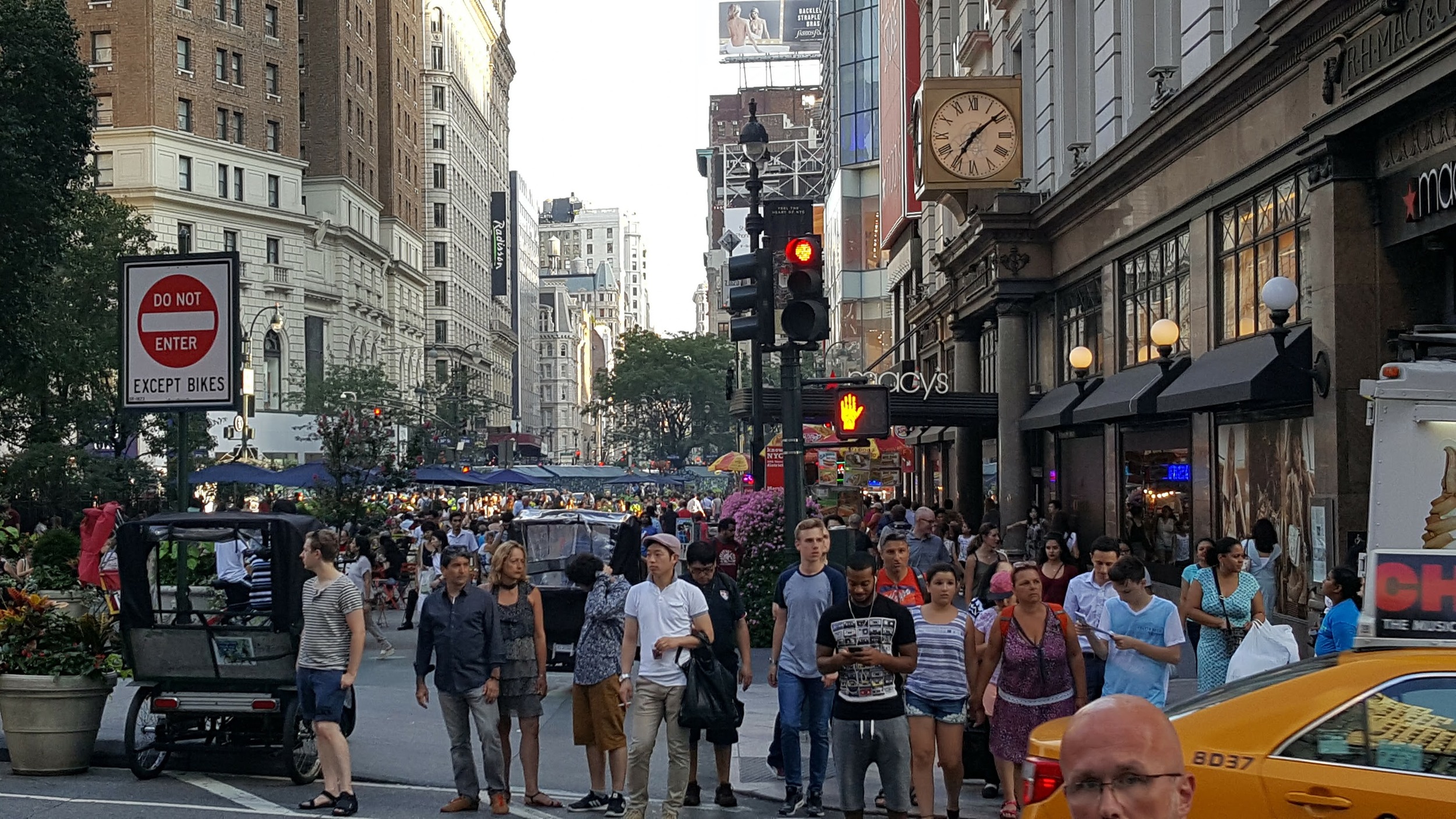
You can't blame the location of 35th Street alone, because this is the street life 250 ft away. If there were something interesting along 35th Street, I am sure the crowds will follow.
Blank walls are the worst.
Javits Convention Center along the 34th Street side.
Can you believe this is still 34th Street - a thriving retail street? This is just 5 blocks west of Herald Square (that photo above with all of the people.) Yet the blank facade and lack of destinations around make it devoid of life. There are attractions around - it's the northern terminus of the High Line, there's a beautiful water front, and we have the Hudson Yards development going on right there.
Despite the wide spacious sidewalk, nobody is walking along the side of the Javits Convention Center. This could be prime retail space in a great location. Black facades and featureless streets are exhausting to walk through. Not only did they lose the opportunity to add many destinations along this segment of the street that would attract activity, but even if there were destinations beyond each side of the block worth visiting, walking past this (despite not being longer than a typical Manhattan block) would be exhausting.
It is easy to see how even in a neighborhood with many useful destinations to walk to, and even if the walk is only a few blocks, if the walk is mentally exhausting, it will be too much to repel most people.
The Javits Convention Center is in a great location along 34th Street that it could have been significantly improved by introducing a little bit of faux-granularity. They could have circled the ground level with retail.
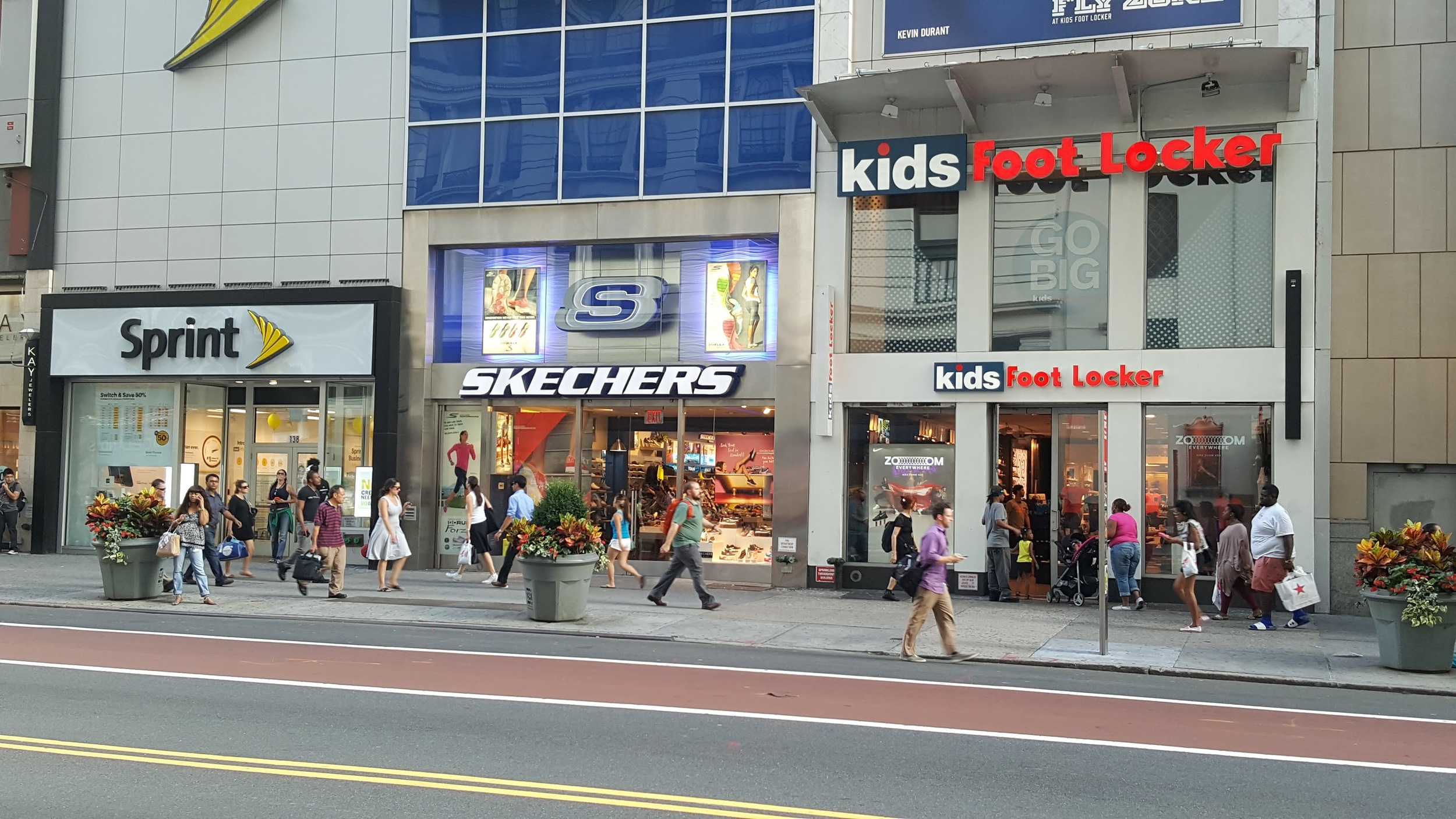
A huge building that takes up an entire block by Union Square, and they wrapped the ground floor in retail both big and small.
There are many benefits to wrapping the ground level in retail: it attracts activity, it makes the area safer by attracting eyes, it makes it more pleasant to walk past, and it generates income to the owner of the property.
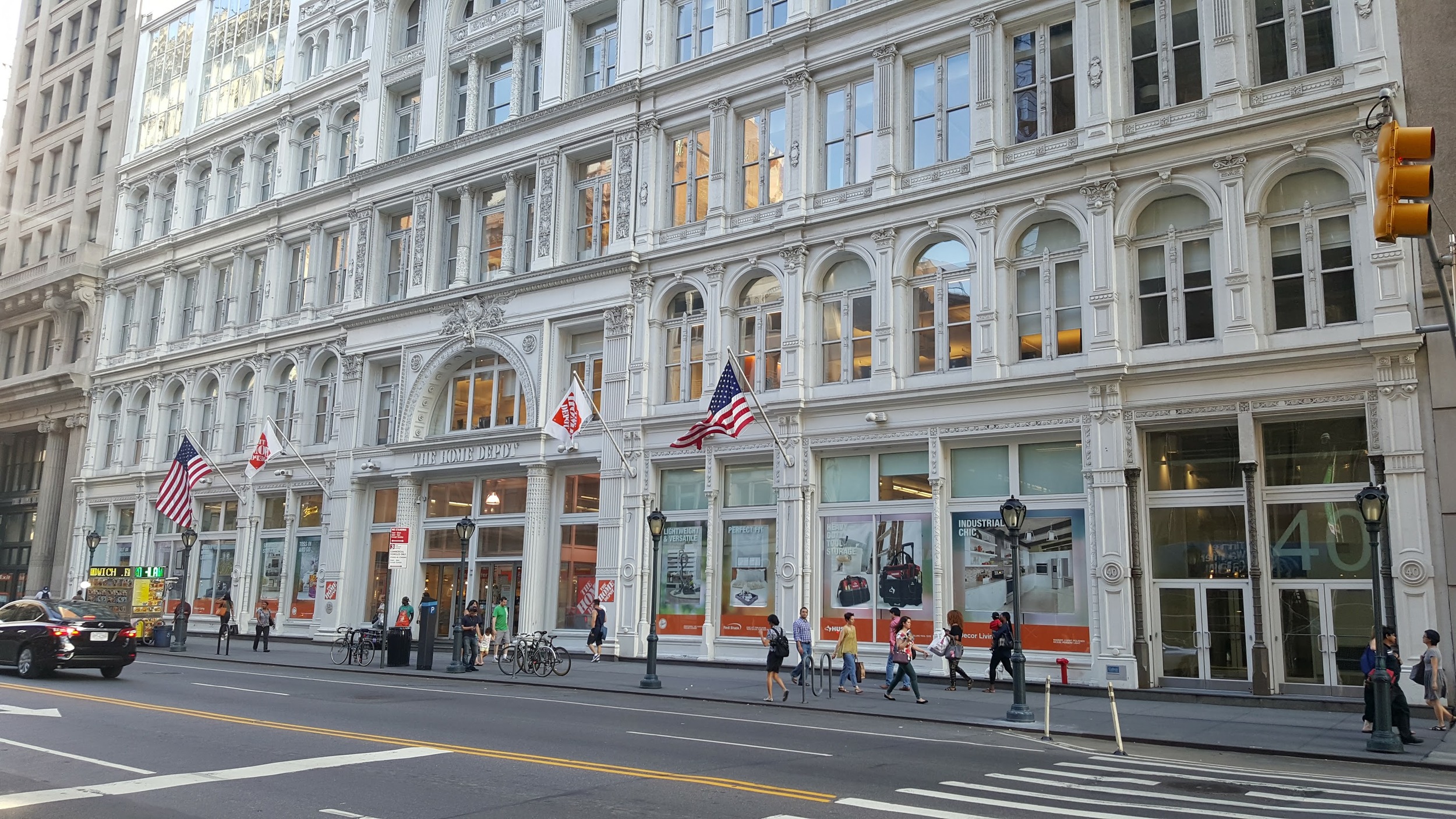
The Home Depot along 23rd Street.
Above is another example. Despite being a very large store, plenty of windows and interesting architecture makes walking past The Home Depot fairly comfortable.
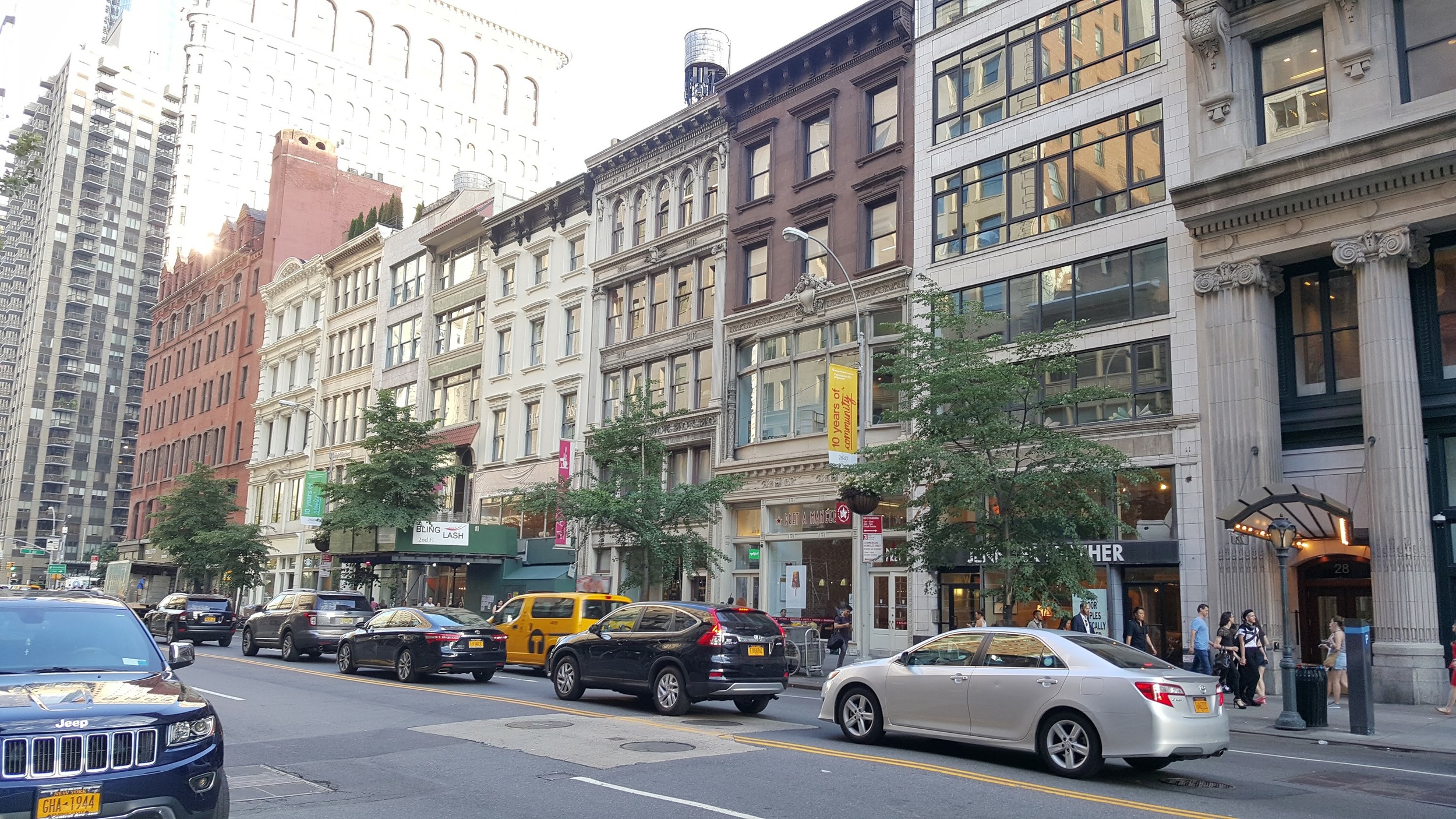
Fine-grained retail next door to The Home Depot.
The Home Depot is unintrusive because it is surrounded by plenty of other retailers both big and small, so there are plenty of destinations within walking distance in this neighbourhood, and The Home Depot itself is comfortable to walk past. The reason this works is because these large retailers are the exception. If every store in this area had a such a large footprint, there would be significantly less destinations (less things to do, less reasons to be there, less within walking distance, thus less activity) in the area.
The Container Store along 6th Avenue. Plenty of windows letting you see the activity inside and interesting architecture makes this a pleasant building to walk past.
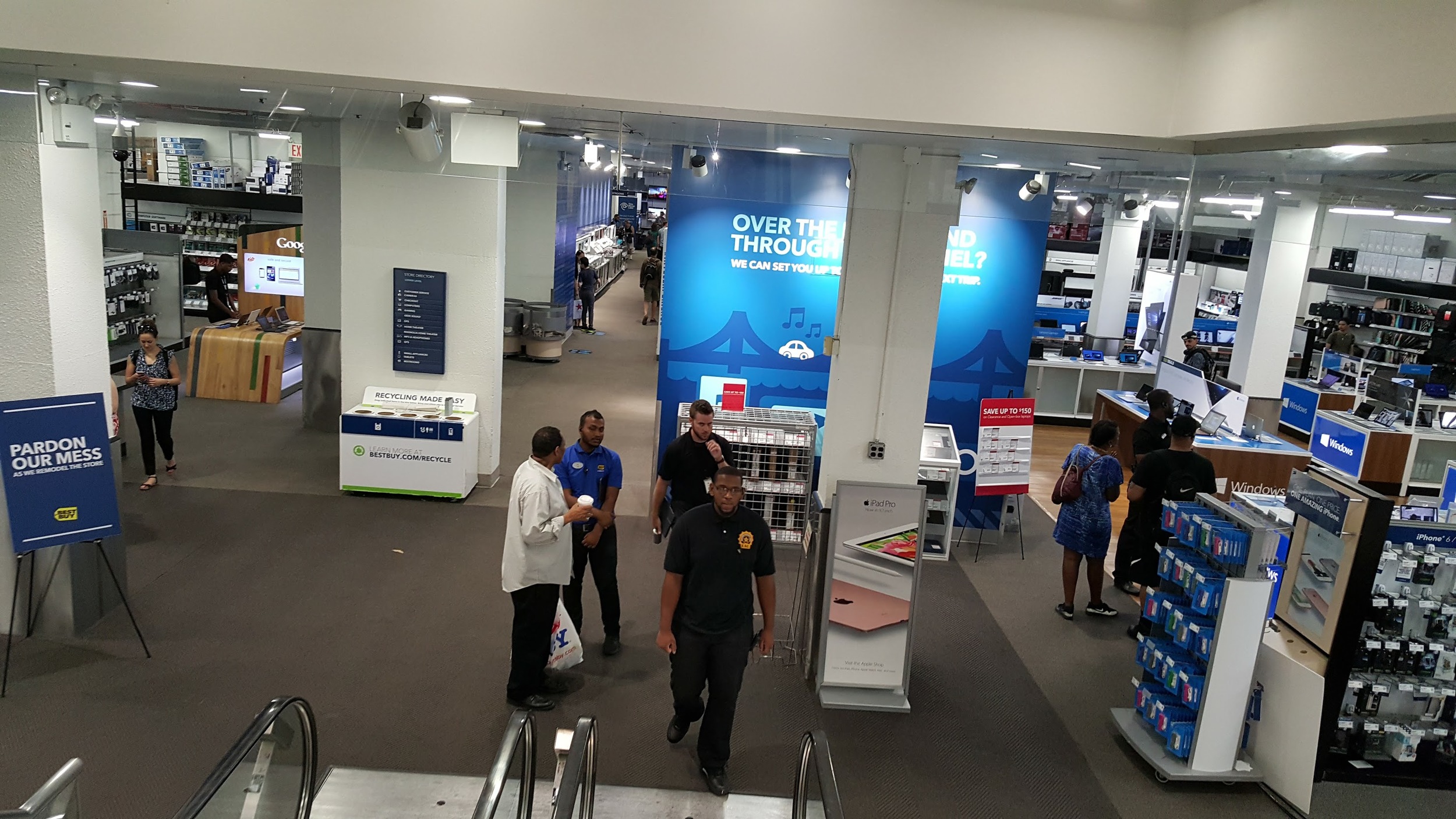
High land value in urban areas makes it feasible to take advantage of multiple floors. Best Buy, the big box electronic retailer, averages around 28,000 square feet per store. In their Manhattan stores that I visit, the ground floor is merely an entrance.
Best Buy along 6th Avenue does not look that big from outside.
Take the escalator down in to the basement and you will see that Best Buy is huge.
It is also possible for big box stores to stack on different floors of the same building, so that each store can have a huge amount of floor space, while only consuming the land area for just one store.
3 big box stores sharing a building. Marshalls in the basement, Bed, Bath & Beyond at ground level, and TJ Maxx above ground.
There is nothing inherently evil or anti-urban about big box stores. Good urbanism is good urbanism, and big box stores can integrate well into a lively urban area. They can work well if we remember to only build them in moderation, and we do our best to avoid blank or intimidating streetscapes that repel walking.


