Patterns of Home, Importance of Homeyness
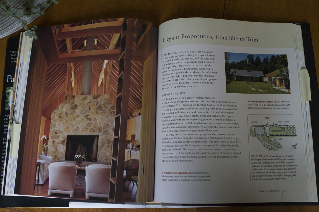
A friend recently lent me a book called Patterns of Home. It’s a summary of the ten most essential findings in of A Pattern Language, the landmark design resource coauthored in part by the same team. The patterns stretch beyond mere practicality to address psychological comfort, focusing on the essential elements that make one feel at home in a building.
I’ve enjoyed the book. It’s full of proof that contemporary architecture can be as cozy as the time-honored buildings that so often illustrate visions of “home.” Be forewarned though, the case studies employed to teach the ten patterns are more likely to be found in a magazine than a traditional neighborhood. If you have a couple million bucks and an acre by the water or mountain foothills, this book may as well be your Pinterest. I’d recommend coupling this with Stewart Brand’s “How Buildings Learn” to bring it back down to earth.
One of the patterns in the book is “Parts in Proportion” - the repetition of similar shapes and compositions at various scales, all in balance. Like fractal patterns in nature, larger structures mirror the small parts of which they are comprised. I’ve written briefly about this before and discovered that it’s also a theme in Antifragile, an inspiration for Strong Towns thinking.
True to Parts in Proportion, you’ll notice that the Patterns of Home can be mirrored at the level of neighborhood and city. I’ll introduce the first five patterns here with that spin.
Inhabiting the Site
The first pattern described is a thoughtful connection to the building site. A house that feels like it emerges out of the larger whole is more homey than one that acts like an island. To inhabit the site well, one needs to observe the advantages and disadvantages of the lot - where trees cast helpful shade, where the topography creates natural enclosure, etc.
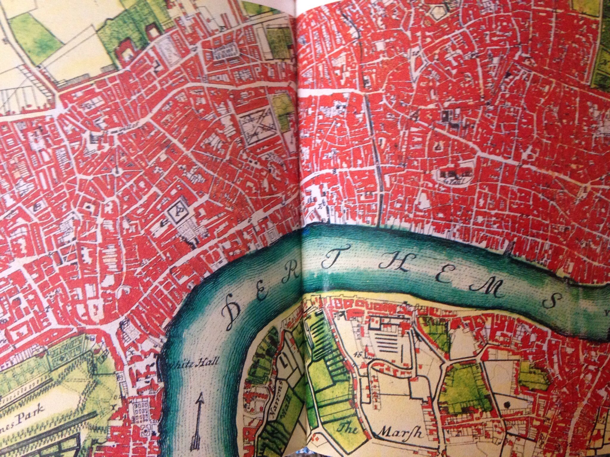
The oldest cities are intimately linked to topography and the bioregion. They emerged at the fork of a river, at the ocean inlet, up in the highlands, all to be defensible or to access waterways that lightened the burden of freight and travel.
Settlements that grew into the advantages and disadvantages of their location developed indigenous cultures and traditions that make a place feel like a place. That’s what puts the there there. Long after the city grid has been platted, we can better inhabit the site of our cities by connecting to our bioregions.
I loved this example from a trip home to London, Ontario this spring. I went to a native plant expo with my brother (as we do) and found the place teeming with people who were ecstatic about reintroducing the Carolinian Forest to our cities and countryside throughout southwestern Ontario.
I love this idea from the Carolinian Canada Coalition - every lot, farm, and garden is part of the big picture. pic.twitter.com/Rjyq5FQXWZ
— Gracen Johnson (@gracenjohnson) April 2, 2016
In a cosmopolitan world where anything could be anywhere, it's nice to see people connected to the natural habitat around them. The deciduous forest, migratory birds, rolling farm fields, and the Great Lakes impact the psychology of the people of southwestern Ontario, me being one of them. You do not realize how much the land itself lives inside you until you leave and return to a feeling of home.
Creating rooms, inside and out
At the building level, the authors describe how the layout of a house can form distinct and comfortable “rooms” even outdoors. We see this in the effective framing of courtyards, porches, patios, gardens, and groves.
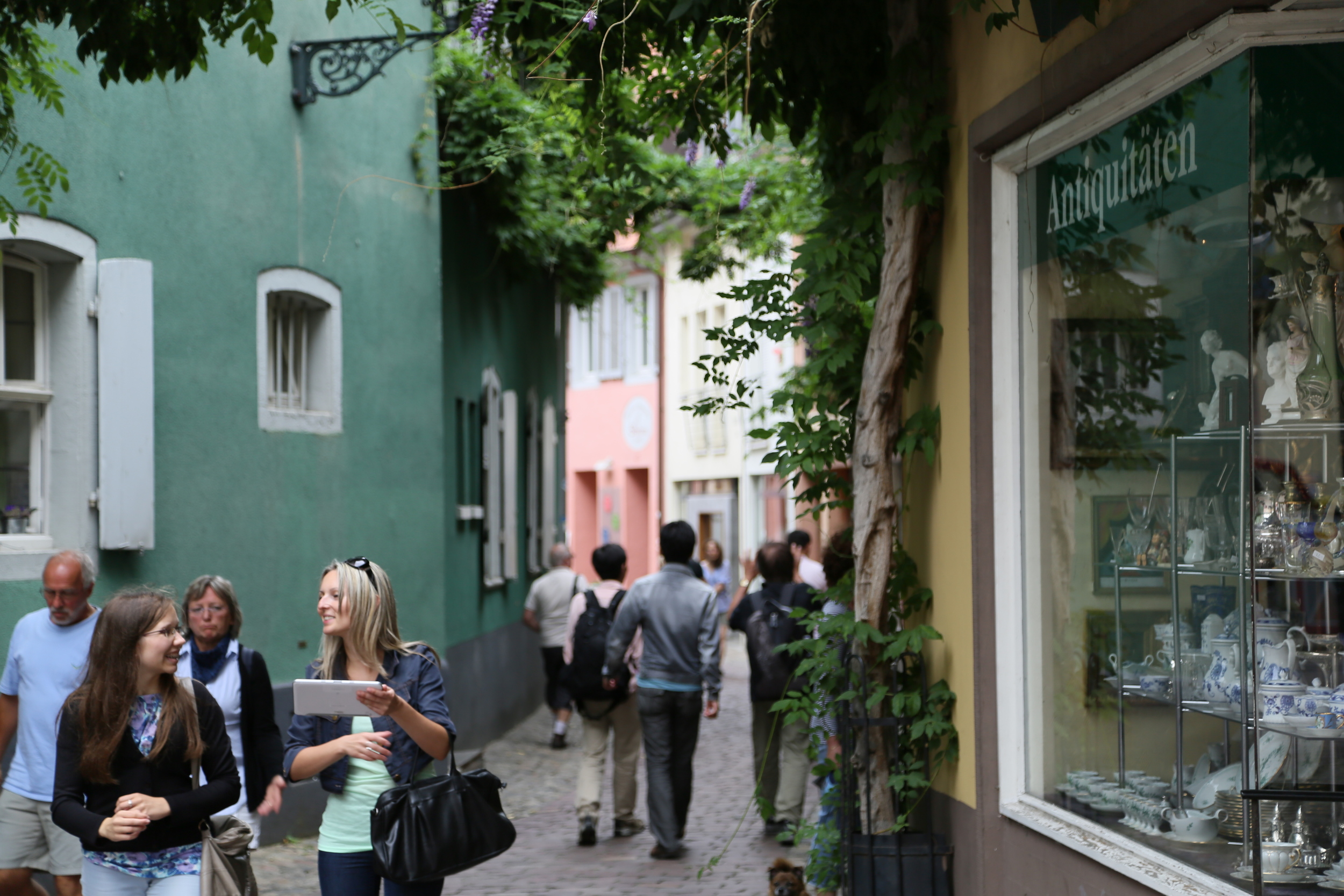
We know this pattern is also the basis for great streetscapes. Parks, plazas, patios, and streets themselves are all outdoor rooms shaped by the buildings and trees on their perimeter. It feels a little tired to repeat this stuff so often, but it’s quality outdoor public space that diminishes our appetite for excessive indoor space.
A cozy outdoor room needs to be framed (“walls” on a couple sides, perhaps a canopy of some sort), comfortable (shaded, not too much exposure), and part of the flow (somewhere you easily end up, not out of the way). While simple in theory, it’s astonishing how often we end up with virtually unusable outdoor rooms.
Sheltering roof
The authors relate that there’s a reason we use the phrase “a roof over one’s head” to describe home. In particular, they note that a homey roof is sloped. It doesn’t need to be peaked, but psychologically, we should understand just by looking at it how the roof is held up and how it will prevent leaks. They note that children, even those who have grown up in high-rises, always draw the same pointy roof when they are tasked to illustrate a house. I’d argue we all know what a store should look like too, and if the perspective drawing were not so difficult for a five-year old, they’d surely produce a box and an awning with their crayons. For fun, you can look up digital icons for “shop” or “store” online and find yourself in a vortex of awnings. So when I think of a sheltering roof at the city scale, awnings along commercial streets come to mind.
Throughout the whole city, we know that street trees provide a powerful sense of shelter and enclosure. They are the cathedral ceiling of grand boulevards and the the cozy dormers of pocket parks. On most sidewalks, trees are the roof over our heads.
Capturing light
There is no satisfactory substitute for natural light in a home and the authors recommend letting in natural light from at least two walls (or a ceiling) in important rooms. Beyond the delight of more windows, having light from two angles lets you track the sun over the course of a day. This requirement poses natural limits on the size of a home and demands some creativity in tight urban quarters.
In tall cities, blocking the sun is always a risk to design around. The more common challenge for cities of all sizes is absorbing or reflecting as much light and heat as possible, depending on the season. Older cities like Barcelona oriented their entire grid to make the most of sunshine. In the air-conditioned age, we barely give a second thought to southern exposure or late afternoon sun, to our demise. Just as a thoughtful home is energy efficient through natural heating, cooling, and lighting, strong cities are adapted to their climate.
Parts in Proportion
I’ve already alluded to Parts in Proportion as the inspiration for this post. The authors highlight how an elegant home can often be broken into a sort of Russian doll of pieces, nested in various sizes. Together, they create a whole that can be experienced fully at each scale.
Traditional cities work the same way. For example, a neighborhood commercial node mirrors the relationship between downtown and the neighborhoods at large. Another example: houses tend to be organized with the more communal activities like eating and socializing on the ground floor and the private quarters upstairs; commercial streets are organized the same way. And so on.
When you travel to a new city and instinctively know where to look for a convenience store or cafe, it is these patterns at work.
- -
If patterns interest you, consider borrowing this book from your library to read about the remaining five: Flow Through Rooms; Private Edges, Common Core; Refuge and Outlook; Places in Between; and Composing with Materials.
Homeyness Matters
I think the real takeaway from this book and my reflection on it here is that homeyness itself matters. If these patterns do scale up as well as I think they do, you could even argue that our highfalutin principles of good design are really the more humble and instinctual art/science of making things homey.
In recent years, I’ve leaned on “walkable” as the catch-all term for a place that’s got everything going for it. Jargony buzzwordness aside, the word is helpful, concise, and effective. In three syllables, it implies streets full of people and a residential/commercial combo of buildings assembled close enough together that transit would also be attractive. It’s a very handy word but I’ve always felt it incomplete. For example, there are plenty of perfectly walkable places that behave like consumerist urban theme parks - where every walk involves a purchase and a disposable coffee cup, and where the people come and go without investing any care into the place. But that’s not the image of a Strong Town. Strength needs homeyness.
“You cannot build a place of enduring value that isn’t homey, that isn’t loved.”
Homeyness implies longevity and belonging. It moves along axes of time, effort, and affection, not market forces. You don’t grow out of the "lifestyle" of feeling at home. Homeyness doesn’t give two farts whether there’s a Starbucks on the corner. Eventually that Starbucks will be something different and the homeyness will remain, embodied in the tenderness with which people treat their city.
Perhaps because it’s not profitable or easily quantifiable, we don’t bake homeyness into our cities' goals. But we should.
The authors titled this book, “Patterns of Home: Ten Essentials of Enduring Design” [emphasis mine]. There is wisdom in that. You do not necessarily make any money by prioritizing homeyness in your town or encouraging the makeshift process from which it emerges. But you save on lots, and that's even better. You save on the waste of building things no one cares to maintain or repurpose. You save on the constant need to draw people in because they don't want to leave. You cannot build a place of enduring value that isn't homey, that isn't loved. Maintenance is a slog that no one really enjoys - lots of effort just to make sure nothing happens. And yet time pulls us all toward disorder. It takes something more than walkability and productivity to inspire places that can stand the test of time. Affection is the fuel of maintenance.
(All photos by Gracen Johnson.)


A Japanese study is the first to quantitatively measure the economic impact of tactical urbanism. Spoiler alert: it’s good for business.