Public Art: Project vs. Process
It's Public Art Week at Strong Towns. For the next few days, we'll be discussing the value of art in public life, the impact of public art on our neighborhoods, and how to ensure that public art is created by and for the people, not through a top-down process.
Should public art be above the scrutiny of “return on investment”?
When procured by the city, I think public art is as worthy of debate and investigation as any line item in the budget. Its “return” is difficult to evaluate if you believe, as I do, that art has intrinsic and immeasurable value. Nevertheless, you can still ask if an investment in public art is achieving what you set out to accomplish.
Just as Strong Towns does not advocate growth, but productive growth, I believe there is a way to advocate effective art. And just as we do not have a formula or solution for productive growth, but rather an approach to development, I believe that effective art is more about process than project.
First, establish why you want public art in your city.
Since there are so many possible virtues of public art, we cannot take for granted that people value it for the same reasons. Of the many ways public art can enrich a place, I find three categories stand out:
- Public art can be aesthetically pleasing.
- Public art can make an environment feel special or personalized (placemaking).
- Public art can make a statement or spark a conversation.
I'd argue that “effective” public art has a lasting or catalytic impact in at least one of these categories. The way you go about achieving that depends primarily on what you value most as a city.
If public art is beauty that can be enjoyed by everyone...
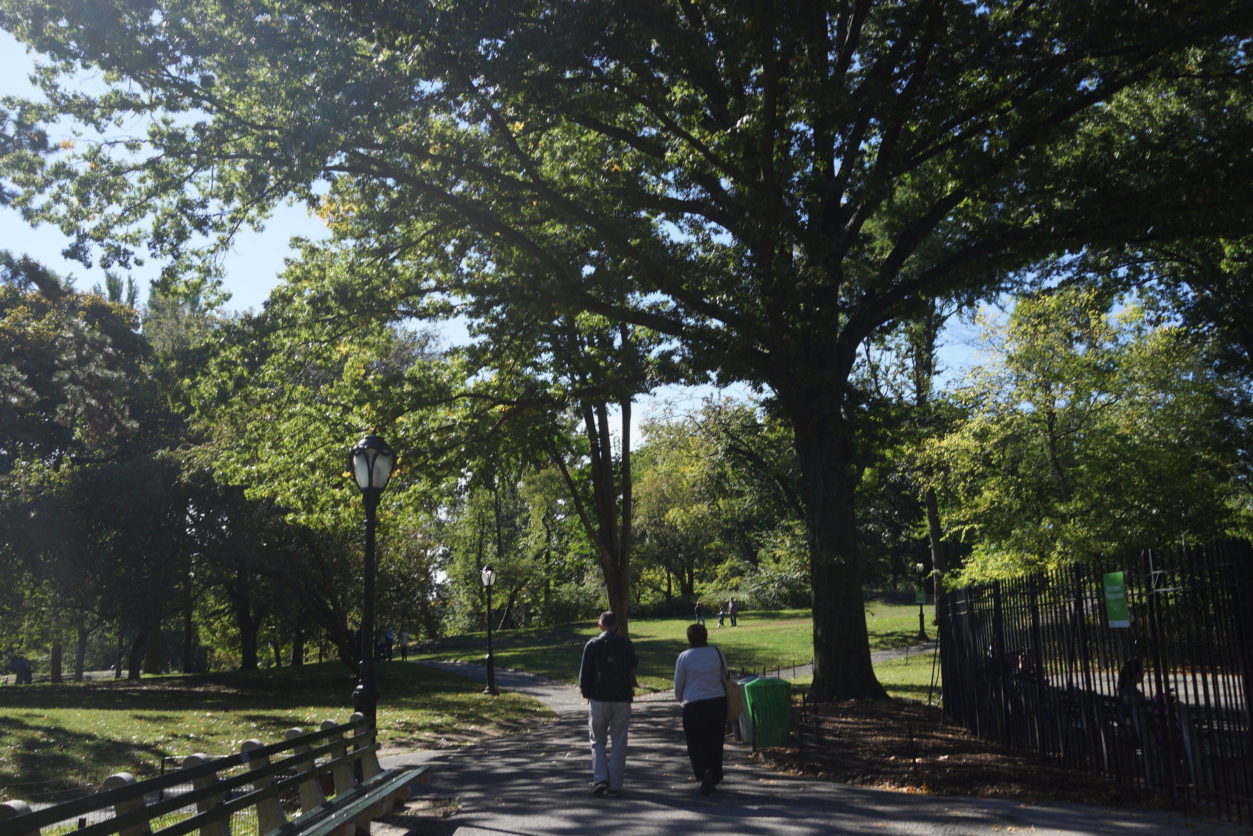
If the city’s goal with public art is simply aesthetic, to make a place prettier, I believe the most effective art is the most overlooked. If we’re talking about beautiful, durable, loveable, installations that are valued by all people (read: not just those with urbane ideas on art), the road forward extends from the path worn bare in great neighbourhoods all over the place: nice buildings, and mature trees and landscapes.
We can't all have an Olmsted park, but thoughtful landscape design goes a long way.
Magnolia doing more for my neighborhood than any paint or sculpture could.
Allowing buildings to adapt gives them the opportunity to grow old. Any building can be interactive art if you care to make it so.
If this is your goal as a city, save yourself the drama and debate of subjective art and plant a bunch of trees strategically. Adopt the Existing Building Code so that old buildings can be more feasibly adapted. And before building new, ask if it’s possible to rather maintain, adapt, rehabilitate, or improve something that people already love.
Usually cities want more than beauty though. Then the question becomes: how do you obtain art that effectively sparks a conversation or makes a place feel special? Bonus points if it looks nice.
This is where process is of utmost importance.
To illustrate, a tale of two pianos.
I do not know where or when the trend started, but a some point, painted pianos started popping up in cities all over the place.
Piano 1:
My first encounter with one was in 2012, walking home from the city center in Cambridge, UK, along a path used only by bikes and pedestrians. It was getting dark so I heard the chords and a sing-along before I saw the old, out-of-tune upright, bedazzled in a DIY paint job. The piano had been prepared for English weather too with a tarp raincoat at hand. There were no rules or instructions, just the implication that people can figure it out.
How this piano arrived on the path was a mystery to me. It could not have been easy to move there and I guessed there were probably a few sore backs and a funny story behind it. Over the next few days, I’d cross this piano or one of its painted peers throughout the city several times on my way to or from class. I heard everything from Rachmaninoff to Lion King to Coldplay, pounded out by students day and night, some of whom were intoxicated but the music was never unpleasant. Then the pianos disappeared. It was all a delight, a mystery, and a good memory.
Piano 2:
Over the next few years, I saw the project reimagined in several different cities, always with the same haphazard look and come-what-may attitude, until one day I saw the idea professionalized. There it stood, in front of a City Hall. If you sat down to play, you would see that the piano was in fact an electric keyboard sitting on a wooden piano-shaped frame, no doubt to make it easier to move the piano inside at night or in bad weather. The frame itself was painted carefully in what appeared to be a commissioned piece by a famous local artist. The city had printed a glossy sign next to the setup inviting people to play.
Perhaps the city was full of skilled pianists, or perhaps the very central and formal location of the piano warded off anyone mildly self-conscious about their musical abilities. Either way, I only ever saw performance-level players at the bench, and the keys were locked up inside before nightfall could bring out the social scene. To this day, I’m unsure whether the piano was programmed with paid performers.
By day, attracting performers in front of City Hall.
By night, closed for business.
This is more or less the same project: the painted pop-up piano. The effect is very different though. One felt like bottom-up art, the other felt like top-down “placemaking.”
They are both good. They bring music to the city and add an element of surprise. The people involved in both of these projects did a really good thing and I am grateful for them.
What the difference between these two pianos reveals though, is the magic left on the table when we demand of our cities the project without undergoing the process. Public art has the capacity to be so much more than a charming thing you encounter while walking through a city. It can change the way people feel about each other and their ability to shape their environment.
If the goal of public art is to make a place feel special, beware of project vs. process
It’s so tempting to focus on the project, the cool outcome that tourists will photograph and locals will celebrate. In the world where placemaking and public art meet, the project is bountiful:
Some makeshift seating and sprucing in the Edge District of Memphis. Everything down to the rock levelling out the wobbly chair screams that this is an effort of humans making do with what they have. It inspires others to be resourceful.
- Little Free Libraries
- Park[ing] Day
- Pop-ups: patios, bike lanes, shops, food
- Painted crosswalks
- Chairbombing
- Rainworks and Sidewalk Art
- Murals
- Big climb-able installations, often in the form of letters
The list can go on many pages.
In leading or participating in several projects that fall on this list, I’ve learned that the outcome itself is less powerful than the vibe it gives off. When people look at a project, do they think:
- A) “Oh wow, it looks like my neighbors did something really cool here. Man, I could/should do something cool too.” OR
- B) “Oh, that’s nice that the city/festival/business association did that.”
Again, both are good, but one approach is more likely to have a lasting or catalytic effect. In one case, the haphazard and makeshift nature of a project marks it as truly local. The more makeshift it is, the less intimidating it becomes to mimic or interact with the art. When it’s clear that art has come from “the people,” it puts the onus on "the people" to create more. It becomes a call and response kind of interaction that fills a place with a human touch. In the other case, the public become consumers of art projects that formal groups are then expected to deliver.
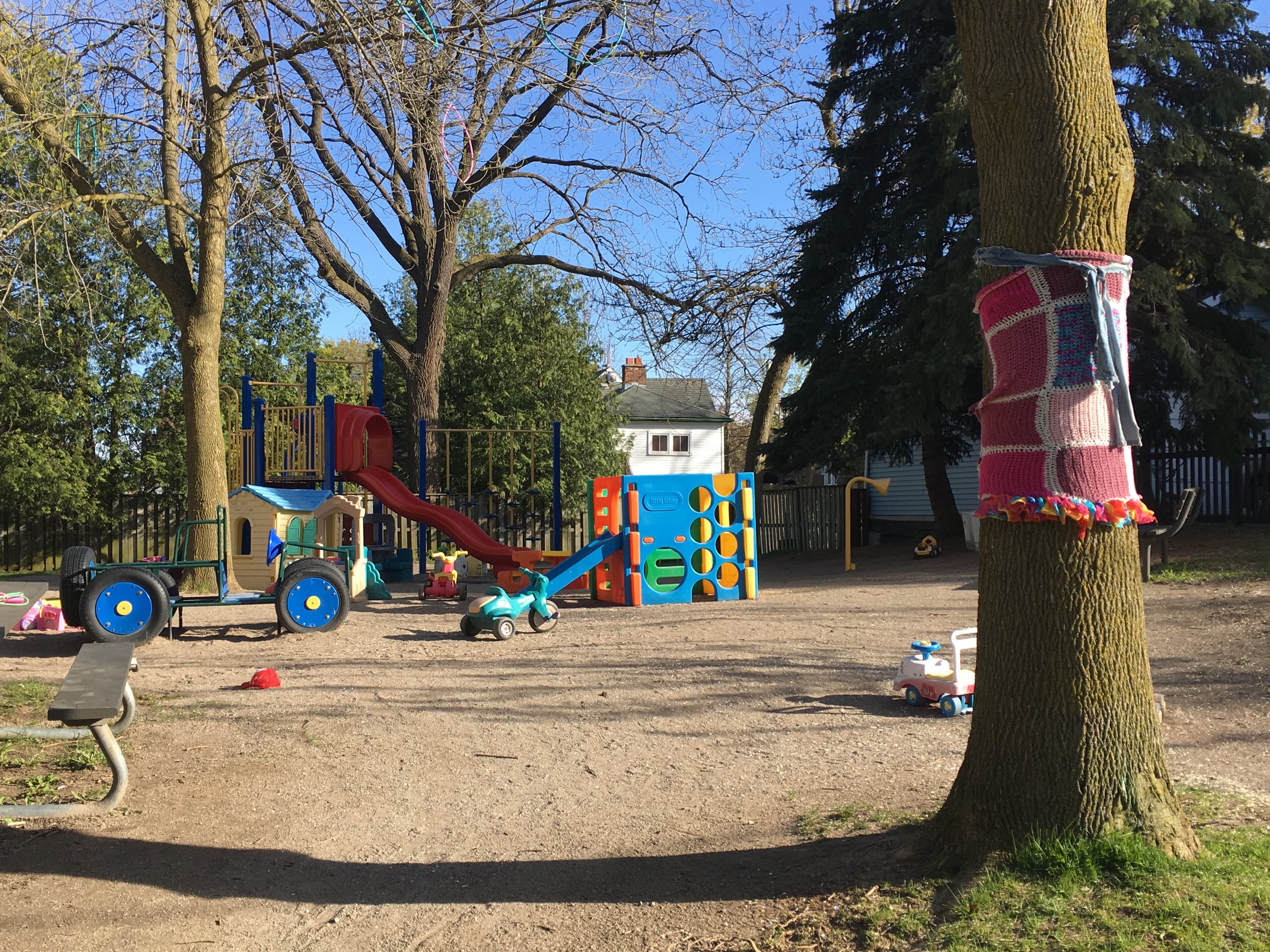
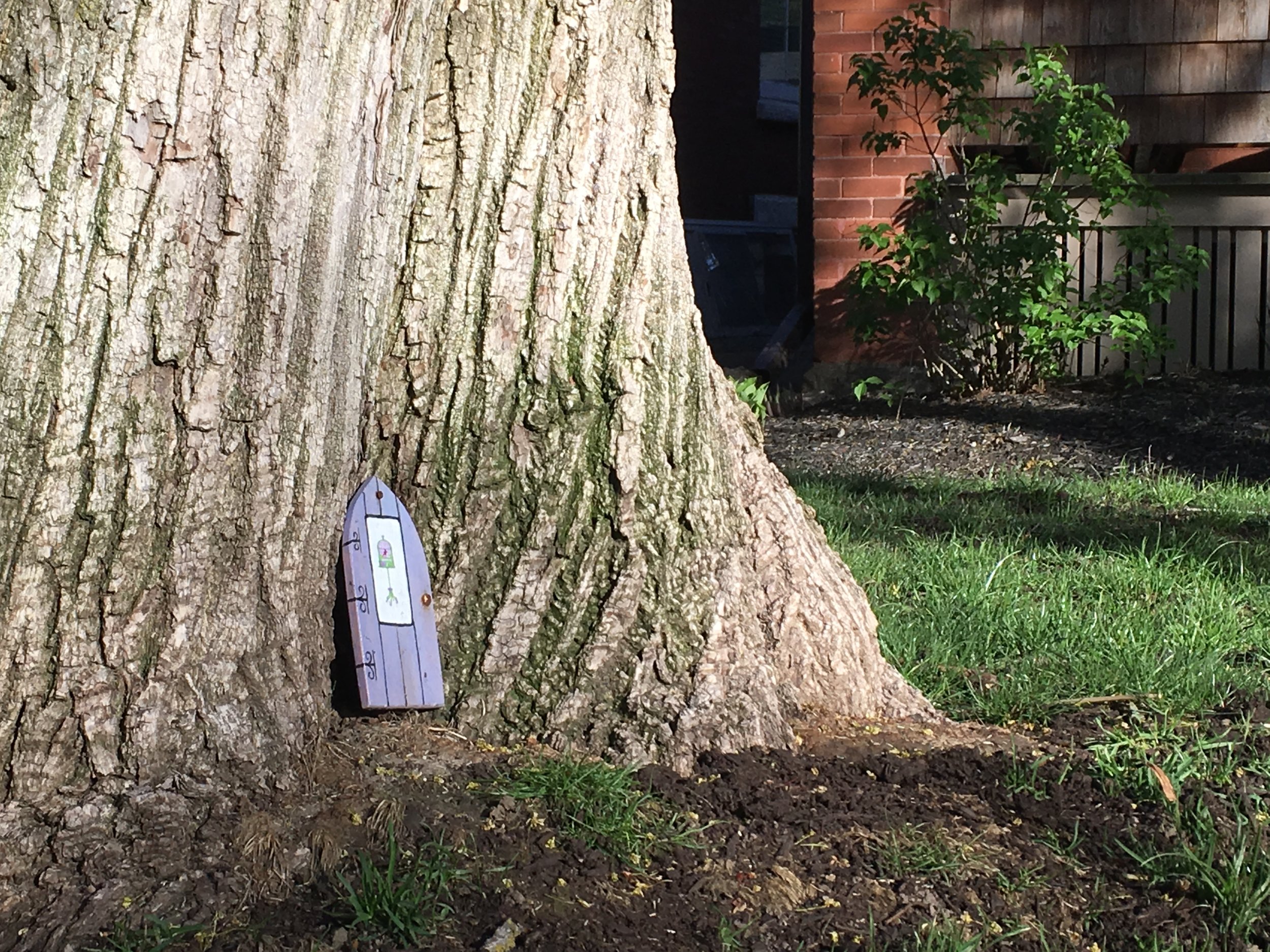
For instance, in my neighborhood you can find local examples of classic public art projects like yarn-bombing, fairy doors, and little libraries. The projects themselves are not doing the heavy-lifting. It's the DIY nature of the projects that makes the difference. The makeshift decor in the neighborhood communicates that this is a place people love enough to adorn, in whatever folksy, funny, whimsical, or even tacky way they please. It shows that a place is cared for and inhabited by people with personalities.
If this is the effect you are going for in your city - the authentic, fun, whimsical public art that makes a place feel personalized - it may be most effective to leave it to the people. Although, it's worth taking a good look at your rules to make sure citizens are not scared off or penalized when taking this adornment into their own hands.
If the goal of public art is to challenge or make a statement...
Makeshift projects are all well and good when they can be pulled together with a free piano off of Craigslist and a box of glitter. What about projects that require more expensive materials and most importantly compensation for the artist? I think process matters here as well. Nothing kills the creative spirit like paperwork and committee review.
If a city wants to acquire durable, iconic, and challenging art, just give artists money with as few strings attached as legally possible. You’ll probably end up with something both deeply loved and virulently hated by the public, but that is what you asked for. If you want something universally loved, I refer you back to my tree recommendation.
- -
What is the most memorable or effective public art that you have come across? In your experience, does my theory that process outweighs project hold up?


