We Regulate the Wrong Things
We recently shared a great article from The Walrus on our social media feeds entitled, “The Future of Cities: The perfect urban space was invented thousands of years ago.” We wholeheartedly agree: the best innovations humankind has produced to date in how to organize, design, and live together in cities are not new or innovative. They don’t involve machine learning or pneumatic tubes or flashy buzzwords like the “Internet of Things.” The things that make our places strong are thousands of years old, time-tested and proven, and for that reason found all over the world. In combination, they are the elements of what we call the traditional development pattern. Some of these elements:
Cities designed at the human scale: when experienced on foot, they are comfortable and navigable. The spaces between buildings are not too big, providing a sense of enclosure: the streets feel like an outdoor living room, a place where you might want to linger. The buildings themselves are not so big as to be imposing and alienating: the development pattern is granular.
Cities designed for walking or other self-propelled movement as a viable mode of transportation: you can leave your home and meet your day-to-day needs on foot or by personal mobility assistance device within a reasonable radius.
Cities designed for a mix of uses and building types in close proximity. This is a requirement for the walkability described above.
Cities built incrementally and iteratively over time. This promotes a pleasing variety in the environment, but more importantly, the city evolves in response to real-world feedback about what is and isn’t serving residents’ needs, instead of too much of it being designed too quickly by one (fallible) master hand.
Cities built to be financially resilient. There is enough concentrated economic activity to generate the wealth needed to pay for whatever level of public infrastructure exists. Incremental development was the only option for most of history, when the modern financial system did not exist and city-building was largely a pay-as-you-go endeavor.
Traditional development in Galena, Illinois (Source: Wikimedia Commons)
You can find sterling examples of this pattern literally all over the world. Just on this site, we’ve taken readers on tours of the traditional development pattern in the United States, Mexico, Puerto Rico, Morocco, Spain, Japan, Turkey, and more.
However, because of the post-WWII hegemony of the automobile, and the also-post-WWII emergence of a Ponzi-Scheme-like model of debt-fueled development, the rules of traditional development are often no longer followed, especially in North American cities.
In more recent years, the rise of the New Urbanist movement in city planning and an increasing recognition of the value of these traditional forms has led to an environment in which most cities’ staff and elected officials will tell you they want traditional development that hits the bullet points above. They will say it right in their comprehensive plans and zoning codes.
And yet, the principles of it have been alien to the way we do things for so long that developers often don't get the details right. It’s not because they don’t get it or can’t find architects who get it. It’s more about incentive problems, what economists might call a “market failure:” developers’ incentives are not aligned with the long-term interests of the community.
Bad Urban Design is a Market Failure
Bad Design is a Catch-22. This can be summed up as “We don’t need to spend extra money and effort making it nice for people to walk here, because nobody walks here.” Or the even less charitable version, “There seems to be no demand for a bridge across this crocodile-infested river, because I don’t see anyone swimming.”
The result of the car-oriented status quo is that even in areas that could be walkable—they have the density and the mix of uses—developers often view a top-notch walking environment as an optional “wish list” item that can be discarded from their design when it comes time to cut costs, because hey, most people are going to drive to my building and park in the parking garage anyway, right?
Bad Design is a Collective Action Problem. Wikipedia defines a collective action problem as a situation in which all individuals would be better off cooperating but fail to do so because of conflicting interests between individuals that discourage joint action.
Good design helps a place maintain value over the long term—when each building enhances the overall streetscape, you have an environment which inherently draws people in to linger. However, for any one developer, good design costs extra, and that extra cost has to be justified based on the presumption that other property owners in the area will also do their share. Creating a great street requires the collective effort of those who own the buildings along that street.
Local Regulation Fails to Correct the Incentives. This is the kind of market failure that government regulation—by which I mean local zoning and development standards—is ideally suited to correct. Development regulations exist, in theory, to prevent people from doing things on their private property that harm their neighbors. And because buildings, once built, will likely be around for decades or more, we ought to be comfortable with a fairly expansive interpretation of "harm" in some cases. If you build something with an especially bad frontage, you are diminishing the quality of the street for everyone else who lives, works, and owns property along it. It makes sense to impose some reasonable standards governing the things that make the most difference in this area.
Do we? Not really. The unfortunate truth is that most development codes still regulate the wrong things aggressively, and the right things not well enough.
And they do this despite the best of intentions. My own city’s code introduces its Downtown zoning districts with the following language, which checks all the boxes:
The singular quality that helps differentiate the urban downtown from typical suburban environments is the primacy that the urban downtown places upon creating a high quality pedestrian environment. This environment is best described in terms of the quality of the frontages along the street edges. Frontages are the area between the facade of the building and the lot line (see frontage definition II-201).
An excellent frontage is one that provides a high level of positive stimulus and interaction for the pedestrian. In an ideal setting, buildings would form a continuous edge, generally up against the outer edge of the right-of-way, with large expanses of glass for pedestrians to see what is happening inside, and a constant sense of give-and-take between inside and outside. The width of the buildings along the street would be relatively narrow, with a range and variety of stores and shops. Restaurants and other uses might spill out onto the sidewalk creating open-air cafes, galleries and other attractions. Landscaping is prevalent, but does not dominate the setting, and does not prevent the pedestrian from getting close to the buildings, storefronts and display window[s].
A poor frontage, on the other hand, is one in which there is little, if any, stimulus or interaction with the pedestrian. A surface parking lot is an example of the worst type of street frontage, affording the passerby little sense of enclosure, protection or interaction.
In that language, we’ve got nods to human scale (“high level of positive stimulus and interaction”), granularity and incrementalism (“width of buildings along the street would be relatively narrow”), mixed use (“range and variety”), and the idea that the streets should be the public’s living room. I like this code. How can we go wrong?
My city’s downtown also happens to be in the middle of a construction boom, giving me ample opportunity to actually hit the pavement and take photos of buildings that have gone up in the last five years. Let’s look at what that new development gets right, what it gets wrong, and how that relates to the city's codes—what are we not regulating that we ought to be, and what are we over-regulating?
3 Things We Should Be Regulating More Aggressively
1. Pedestrian Comfort: Shade
If you want to encourage a lively street full of people walking, you need to make it comfortable to walk. The exact needs might vary a bit depending on your climate and situation: wide enough sidewalks to feel safe, places to sit and rest. In Florida, where I live, comfort means one word above all else: shade.
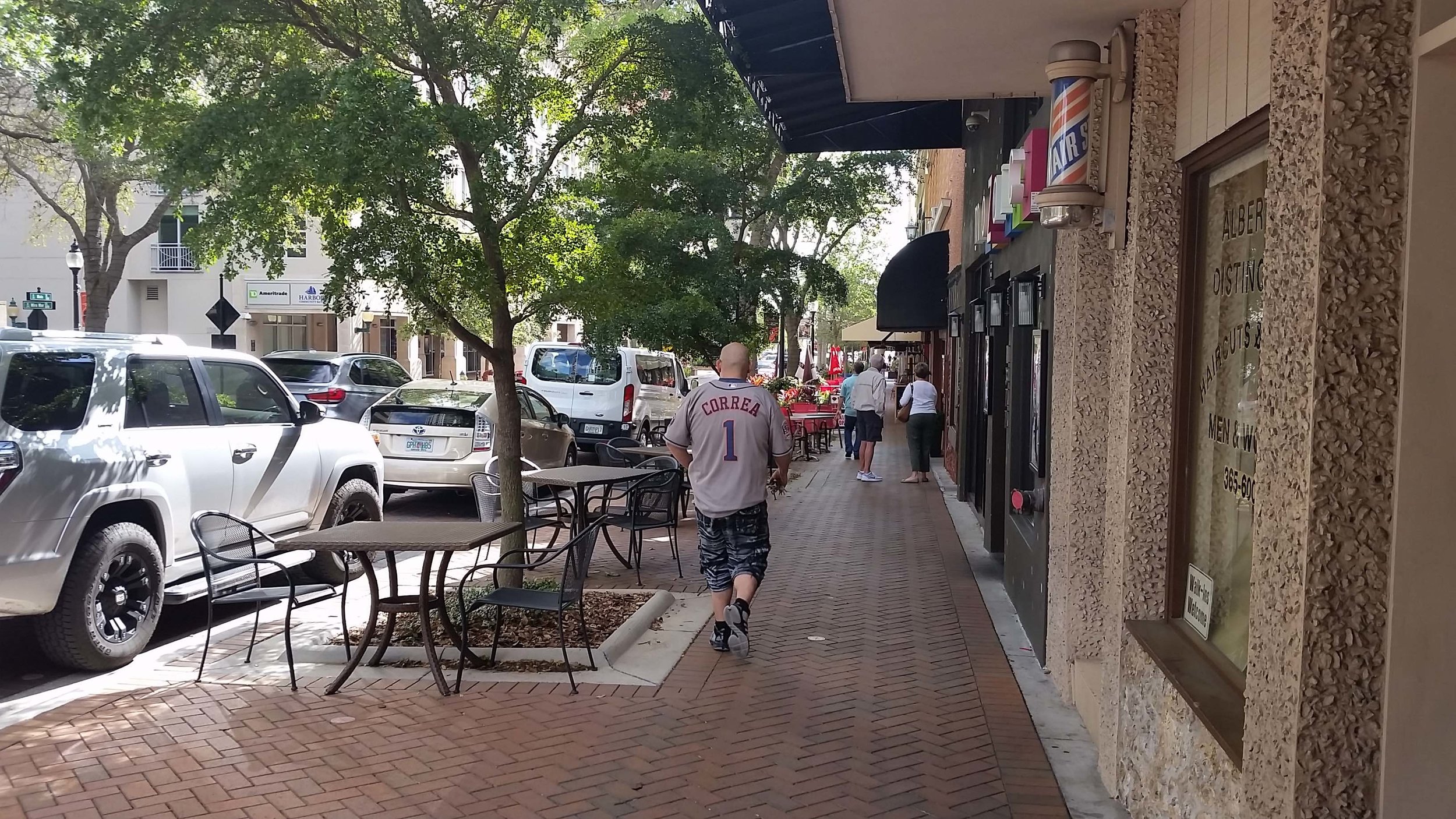
For this reason, we require awnings on retail and restaurant frontages in our downtown—the awning must cover at least 90% of the front of the store. This is great. It looks like this, when done well:
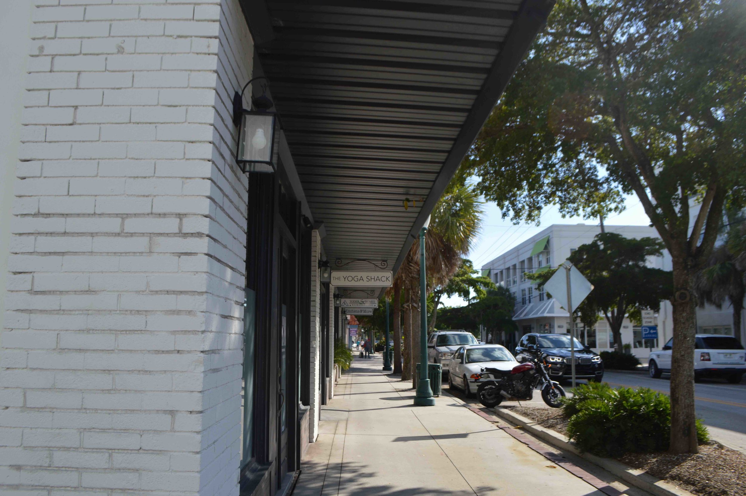
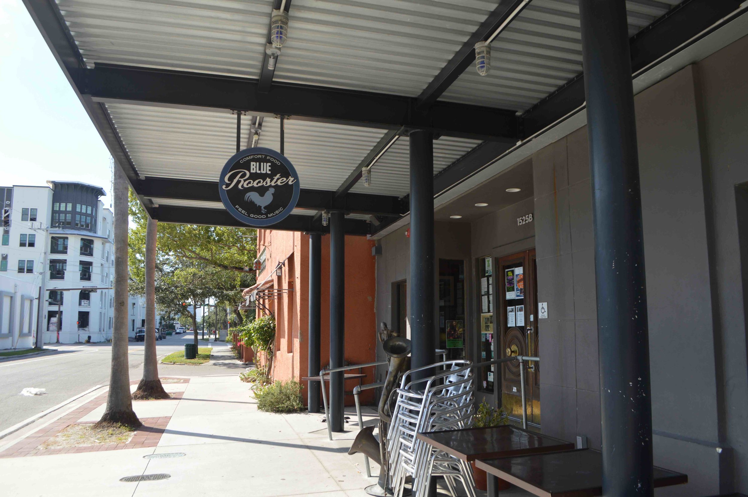
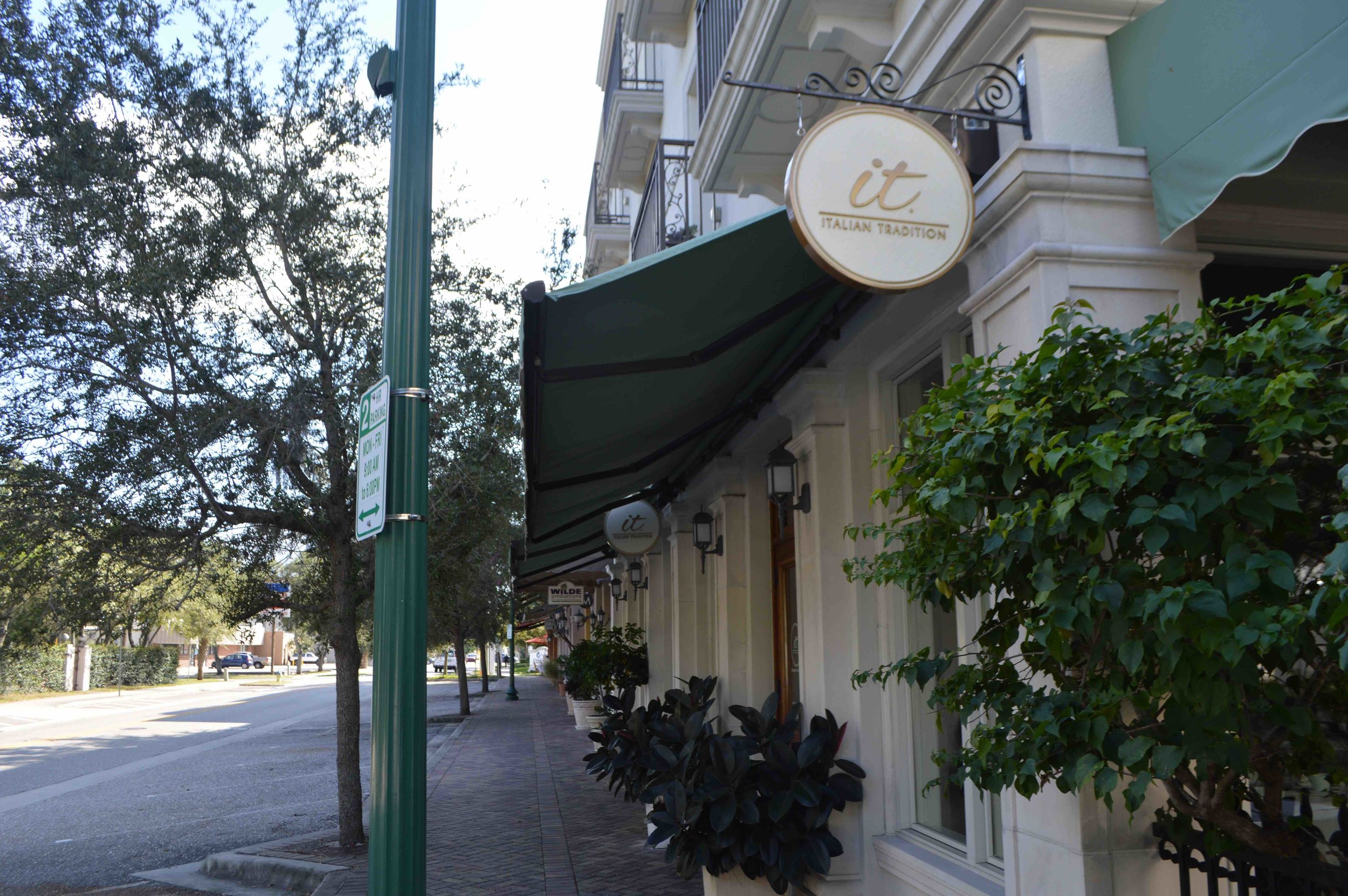
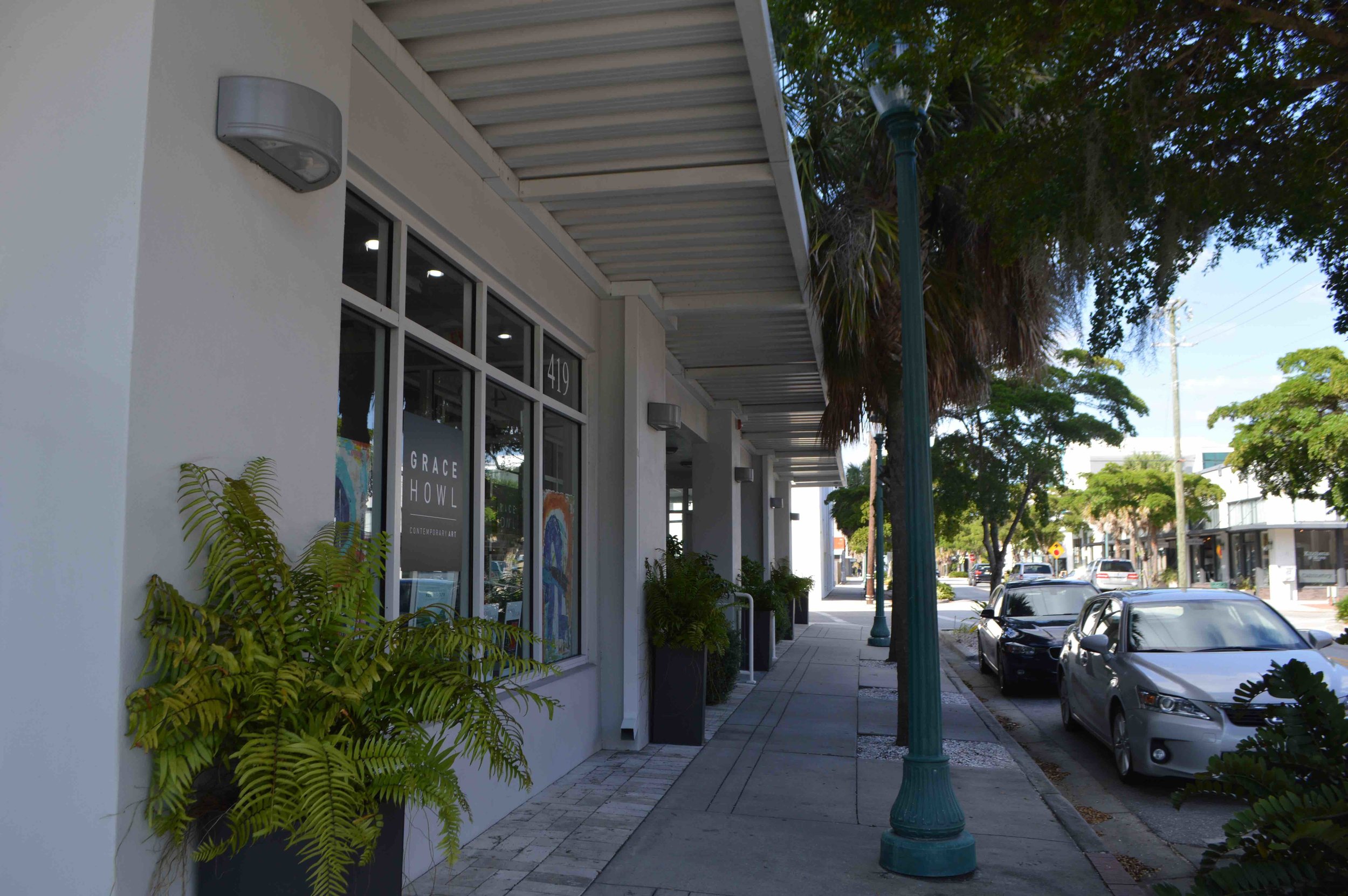
Unfortunately, residential buildings get a pass from this requirement. And in a mixed-use neighborhood, you're going to be spending more time walking past residential buildings than retail ones, and you're going to have to walk past residences to get to the businesses you want to patronize. How do our new residential buildings do on the awning / shade front? Poorly:
The above photos also bring us to point number two:
2. Avoiding Monotony: Granular Streetscapes
The value of granularity has to do with pedestrians’ psychological comfort, rather than physical. Have you ever had the experience of having a monotonous ten-minute walk in a place familiar to you feel interminably long, but then you went to a city with stellar traditional urbanism and found yourself walking ten miles in an afternoon without even feeling like it was a lot?
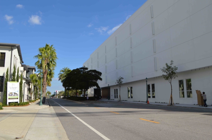
The introduction to our downtown zoning standards, quoted earlier, acknowledges the value of granularity to a high-quality environment. But the actual codes don’t require it. Some of this comes down to the monolithic scale of our new development, which has been dominated by “Texas doughnut” buildings that occupy an entire city block:
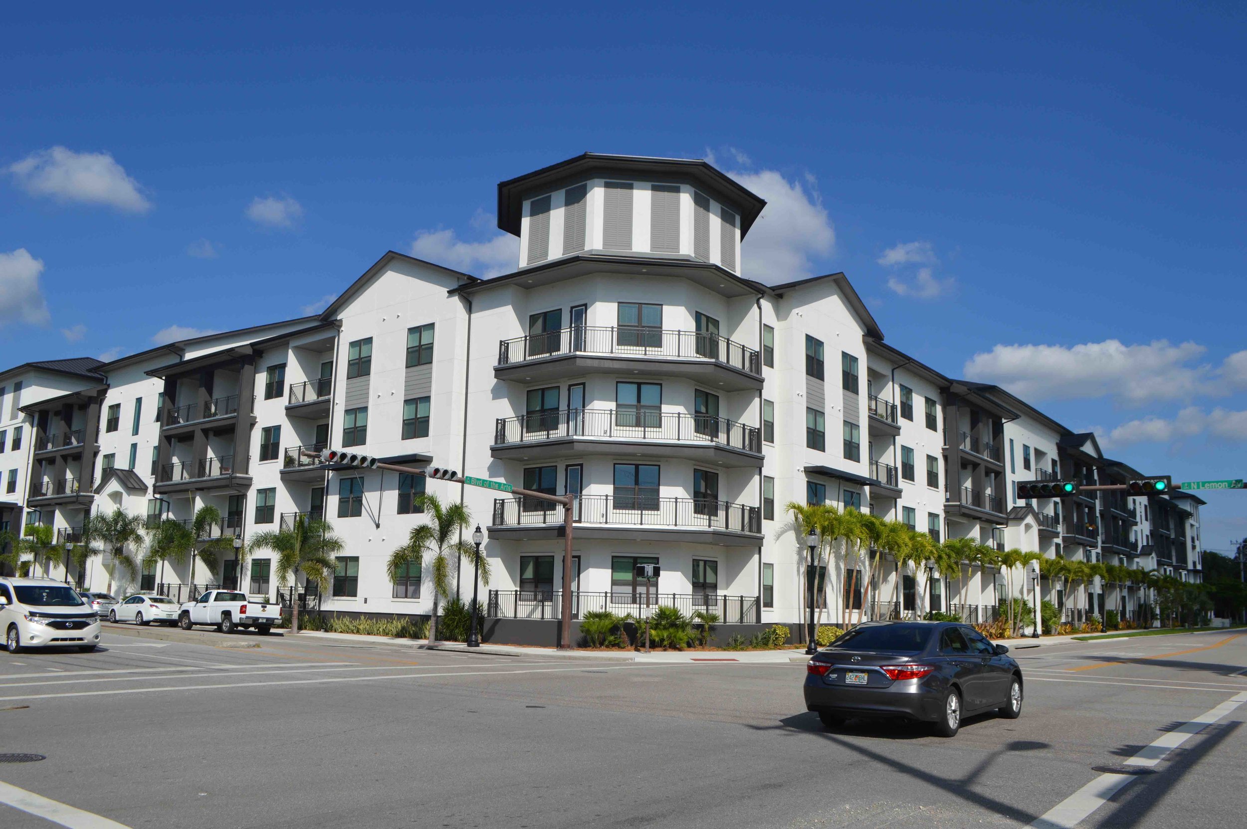
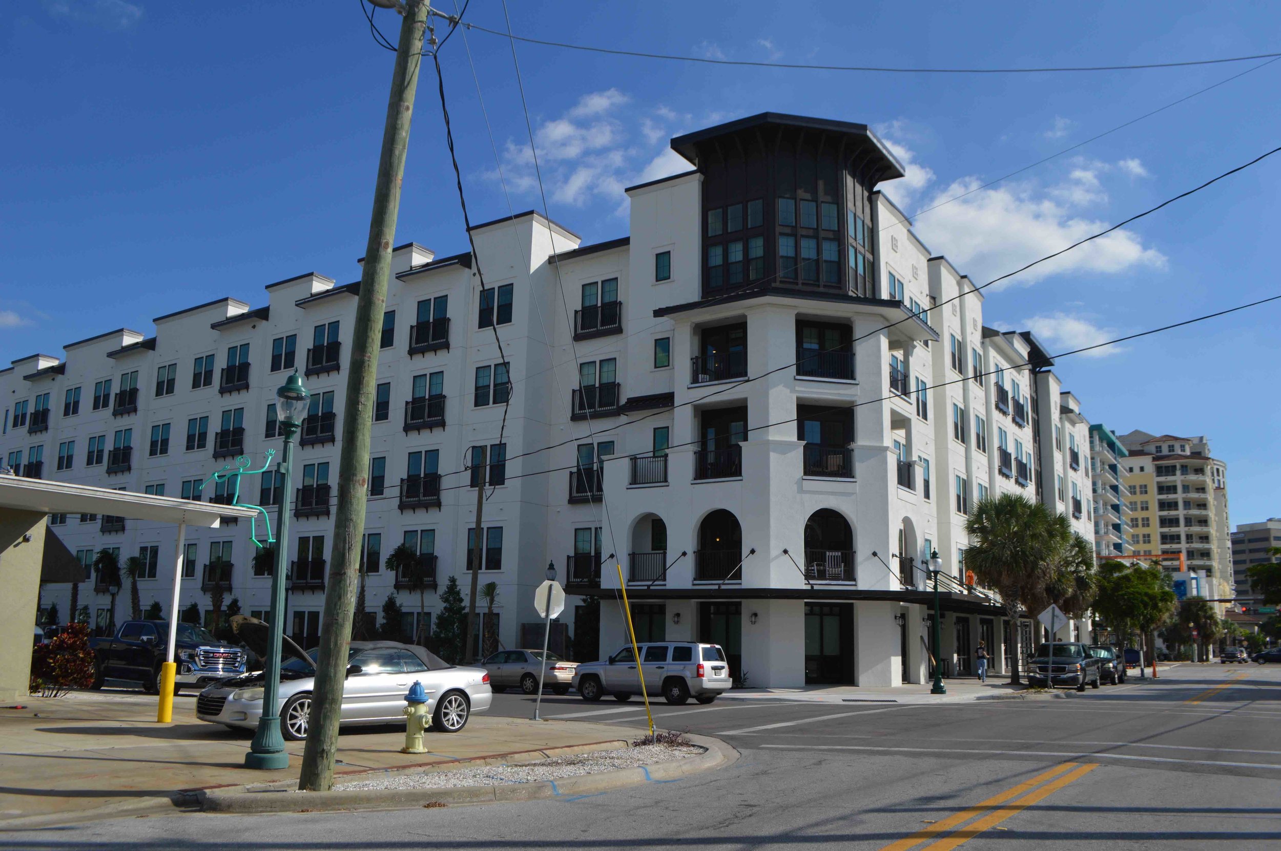
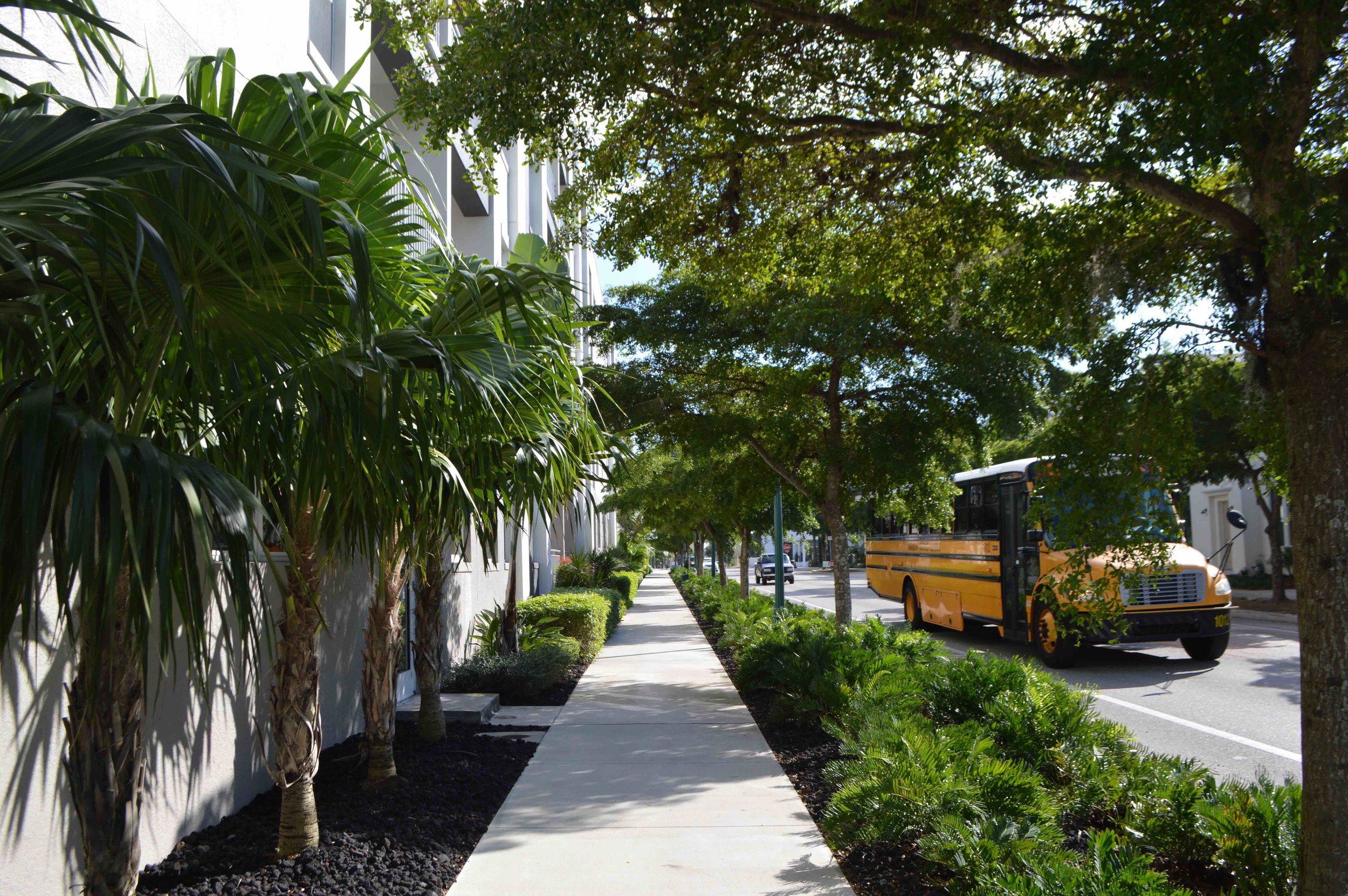
The result is that even when some attention has been paid to planting nice street trees, the walking experience is monotonous.
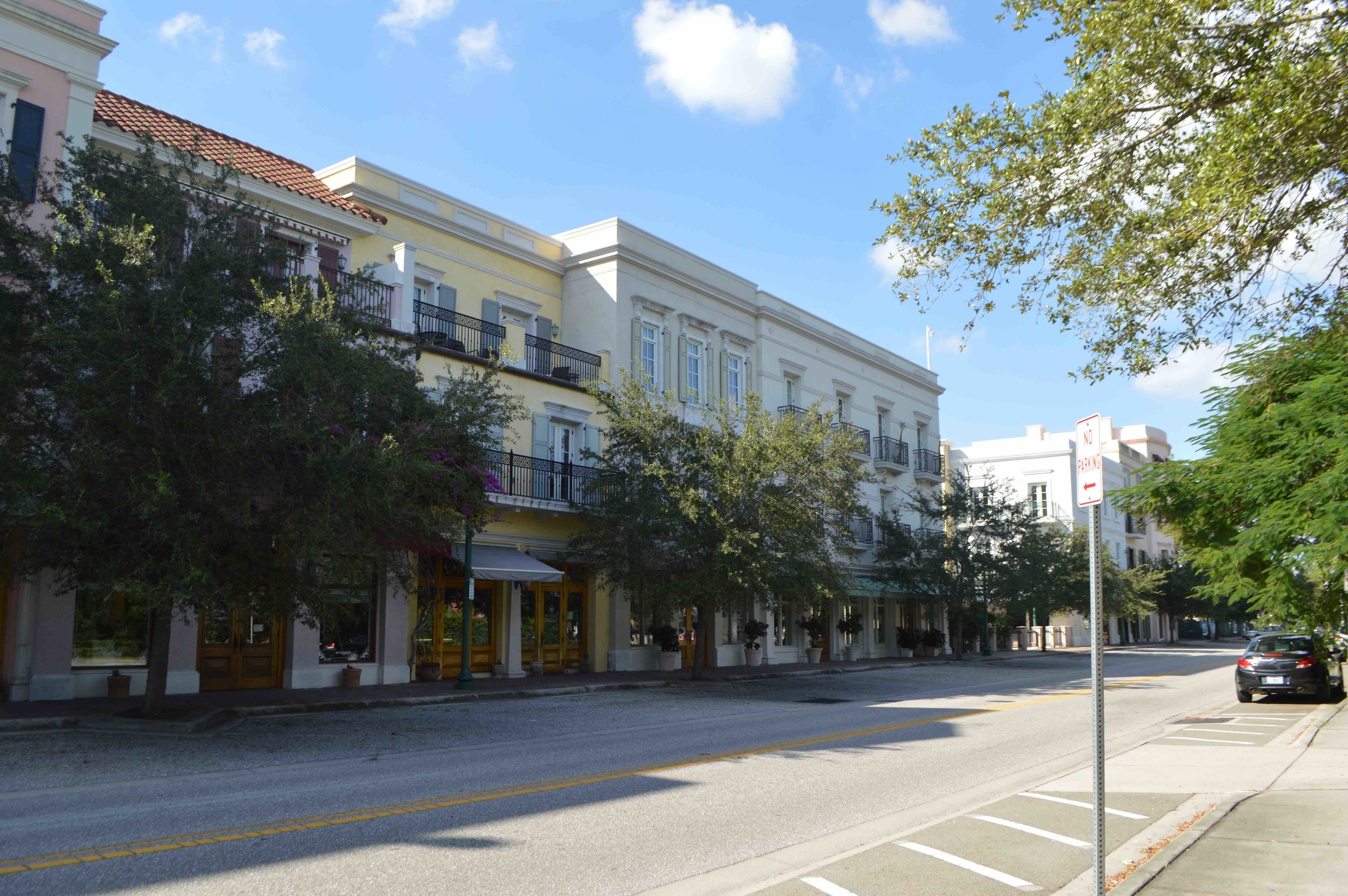
There are ways we could require variation—faux-granularity, even if the whole block has a single owner (though ideally, it should not). Here’s my favorite recent development in this part of downtown, because of the way the architect created a varied, interesting streetscape for the pedestrian:
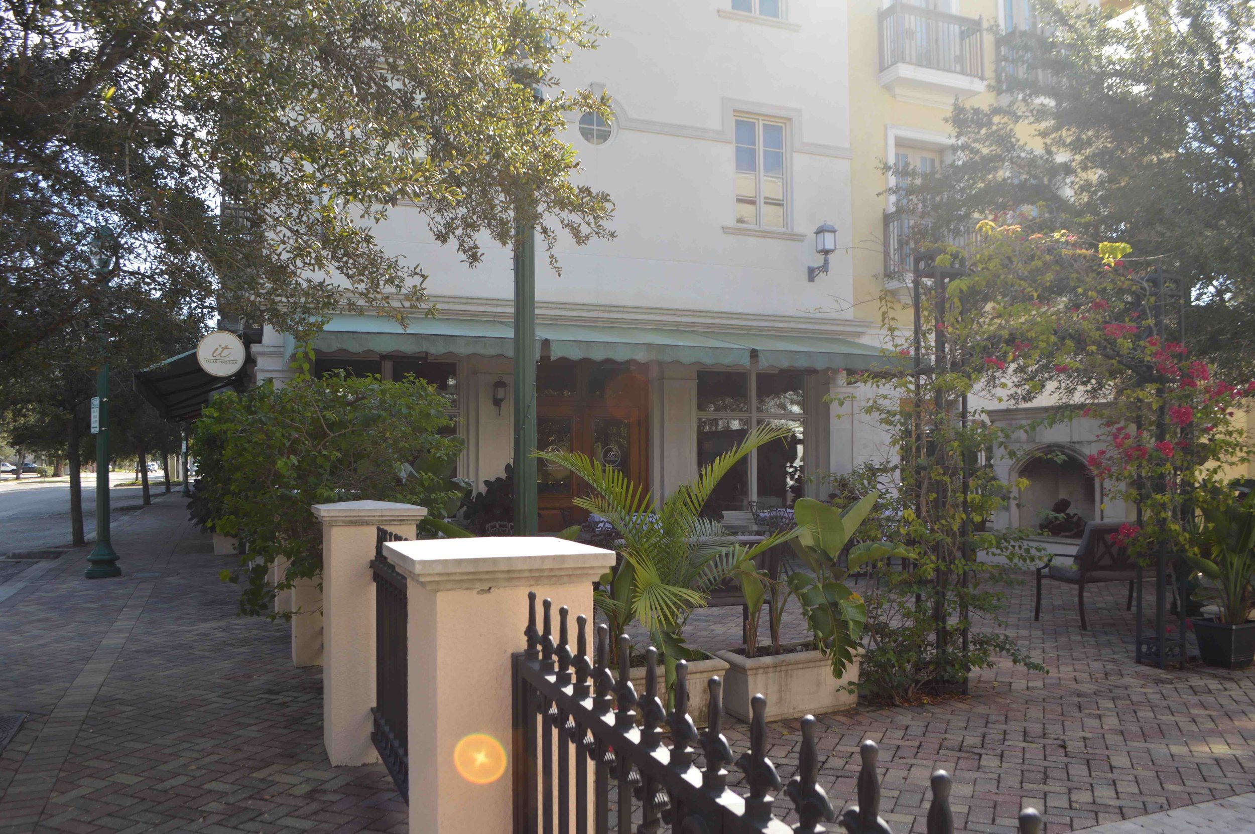
One of my favorite suggestions ever for how we could operationalize sidewalk-level variety in the zoning code is Sam Newberg’s Gehl Door Average, inspired by the work of Danish architect Jan Gehl. Frequent doors mean activity: people coming and going, or at least the sense of possibility from knowing that there’s something there and someone could appear. Newberg’s post is well worth a read. Let’s look at a townhome development in progress on my downtown walking route:
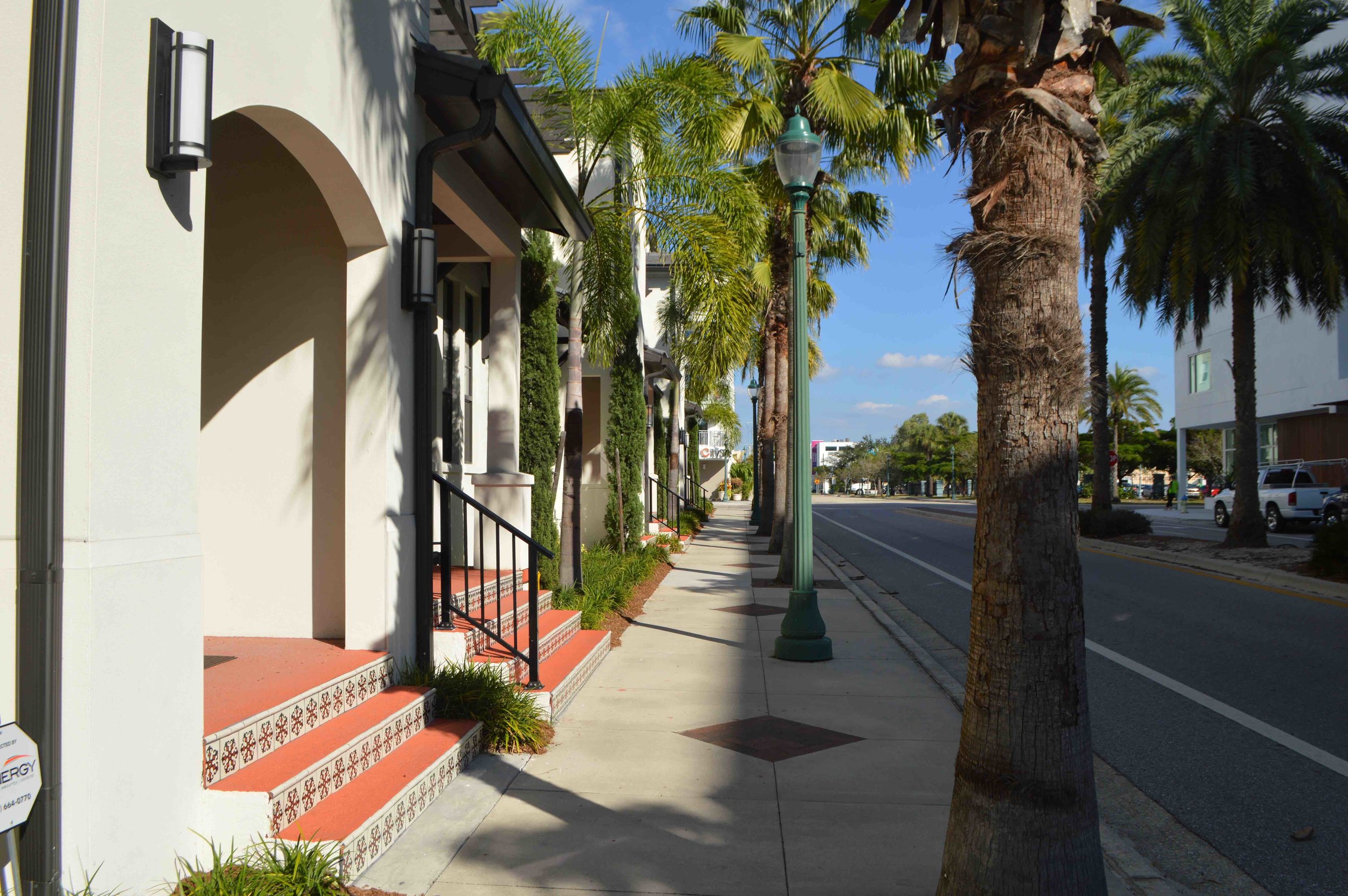


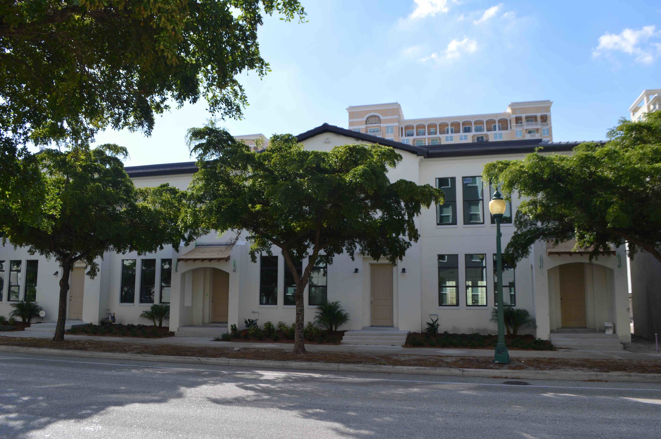
Individual front stoops! Halloween decorations! Someone is home!
On the other hand, the large apartment complexes not only haven’t given their first-floor residents individual front doors, they have elevated those first floors far enough above street level to further remove the possibility of interaction between the private and public realms. The only entrances along the sidewalk, other than the main entrance to each complex, are utilitarian doors, tucked away, and the experience for anyone walking is of a monotonous, even somewhat forbidding, dead zone.
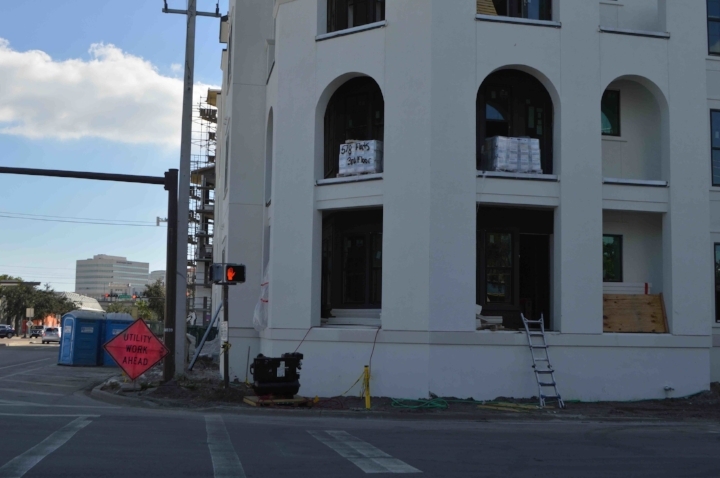
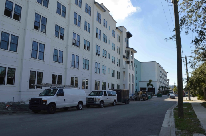
A lot of developers may be resistant to providing transitional spaces like front porches or stoops, believing their customers don't want it for security or privacy reasons—but that's the collective action problem again. A place built around active streets is self-perpetuating. But so is a place built around desolate ones.
Even this retail frontage fails the monotony test: it has windows, and it has the required awnings. But it fails the Gehl Door Average test, and that is central to why this will likely never, ever be a lively sidewalk, no matter what businesses end up occupying these ground-floor spaces:
3. Preventing Huge "Gaps" in the Urban Fabric
Another little thing that makes a huge difference when you're on foot, but might strike an architect as a minor detail, is the presence or absence of "gaps" in the urban fabric. Consider these two contrasting examples of how two very new buildings have dealt with the issue of necessary access to their (internal) parking garages:
The experience on foot of walking past the recessed loading-dock area with its weird little palm-tree island is so much worse than a single driveway to a parking garage. Why aren’t we requiring every new residential building to look more like the right example and less like the left one?
I can’t end this section without capping off the hall of shame: a new hotel, across the street from those new townhomes and about the same age, that truly does everything wrong. This building is harming the neighborhood. A code that took its own stated walkability goals seriously would not have allowed it.
3 Things We Could Stand to Regulate Less
We tend to regulate what is easy to quantify. It’s an unfortunate but understandable impulse. You can put a number on building height, in feet or stories. You can put a number on density, in dwelling units per acre. But to the extent that the goal of development regulations is to control for the negative impacts of new development on its neighbors, these things are often very poor proxies for impact.
1. Height
“It’s too tall” is a common refrain in public hearings to approve new construction, but I’m honestly puzzled by the obsession with the notion of a building’s height as a measure of compatibility with its surroundings. I think the importance of height in and of itself is vastly overstated.
It's easy to imagine a tall building blocking out sunlight, for example, but here's a 10-story condominium complex only a block away from our row of townhouses. Look how little of the sky the condos actually take up:
This isn't to say that height is never an issue or shouldn't be a factor in development regulations. It is to say that it is actually often overstated as a measure of compatibility, whereas harder-to-quantify features like streetscape elements are understated. I recently profiled the West End of Vancouver, a neighborhood where tall buildings comfortably intersperse among short ones, and from the pedestrian’s point of view, it’s really not disruptive or unpleasant at all.
One of the buildings on this side of this block of Main Street is seven stories tall; the others are all 1 or 2. Can you tell from this sidewalk view? I can’t.
2. Density
The same thing goes for density: we use it as a proxy for the potential impact of a project on its neighbors because it's easy to measure, not because it's an accurate direct measure of that impact.
Hoboken, NJ on a Monday at 5:45 p.m. (Source: Andrew Price)
Density is poorly related to physical form, as this essay by Andrew Price illustrates very nicely. Areas of equivalent numerical density can look very, very different from each other.
Density is also poorly related to traffic congestion or vehicle trip generation. Many spread-out, suburban areas are congested. On the other hand, much of Manhattan and its New Jersey suburbs are not.
Density is a blunt instrument that doesn't measure much of anything we should be measuring if the goal of land-use regulations is to prevent development from imposing negative impacts on its neighbors.
The thing that makes density threatening to most people is not actually having a lot of neighbors: it’s the presumed (or actual) traffic those neighbors will generate. So let’s pay more attention in our regulatory processes to the features that are likely to generate more vehicle traffic versus those that promote walkability, rather than assume that all density is created equal.
3. Land Use
Segregation of uses is the most important of those features. The biggest factor that predicts walkability is the presence of actual destinations in walking distance of where people live. The postwar paradigm has been to rigidly control where commercial land uses can go and where they can’t, based on the premise that they are a nuisance in a residential neighborhood—bringing traffic, noise, and possibly crime. Yet all commercial uses are not created equal.
I don’t want a full-size supermarket or a car wash on the corner of my street. I’d happily have a coffee shop, hair salon, law office, bookstore, bodega, or many other things.
In some cities, planners have begun to overcorrect: recognizing the (supposed) virtue of mixed use, they zone for more mandatory ground-floor retail than the market can actually support.
Let's stop pretending we know exactly what should go where.
Use categories a very indirect way of getting at the impact of development on those around it, and internalizing the externalities. We do it because it's easy, not because it makes sense.
How Do We Fix This?
Form-based codes can do some of it. A form-based code regulates development based on aspects of its physical form—the frontage, the setback (how far it is from the street or public right-of-way and from the edges of its lot), and how it does or does not interface with the public realm. A good form-based code would not have allowed many of the bad examples in my above photo tour, and would have encouraged the good ones.
Fortunately for us in Sarasota, the city is working on replacing its conventional Euclidean zoning code with a form-based code: a draft is out and planners are soliciting public feedback. It’s a hybrid code that still regulates things like use and density more than I would like it to, but it has the potential to be a big step forward—if we get the details right.
Strong Towns is often perceived by readers as advocating for laissez-faire, free-market policies regarding urban development, because we stress the importance of market feedback in shaping our cities rather than top-down planning. However, I think that’s simplistic.
Development regulations are fully appropriate where there is a market failure that we need them to correct, because individually rational decisions by developers and land owners are likely to lead to deeply sub-optimal outcomes for our neighborhoods and our cities.
I would argue that getting human-scale design right is exactly such a situation, and that there are ways we can regulate for the things we care about. The goal should be not to dictate how a neighborhood evolves, but to build adaptable buildings that play nice with each other and with the street.
To achieve this, we ought to stop regulating for the things that are easiest to measure—like height and density—but that don’t ultimately determine whether we’ve built a great place or not.



Daniel Herriges has been a regular contributor to Strong Towns since 2015 and is a founding member of the Strong Towns movement. He is the co-author of Escaping the Housing Trap: The Strong Towns Response to the Housing Crisis, with Charles Marohn. Daniel now works as the Policy Director at the Parking Reform Network, an organization which seeks to accelerate the reform of harmful parking policies by educating the public about these policies and serving as a connecting hub for advocates and policy makers. Daniel’s work reflects a lifelong fascination with cities and how they work. When he’s not perusing maps (for work or pleasure), he can be found exploring out-of-the-way neighborhoods on foot or bicycle. Daniel has lived in Northern California and Southwest Florida, and he now resides back in his hometown of St. Paul, Minnesota, along with his wife and two children. Daniel has a Masters in Urban and Regional Planning from the University of Minnesota.