Boring Buildings, Great Places
The ingredients of a great place are simple. There are fundamentally only two of them, and neither is reliant on years of design expertise and training. You don’t need A+ architecture. You don't need a genius master plan by a Nolen or Olmsted. You don’t need a great amount of wealth, either.
There are two prerequisites for every great urban place. One is a critical mass of people, on foot. Which means something to attract them: shopping, recreation, scenery, some other destination of note.
Requirement number two is a human scale setting. You need to put that critical mass of people in a space built for comfortable lingering. It can’t be so wide open as to be uncomfortable, nor so claustrophobic as to be impassable. It should have good solid edges, and feel like an outdoor room or hallway of sorts.
Get those two things right, and free people to embellish on that scaffolding, and the rest will sort itself out.
Can Good Urbanism “Save” Bad Architecture?
I responded a few months ago to a tweet by an architect, Christopher Liberatos of Bevan & Liberatos (whose design work I very much admire, and whose case study of fine-grained traditional urbanism we have cited and discussed at Strong Towns). He wrote, “Good architecture can save bad urbanism, but not vice versa.” With all due respect to Mr. Liberatos—and I grant that our disagreement might hinge on what we each mean by “save”—my own view is diametrically opposite. I think good urbanism can save bad architecture any day, if your goal is to create a place worth being and maintaining and belonging to.
The example I cited in our Twitter exchange was the Yanaka Ginza in Tokyo. It’s a small neighborhood shopping street in a quiet, mostly low-rise neighborhood, albeit one that has gained a certain amount of low-key renown. It’s not a tourist attraction, really—although I visited this place as a tourist (in 2005), the customers are mostly locals, and the shops cater mostly to locals, selling everyday goods rather than, say, souvenirs. But the Yanaka Ginza has been written up here and there. JW Magazine calls it “Tokyo’s best old-fashioned shopping street,” and emblematic of the traditional Tokyo lifestyle of the shitamachi. (Literally “low town,” the shitamachi is the traditionally working-class eastern side of Tokyo’s core. The shitamachi was far less radically transformed by Japan’s postwar economic boom than was Tokyo’s hilly western yamanote section, now home to the neon-bedazzled, affluent and ultramodern high-rise districts that most Westerners associate with Tokyo.)
I encourage you to take a Google Street view tour of the Yanaka Ginza by following this link. Here is a slideshow of photos of the main shopping street and the surrounding residential neighborhood:
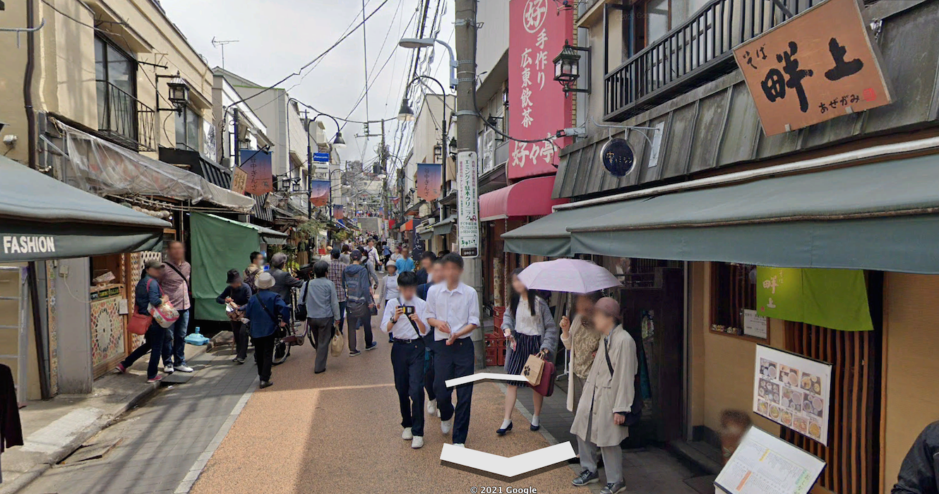
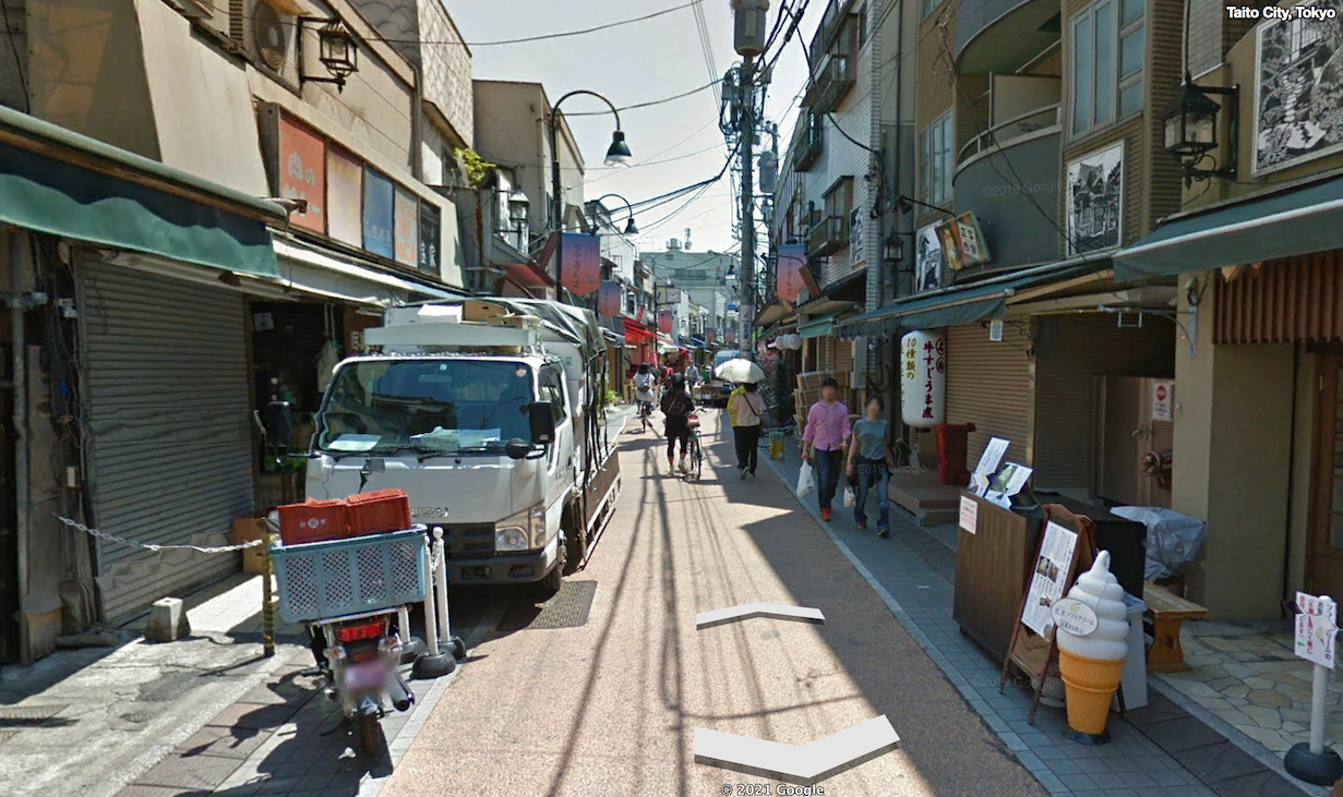
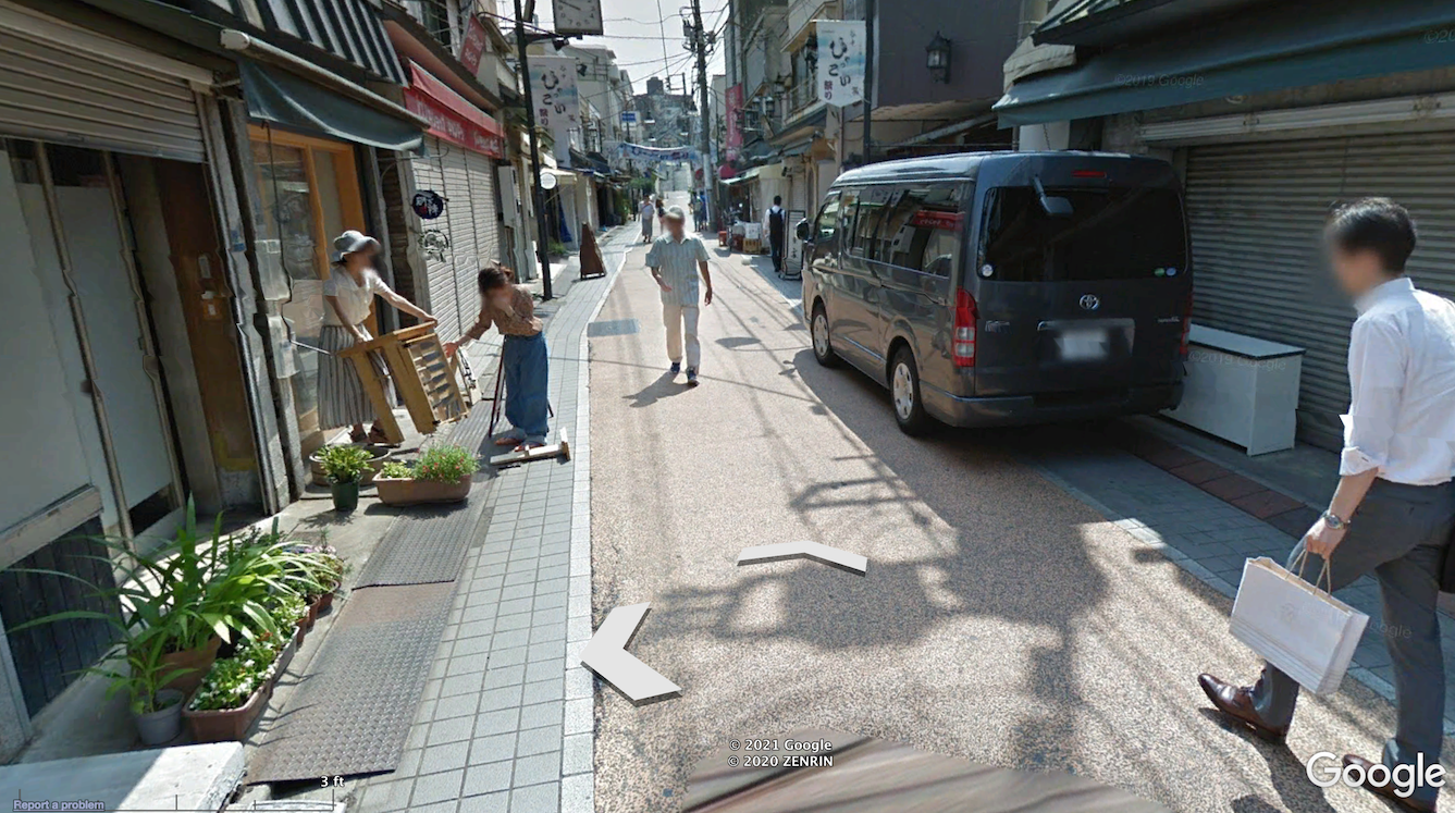
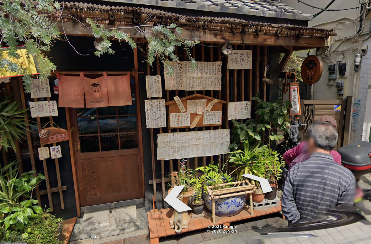
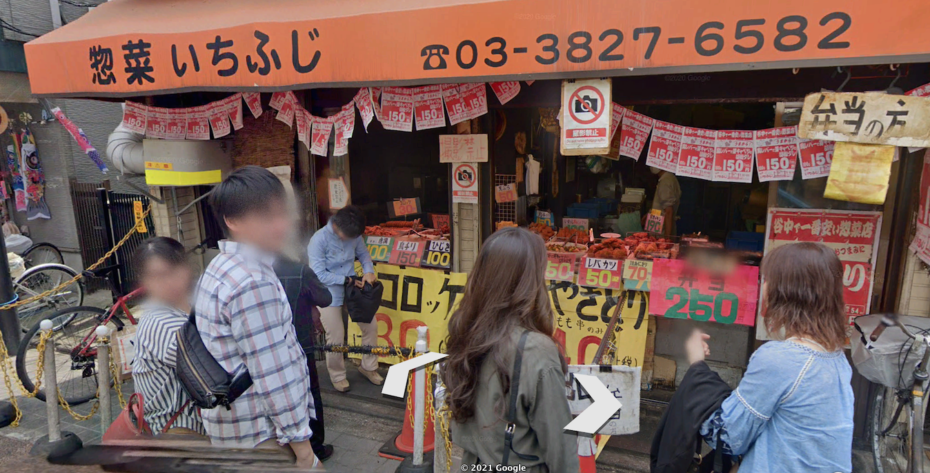
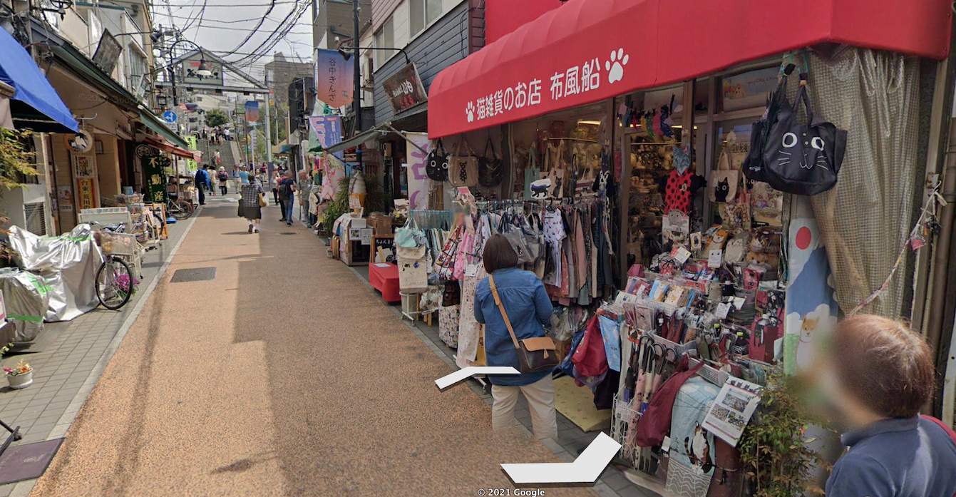
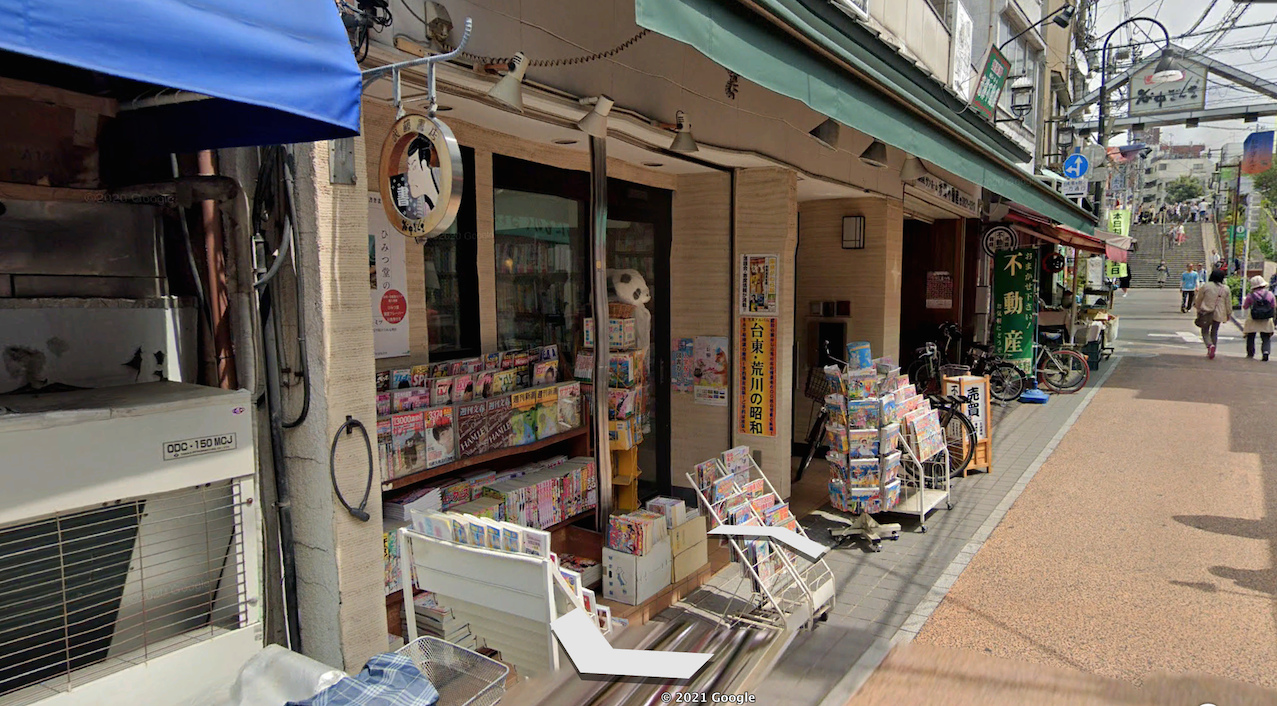
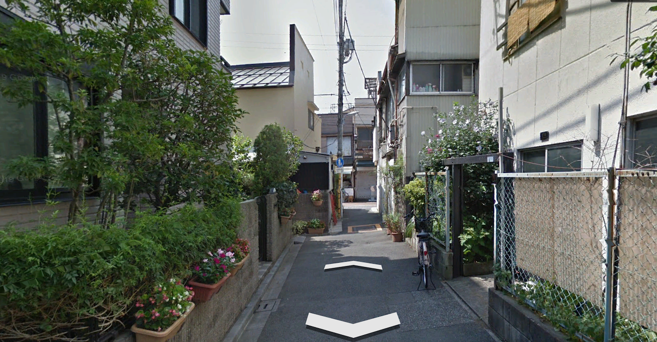
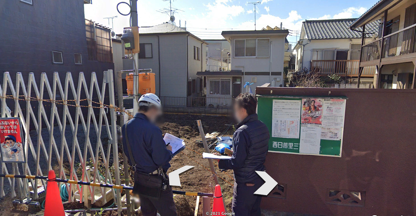
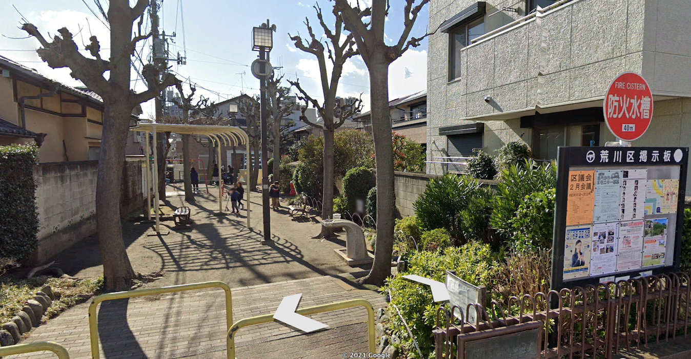
The shops here sell street food and confections but also basic groceries. You can buy a watch or a book or get a haircut. Most are very small and locally owned. A large staircase comprises the eastern end, from which it is a short walk to the train station. Turn down a side street, and you’re in residential quarters.
The area is extremely compact, enough to be fairly high density without being high-rise. Not a square foot is wasted. The streets are narrow and designed for all users to share the space, in the typical Tokyo style, and the residential patios and courtyards are small and purposeful, rather than big and empty. (The Japanese are maybe the world's masters of economy of space because they've had to be throughout their history, as a small island country with little flat or arable land.) I don't have access to data about property value, aggregate sales, or tax revenue in Yanaka, but the photos are enough to tell me that this place is off-the-charts productive.
Yanaka achieves that without being a major commuting-in destination. This is truly a village within a metropolis. You could go about a lot of your life within Yanaka. And when you want to leave it, the metro is a 5 minute walk from this scene in either direction.
The Yanaka Ginza is a great enough place to have become a tourist draw without having any interesting buildings. Check out the architecture in this place: focus above the street level at the second stories. These are bland, utilitarian boxes. They are what Gracen Johnson calls “background buildings”: they’re a minimalist stage set for the life that occurs within and in front of them. All visual interest here comes from colorful signage, awnings, and of course the storefront displays themselves.
And yet the ensemble is certainly interesting and, arguably, beautiful. It’s a kinetic sort of beauty rather than a static one; it’s the motion and the flow of the activity in the place that is beautiful, not the setting itself. It’s an organic beauty that relies very little if at all on formal order. It’s still a delightful place for being.
The Open-Air Market As Template
There are a few shopping streets in America that are like this in dimensions and feel, but they're much more likely to be full-scale tourist attractions that have little to offer the local (Something like LA's Olvera Street comes to mind).
But the kind of shopping experience you have in Yanaka is actually extremely familiar to Americans, just from a different context: that of a farmer's market.
Image via Wikimedia Commons
I haven’t seen a lot written about the urbanism of farmers’ markets, but you can view them as the basic template for every commercial street in history. The narrow passages between rows of stalls, wares on prominent display for window-shopping. The regular local clientele, mingled with some who come from farther away. In the history of civilization, many cities—maybe most—began as simple markets like this, or trading posts.
The popularity of farmers’ markets in the U.S., and the explosion in the number and quality of them in recent decades, isn’t just about growing interest in locally-grown or organic food, though I’m sure it is partially that. It’s also about the deep pleasure of wandering the passageways of a place that meets every criterion for excellent urbanism—top-notch human habitat. It’s fun, and a great third place to mingle or meet. And you can get practical shopping done while you’re there.
When you think of a street like the Yanaka Ginza as just a further evolution of the outdoor market, you start to see worlds of opportunity for placemaking in all of our communities.
Beautiful things are the icing on the cake. Function must come first.
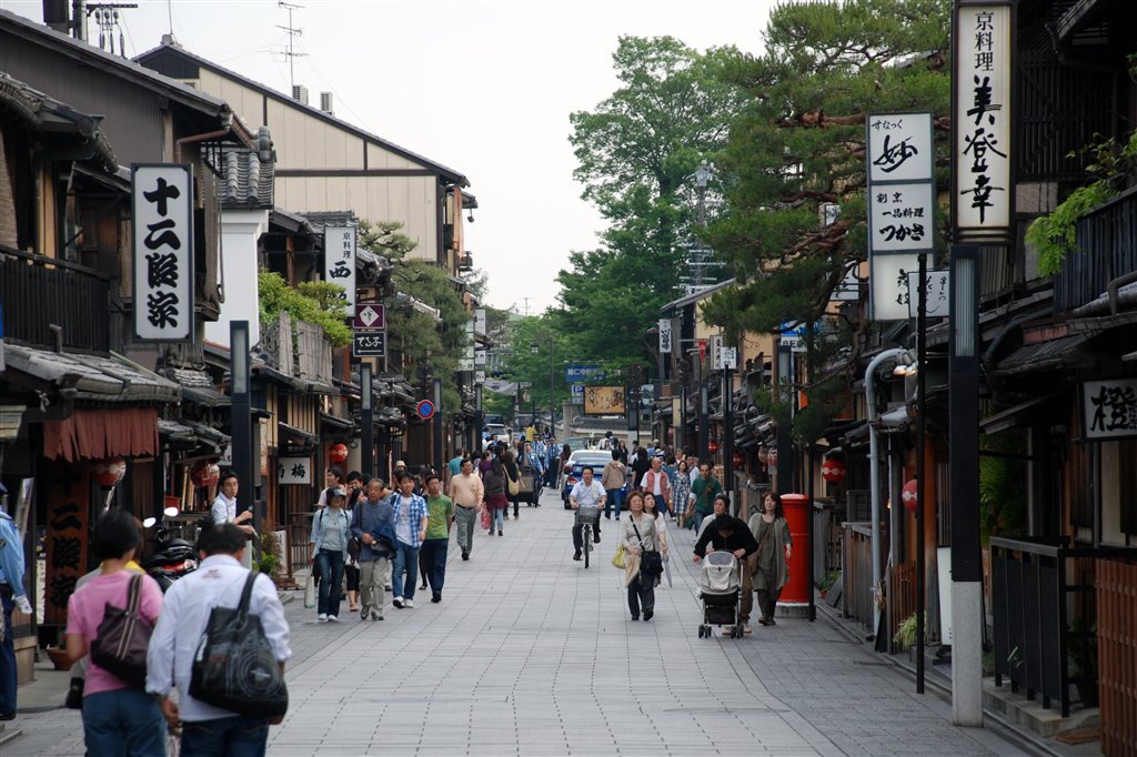
Of course, some truly sublime places do boast all of the human-scale vibrancy and also great architecture that produces a distinctive, unified aesthetic. There’s no reason we shouldn’t aspire to have both form and function. Here are some Japanese examples:
The question, to me, is one of order of operations. The thing to understand is how these places came about, and this is often misunderstood. They weren't designed out of whole cloth like what you see today, in the infinite wisdom of some more enlightened, rooted, or forward-thinking society than our own.
Rather, these spectacular settings are the result of a place that was so successful, for so long, that many generations of its inhabitants just kept improving upon it as well as repairing and maintaining what their forebears had built. This is what G.K. Chesterton meant when he said (and apologies, regular readers, for the sheer number of times I've dredged this quote up on Strong Towns, but it deserves the attention), "Men did not love Rome because she was beautiful. Rome was beautiful because men had loved her."
If you build a place that works and is resilient, time and care will do the rest. If you build a place that doesn't work, all the beauty in the world is just an empty shell.



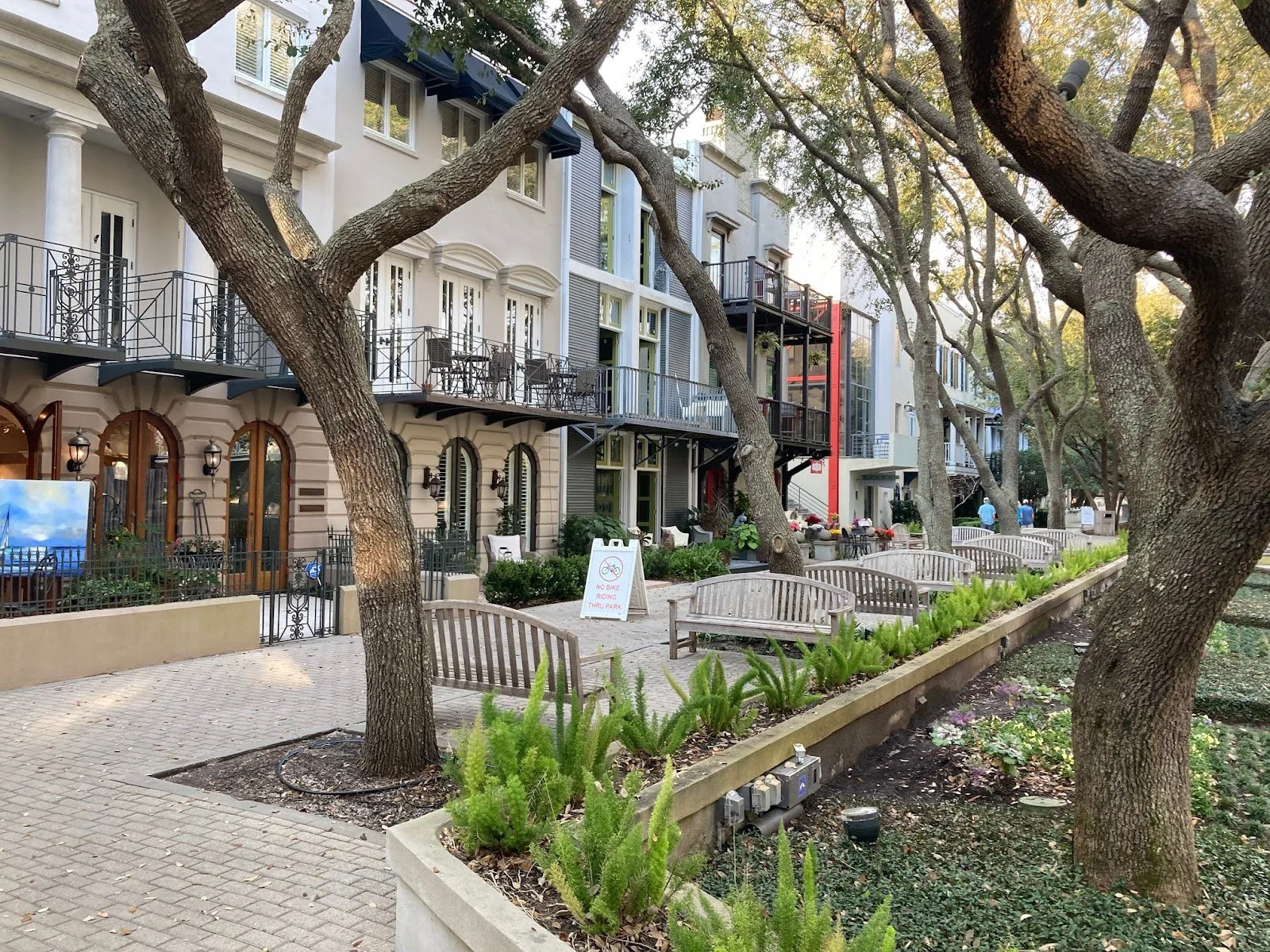

The pre-approved building plan model is beginning to take hold across the country as a streamlined alternative to achieve a community vision. Here’s how one community in Florida is doing its own take on the concept.