Delight per Acre
Old Town, Calp, Spain. Image via Unsplash.
Throughout the world, some of the most delightful urban spaces are also some of the smallest. It's a counterintuitive observation that we ought to give more thought to.
This is true of both private and public space. Think of the most charming, appealing backyards you've ever spent time in. Gardens. Patios. Courtyards. Alleyways or pedestrian streets.
Now think of the largest one of each of those things you've spent time in. Are you thinking of the same places? There's a good chance you're not.
The reason is simple and twofold. Part of it is simply that spaces scaled to our physical bodies are more comfortable, providing us a sense of enclosure and security. Wide open spaces without defining edges to hug can be alienating and disconcerting.
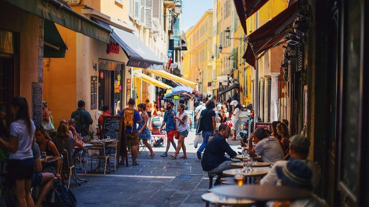
Nice, France. Image via photostockeditor.
The other reason has to do with our capacity for attention. When you're designing or arranging a small space which people will interact with intimately, you're more apt to fuss over every detail, every inch. When you're working with a large space, that same attention to detail becomes impossible to sustain. Inevitably, there will be nondescript expanses like a lawn, a solid wall, or a wide, straight corridor. The ensemble may be impressive and grand, but there will be individual sections that are essentially featureless.
A universal feature of the traditional development pattern across cultures is the often-brilliant use of very small spaces. Cozy patios for dining and drinking; gardens and courtyards bringing welcome light and air to a residence; the narrow passages of an open-air marketplace enticing you with sounds and smells; a staircase nestled between buildings of an old cliffside city like a secret passageway. You can find these things in large, cosmopolitan cities and in tiny, ancient towns. In both cases, the sense of intimacy is much the same.
The "bang for your buck" you get in terms of enjoyment of thoughtfully designed small spaces is really remarkable. A happy side effect is that they also provide us with unparalleled value in a more narrow, financial sense.
Aleppo, Syria. Image via Unsplash.
Delight Per Acre
In Strong Towns the book, Chuck Marohn describes encountering century-old planning texts in the library of the Harvard Graduate School of design that all used the same simple metric for analyzing local financial productivity: the value per acre of development. Value per acre analysis is a way of looking at developed land the way a farmer looks at yield. It incorporates the insight the farmer already knows but that city builders too often don't: land is precious and not to be squandered.
The calculation is a simple ratio, but the implications of using it are profound. Suddenly, the Walmart supercenter on the edge of town doesn't look like such a good deal for the community compared to a district of tightly packed, small shops, which individually are modest but collectively might produce several times more concentrated value in the same amount of space.
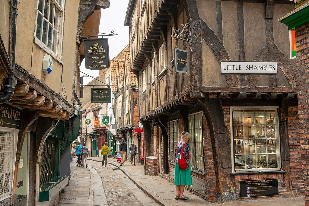
The Shambles, York, England. Image via WikiCommons.
But applied to the city and town environments where we live, financial value per acre can be a bit of a bloodless, detached way of looking at things. Most of us aspire to live in places that meet our needs, that make us feel safe, and that bring us pleasure. We don't live to "maximize the yield" of the city. Even fewer would consider that their greatest aspiration for their own neighborhood (and I'm not too sure I want to be neighbors with someone who does).
If you're motivated by the romance of cities, not by dollars and cents, you still want financial productivity to be a happy side effect of that. It's a necessary one, since anything we build requires resources to sustain, and anything that can't be affordably sustained ultimately won't be.
What you want are places that maximize delight per acre.
Image via Flickr.
What Urban Designers Can Learn From a Japanese Garden
There are some good rules to follow if you're looking to maximize "delight per acre"—and one of the best places to find them may just be the design principles behind Japanese gardens. Anyone who's visited one of these gardens knows what playful, delightful, and deceptively large-seeming small spaces they can be.
Japanese gardening follows a few traditional rules, for which you can find a lot of explainers online—here is a link to one. Among these are:
Image via WikiCommons.
Suzhou, China. Image via Unsplash.
Concealment, or a "hide and reveal" principle. Interesting landscape features are kept hidden from you until you round a corner. Concealment is the most important way to make small spaces feel larger, by compartmentalizing them. It also allows the gardener to make sure your first glimpse of a striking landmark is from an ideal vantage point. (What do Japanese gardens and medieval villages have in common? They were perfectly Instagrammable long before Instagram!)
Image via WikiCommons.
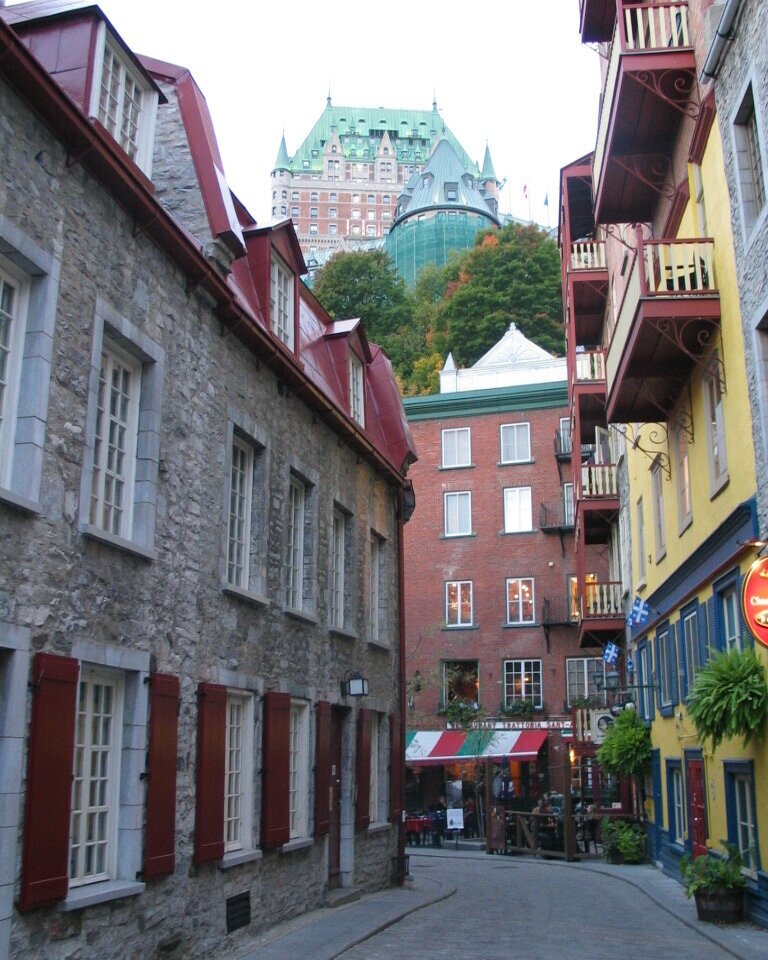
Quebec, Canada. Image via WikiCommons.
Borrowed scenery, or using foreground elements to frame views that are off in the distance. In a garden this might be a mountain peak on the horizon or a glimpse of a body of water. But there are countless urban analogues to be found, such as this stunning view of Quebec City's Chateau Frontenac from the streets of the Lower Town.
(Traditional urban design also relies heavily on the related idea of the terminating vista: a landmark such as an important civic or religious building situated at the end of a street, so that it dominates the view as one looks toward it.)
Image via Piqsels.
Hanoi, Vietnam. Image via WikiCommons.
Asymmetry, resulting in designs that are not overly formal, regular, or centered on a single visual focal point. There are always multiple things of interest to look at, and the gardener's goal is to balance these sights in a harmonious way. After all, when one focal point is everything, then by extension everything around it is nothing.
Miniaturization, in which landscape elements like individual boulders or shrubs stand in for much grander, larger features of the natural world. A small hill might evoke a mountain, or a bubbling creek a roaring river. In practice, this entails extreme attention to details like the placement of stones and shrubs. In urban design, you see this with the placement of features like lamps, flower beds, arches, and ornamental details around windows to create pleasant and evocative patterns.
All of these rules and more have their applications in designing civic spaces and private gathering places alike. The net effect is to produce a place with a near-constant sense of discovery and playful exploration, and a spectacular density of features of interest and beauty. Delight per acre.
You may have experienced this delight wandering the maze of streets of a historic town. But perhaps the most common place for contemporary North Americans to encounter such design is neither in city streets nor Japanese gardens, but a different kind of place entirely: a theme park. Nobody does delight per acre quite like Disney. And if you've both been to a Disney park and looked at that park on Google Maps or the like, you've likely been struck by how much bigger it feels when you're in it than the actual land it occupies. That's these principles at work.
Machu Picchu, Peru. Image via Unsplash.
Bigger Isn't Better
For most of human history, cities were remarkably small by today's standards. This does not mean they were never populous. Ancient Rome at its peak had a million inhabitants, but its land footprint was almost unfathomably modest compared to what we would expect of a city of a million (say, Jacksonville) today.
This wasn't because our ancestors culturally prized small spaces more than we do. It was, rather, for a pragmatic reason: because people walked. Everything you needed for life had to be accessible on foot in a reasonable amount of time.
With space at such a premium, it was almost never wasted. In fact, throughout history, wasting land has often been the primary way that the rich flaunt their wealth. Grassy lawns became a status symbol in Europe for this reason.
Design that maximizes delight per acre—resulting in towns rich in sensory detail, intrigue, and serendipity—is an adaptation to the reality of a world in which many people want to occupy the same small area of land. It makes such living arrangements not only tolerable but appealing. Cities prior to modern sanitation could be nasty places in some respects, but the efforts of their inhabitants to make them delightful anyway are still in evidence.
Mass car ownership has resulted in a radical experiment in abandoning these efforts. Cars completely blow up the relationship of urban scale to the size of our bodies and the range of our senses. We can now travel from interesting place to interesting place with little concern for all the uninteresting (as far as we need know or care) places we're zooming by.
Istanbul, Turkey. Image via Unsplash.
Of course, there are activities that genuinely benefit from more space, like sports. And mass car travel has been a boon to those activities: you can have your very own lawn big enough for a game of fetch with your dog or soccer with your kid, and all your neighbors can have that too, and you can still get to work in 30 minutes if the freeway isn't too congested. (Neighborhood parks were how prior generations enjoyed those activities, but modern suburban culture has moved more and more of life into private space.)
The price we've paid for this, though, is a steep one. Elbow room means energy expended traveling, the overwhelming majority of it still obtained by burning fossil fuels. Ample space means infrastructure, far more of it than we have the money to actually maintain, that begins falling apart the day it's finished.
We're overdue for a course correction. I don't mean to demonize wide open spaces or those who enjoy them. But I do mean to suggest that there is much to be gained, not lost, from a commitment to reduce our footprint on the land.
Grand Bazaar, Tehran, Iran. Image via Unsplash.
A "delight per acre" orientation is a way to think about getting more out of less and having fun doing it. It's a blueprint for what the cities of the future ought to be, based on what the cities of the past were (but with the added benefit of no longer getting cholera or typhoid!). It's relevant in urban settings but also in very small towns. It's rooted in the simple recognition that using more land often doesn't result in a place that actually makes us happier to be in, relative to using less land.
Internalizing the principle of delight per acre is how we make building deeply resilient and financially strong places into a joy, not a burden.


Will McCollum is the president and co-founder of Citymakers Collective, a nonprofit that teaches aspiring architects and planners how to design resilient, beautiful and prosperous places. (Transcript included.)