What's Actually Wrong With This Building?
An eyesore. A travesty. A middle finger to the community. A couple years ago, a high-end condo building that began construction across the street from the downtown public library in my city of Sarasota, Florida, had local Nextdoor and Facebook groups abuzz with this kind of incensed talk. Nothing unusual about that. It’s a very rare new condo or apartment building that doesn’t inspire this kind of rhetoric from politically active critics of development.
Why did they let this happen?! At least one candidate for local office even specifically mentioned this building in campaign communications and candidate forums. I recall this candidate saying something like, “Vote for me because I’ll stand up for the people against projects like 1335 2nd Street.”
I distinctly remember that this candidate did not spell out what was wrong with 1335 2nd Street. It was assumed to be self-evident to the audience.
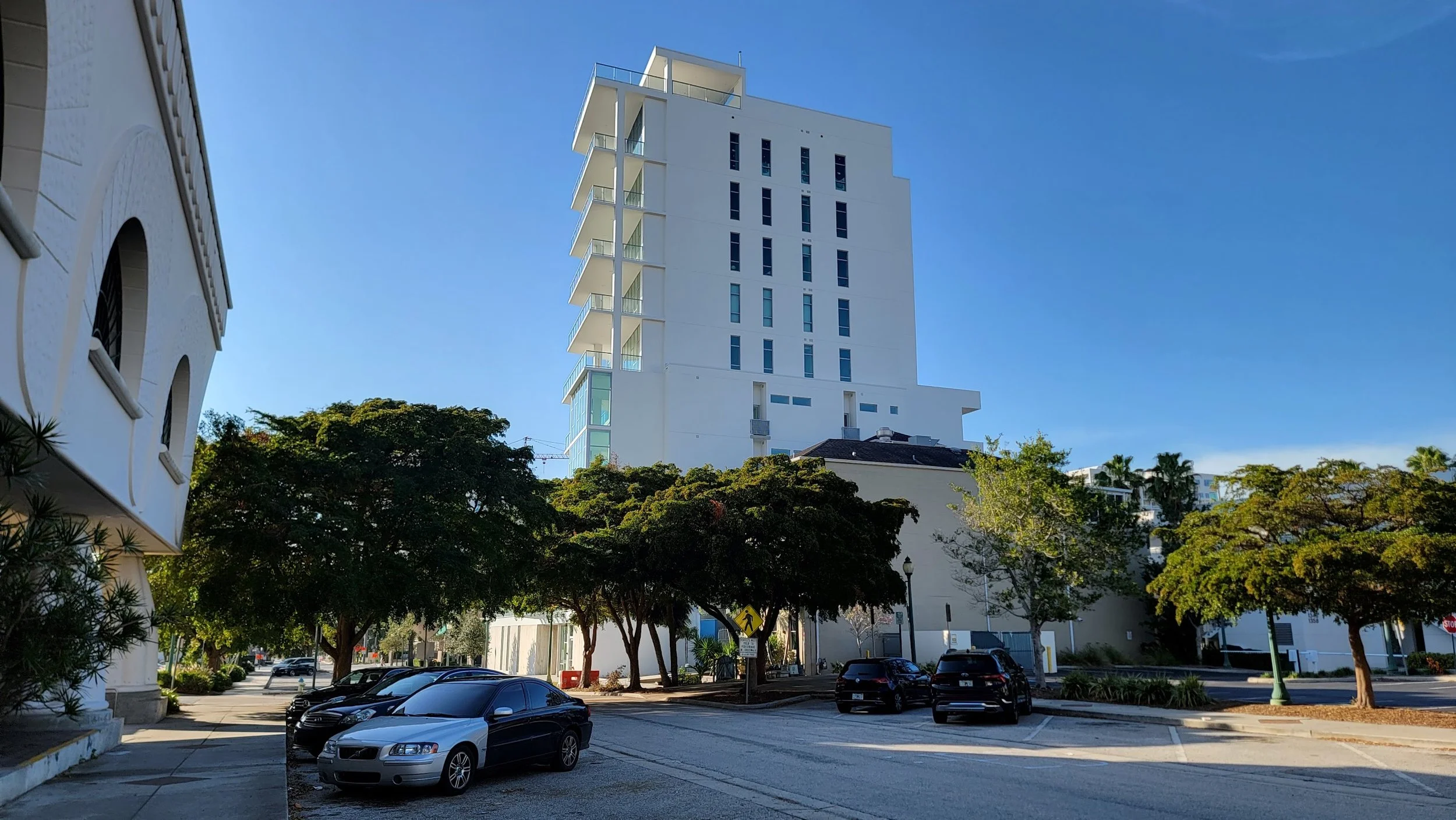
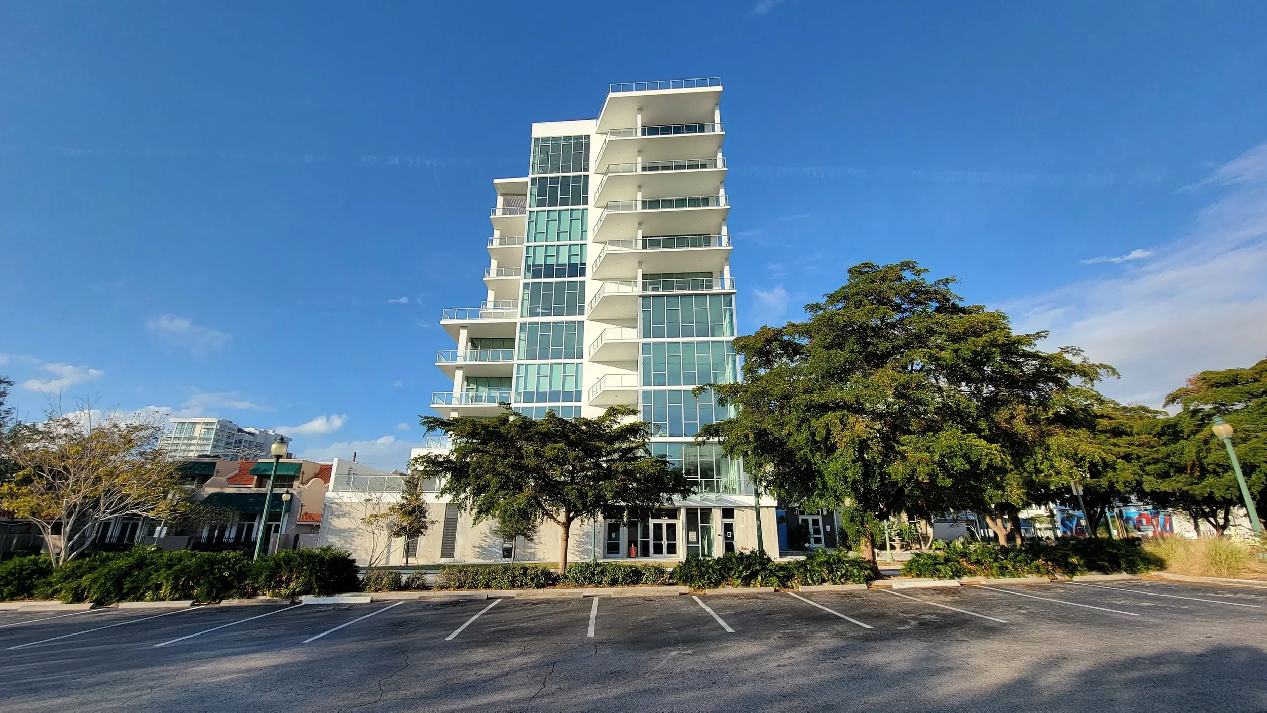
Here are a couple pictures I took of the now nearly-completed building. Is it self-evident to you?
1335 2nd Street, or “The Collection 1335,” is a 10-story condo tower featuring 12 for-sale units starting at $1.5 million. It’s all white concrete and glass, paint-by-numbers Florida modern. The only really unique feature here is that, unlike most such projects, this isn’t on a major corner or adjacent to any buildings of comparable scale. (Though there are dozens of buildings of this height and taller within a five to 10-minute walk.) It’s a mid-block redevelopment, surrounded by two-story townhouses and commercial buildings, and it replaced a small, Mediterranean bungalow-style commercial building.
The project didn’t require any big zoning change. The city didn’t make any unusual exceptions for it that might have justified the ire. Rather, the whole block is zoned to allow 10 stories—our standard Downtown Core zoning—even though nothing on this particular block had previously been redeveloped to that height.
(How) Does Size Matter?
All the negative conversation I heard seemed focused on the building’s height. A 10-story building next to two-story neighbors! What a middle finger!
This is befuddling to me, I confess. I think tall buildings next to small ones actually tend to look pretty cool, and I think this one is a fairly attractive example of its architectural style.
I’ve made this case before—that height disparities on an urban block aren’t objectionable, unless you also think these kind of landscapes are inherently ugly:
But look: I recognize that there is no accounting for aesthetic preferences, and I don’t have any basis to write this and insist that mine are better grounded. So if you don’t like looking at tall buildings, or tall buildings next to short ones, that’s your prerogative.
However, the argument for local zoning is that it exists to prevent harm. There should be a clear and compelling public interest in these regulations. They should make it so you can’t do something on your land that has a demonstrable, significant negative effect on those nearby. So let’s ask ourselves what material effect the height of this building has on its neighbors.
Will it block sunlight to the townhomes to its left? No. There are no windows on the side that would be affected. Will it block sunlight to the building to its right? No. Will it loom over the property across the street? No; directly across the street is a parking lot, and any shade it did cast (it won’t, because it sits to the north of that lot) would be welcome.
It’s frequently argued that we need to regulate building height not because of aesthetics or shadows, but as a proxy for density. Too much density, after all, strains public services and causes traffic congestion. I think these arguments are wrong on their face. In fact, the clustering of development often makes it easier to provide public services. For example, school transportation becomes simpler when schools are in walking distance of more students, police and fire response distances are also shortened, and public parks can serve more people.
(This is not to say that density of population cannot have downsides or cause harms, but the notion that the effect is some sort of one-way or linear relationship is incorrect.)
These arguments are also wrong inasmuch as they assume height is any sort of proxy for density. In fact, the 1335 2nd Street project will have 12 residential units on 0.25 acres, for a density of 48 units per acre. Meanwhile, this nearby low-rise cluster of apartments comprises eight units on 0.20 acres, for a very similar 40 units per acre:
Utterly different built form, virtually the same density. Density tells us remarkably little about the experience of living next to a building.
Density is in our zoning code, regardless. 50 units per acre in the Downtown Core zone.
So why do we regulate height at all? And why do people get so incensed about height? The clear and compelling public interest here is far from obvious.
My theory is that we talk so much about height because it’s an easy thing to talk about, for virtually everyone. You don’t need experience with urban design or a specialized vocabulary. Height is one of the most immediately obvious features of a building. And it’s representative of a whole set of more holistic ideas about the character of a place. To many of my neighbors who have lived here for decades, it’s clear to me that they have an attachment to a certain “quiet beach town” vision of what Sarasota is supposed to be, and tall buildings are an affront to that. Every tall building feels symbolic of the dramatic transformation that has occurred here. Now, our downtown is full of tall buildings and is the central business district for a metropolitan area of over 800,000 people—the 70th largest in the U.S. But relics of its past are still plentiful, such as the little Mediterranean-revival bungalow that was demolished to build The Collection 1335.
I have nothing against hashing out those conversations about the direction of change in the public sphere. Nor am I against public debate about whether the zoning code should be used to steer or restrain that direction. (Though my own opinion is that the zoning should allow for change over time, for abundant housing where people want to live, and for development that is financially productive enough to pay its own way.)
I’m still mad at the architect and the developer of 1335 2nd Street, though. The building has a clearly objectionable feature, to me, and despite a code that has some pretty careful language around these issues.
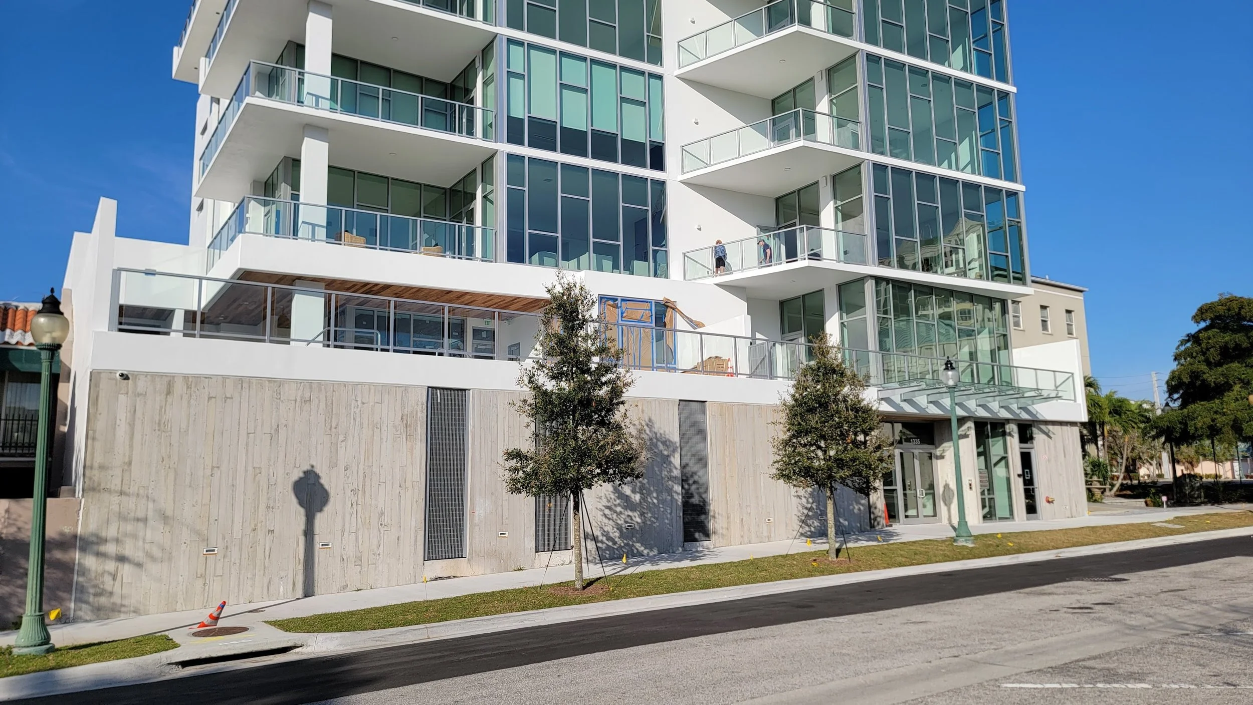
What am I talking about? This stupid parking garage:
It’s not the end of the world. At least the actual car entrance is from the back alley. You can walk the sidewalk in front of this building without crossing a driveway and risking getting hit. But it’s far from a high-quality pedestrian experience, because most of the frontage is just masked car storage space. If you copy-pasted this building up and down the street, you’d have a street that felt like a loading dock.
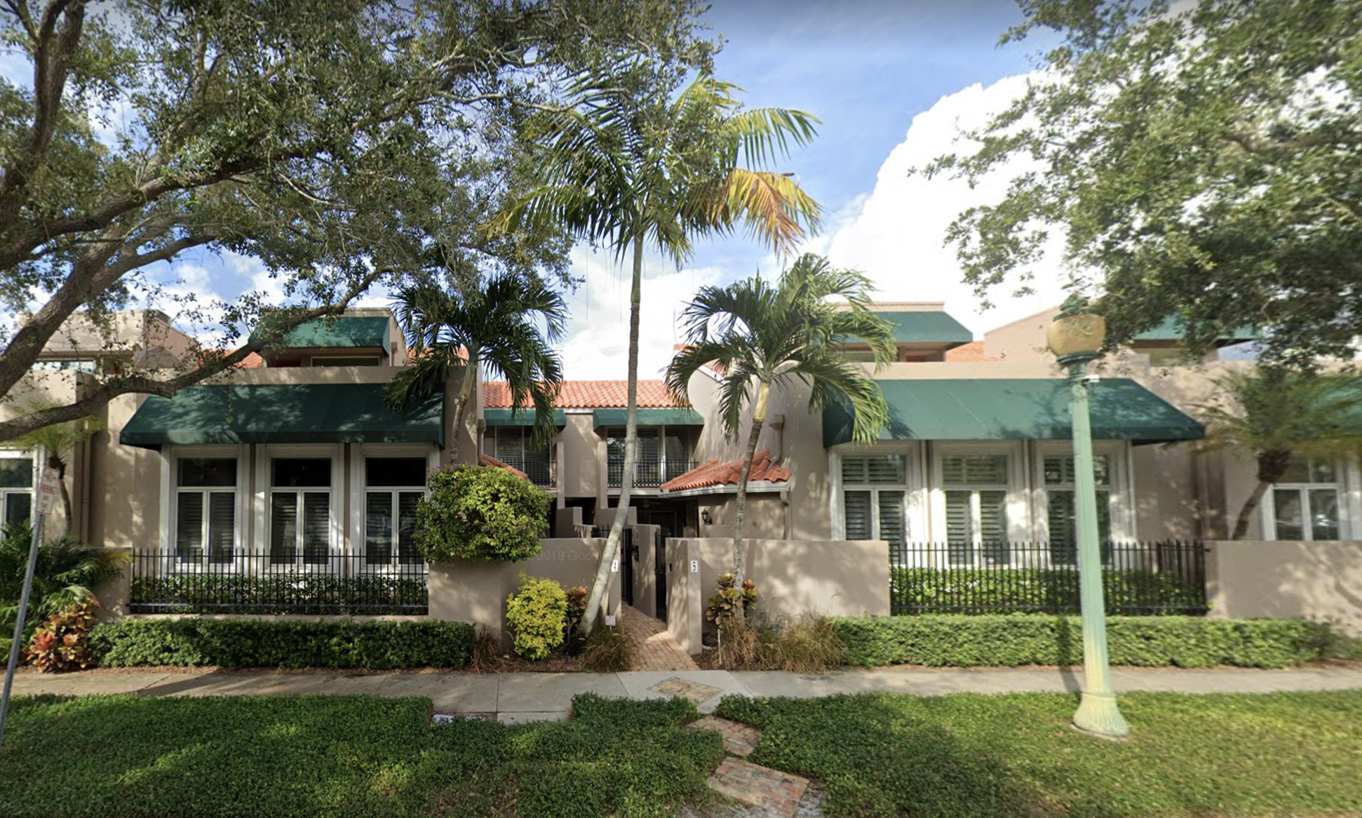
Compare to the townhomes next door, which engage the sidewalk in a friendly, classic way:
(Source: Google.)
This is the kind of design decision that, when replicated over and over, defines the character of a street. Whether it’s an inviting destination, a place to linger and admire, or a place to drive through. And that, in turn, has cascading effects for decades on the financial productivity and the enduring value of a place, even as individual buildings are redeveloped and replaced.
It’s the kind of thing that a good, detailed, constructive conversation about the plans at the time a project is proposed would actually improve. And it's the kind that too rarely happens because we're too busy shouting about height and density.





Public art can do more than add personality and beauty to a space — it can change the way people behave, bring the community together and avoid the resistance other changes to city policy face. It’s time to stop overlooking this powerful and accessible tool and start making our towns stronger, one bucket of paint at a time.