Sign of the Times
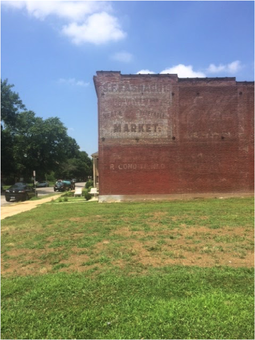
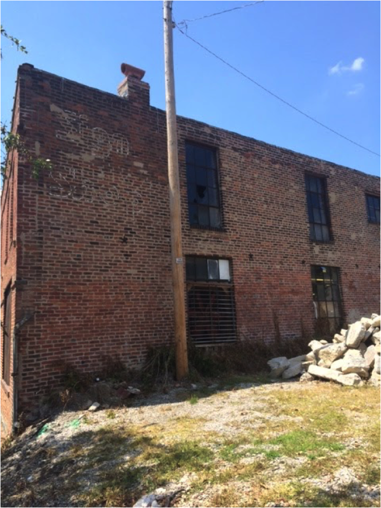
Ever since I moved to St. Louis, I’ve been collecting ghosts. Someone told me that’s what you call those generation-old signs painted on the sides of brick buildings all over town, faded by weather and rendered incorrect by time—a visible archeology of what this city used to be. I make a note to myself whenever I pass one on a walk.
My current favorite is from Panda Paints, a few blocks from my house and still an eye-grabbing yellow under years of brutal wear. The building it belongs to has been vacant for years, but I heard a local community development corporation is in the process of converting it into a coworking space for small-scale manufacturers and craftsmen. I’m hoping the ghost sign will stay.
We spend a lot of time in urbanist circles talking about the way we build our cities: over-wide stroads that don’t match the needs of the residents who might bike along them, whole blocks of ground-level parking garages that transform a scenic downtown walk into an eerie trip down a silent tunnel of concrete.
But we don’t talk as often about the way we paint our cities. We don’t always talk about the way that the slow disappearance of architectural details—a carefully chosen gate, a unique porch column, a lamp post—can act as a marker of how our values are changing as a community. We don’t talk about how, as our cities grow and grow and go further and further into debt to do it, they also tend to lose their color, their dimension, their dazzle.
I don’t blame you if you don’t think about these things much. Not every urbanist is into the visual aspects of architecture, much less its intersections with straight-up graphic design. You certainly don’t need to care about how beautiful your place is to read a city budget proposal and realize that things have gone terribly wrong, and it will have visible effects on your city’s future. The things we tend to build and subsidize in American cities—parking lots and spaghetti tangles of highway overpasses and massive, concrete-faced medical facilities in the middle of town—we know that these things are making us broke. We also know, just by looking, that generally speaking, they’re making us uglier.
Are these two things a coincidence? If we took just one visual piece of the archetypal city—a storefront sign—and tracked how it changed across time, what would that tell us about ourselves?
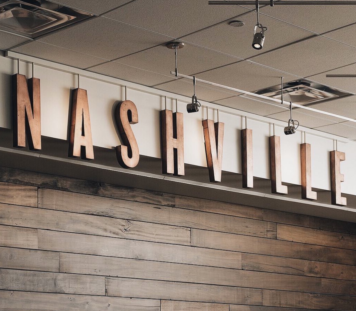
A few weeks ago, I had the opportunity to interview an artisan signmaker in Nashville for Alive Magazine, which profiles people who make extraordinary things in the middle of America. Luke Stockdale started his company, Sideshow Sign Co., as a recent expat from Australia who came to Tennessee and to his new career after years as a graphic designer and a sometimes-birthday party clown in his home country. (The latter was an extension of the family business; his parents owned a magic shop.) But those two passions came together in Stockdale’s fascination with the aesthetics of vaudeville: old-timey circus lights and frantic colors, all the old huckster visual tricks meant to lure passersby into a big top. He became interested in large-scale typography more generally—he cited Broadway in the 1930s as a particular inspiration—and then realized, finally, his love of seductive signage of all kinds.
He made friends with a few restauranteurs in Nashville who wanted something bold to signal their brands. His sister in law had a spare garage she didn’t mind lending. Stockdale got to work.
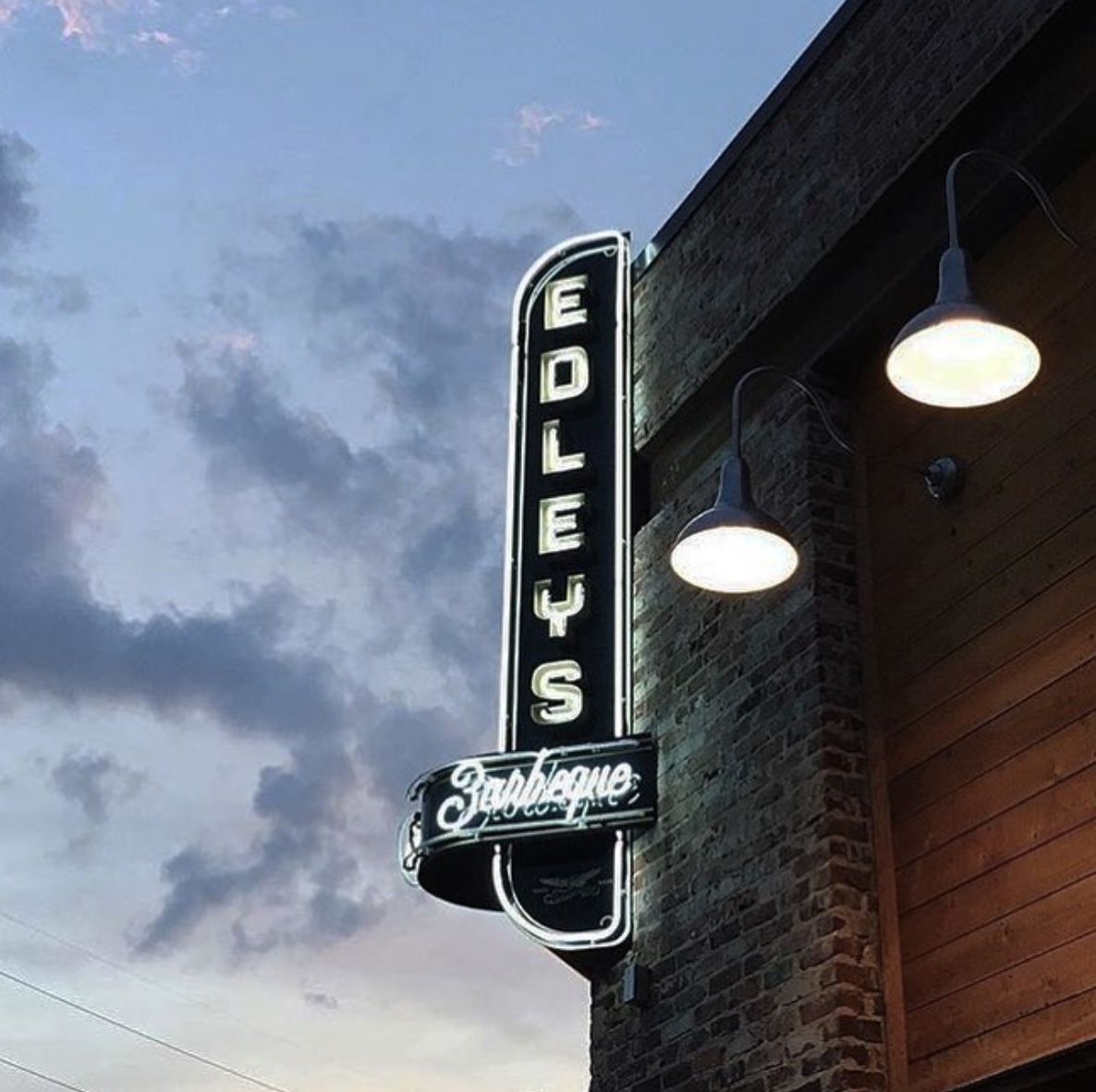
Eight years later, Sideshow signs are hung outside dozens of coffee shops and clothing stores and luxury apartment buildings all over Nashville. They’ve branched into interior signage, too—think sinuous neons that beckon you into a side-street bar—as well as broader brand consultancy work. Stockdale and his team’s work is all over the country now; go to their Instagram account, and you can see Jake Gyllenhaal and Ice Cube mugging in front of a lighted sign they did for the ESPN offices.
Still, Stockdale doesn’t seem entirely happy with his success. His ambition had morphed from a purely aesthetic one—to put beautiful typography and thoughtful materials out into the world, writ large—into something slightly more complex: to break through, as he puts it, our culture’s “scary level of comfort with making crappy stuff.”
Photo via Urban3
A lot of this didn’t make the final cut of my Alive interview. But as Stockdale and I spoke, our conversation meandered away from the design specs of a waterproof LED boxes and towards the economics of placemaking itself. He told me about how the signing industry had slid from those gorgeous, story-high wooden letterforms along prohibition-era Broadway to what we have now: Cheap vinyl. Changeable letter boards with sliding plastic alphabets in one standard-issue, all-caps font. Electronic billboards you can rent by the day and read from behind the wheel of an SUV doing 80.
“It’s just money,” Stockdale told me. “It’s like everything. You can’t blame the sign industry for compromising quality for speed and cost effectiveness.”
We spend a lot of time at Strong Towns talking about why we’re so addicted to growth in this country, even if we know, deep down, that future generations won’t be able to afford to maintain the things we’ve built—that even we can’t maintain the things our grandparents’ generation built today. Temporal discounting is that powerful; it can physically change an entire civilization’s relationship to how they’re willing to travel, where they’re willing to live, and how they conduct their daily lives.
But think, too, about how profoundly different the word looks now that we’ve moved away from more incremental forms of development. In order to get to where we are now—debt burdened and in vast denial, telling ourselves we’re growing when the only things we build are massive liabilities—we also had to inure an entire country to the cheap, fast, ugly design that goes hand in hand with all that growth. Towering RENT THIS SPACE billboards, fast-food logos stuck on top of poles, white block letters on identical green awnings. We had to collectively lose our appetite for beautiful handmade things, after generations of literally only laying eyes on things made by the hands of other human beings. That’s a colossal feat.
I don’t think artisan sign makers can save our cities. I’m under no illusions that a fantastic neon logo is an indicator of anything more than a business owner with some money to burn who thinks that good exterior branding might help them bring a few more customers through the door.
But pay attention to the signs in your neighborhood. It doesn’t have to be signage itself; pick something visual and specific, and watch what happens to it over time. Maybe research back to how that thing looked a few decades ago, before the street was widened or the zoning code shifted, before it became clear that more money could be made or cars could move faster or we could grow more (whatever that meant at the time) if we did things another quicker, cheaper, shoddier way.
You might not be able to see the ghosts of what your city used to be as easily as I can when I walk through St. Louis, snapping bad, sun-bleached pictures of century-old building sides. But they’re lurking if you look—and if we want, we might be able to bring them back to life.
Share your ghost signs on Twitter with the hashtag #ghostsign to help preserve and share a piece of history from your town. (Don't forget to tweet @StrongTowns when you share it too!)
(All photos by Kea Wilson unless otherwise noted. Top photo source: Wikimedia)



We talk with author Jake Berman about the history of rail networks in America’s cities and why our transit systems are the way that they are in the current era.