The "Diverging Diamond": Greenwashing Auto Infrastructure
Joe Cortright (Twitter: @CityObs) is a longtime Strong Towns contributor who runs the think tank City Observatory. This post first appeared on the City Observatory website, where you can find other articles, original research, and data-driven analysis of cities and the policies that shape them.
The intersection of Highways 9 and 27 in Natick, Massachusetts, just east of Boston, is no urban wonderland. It’s a classic American highway strip, with a line of car dealers (Dodge, Jeep, Volvo, and others), the 9/27 Plaza has a Stop & Shop grocery store, but predictably turns its back on the intersection, and the roadways are ringed with acres of surface parking lots.
MassDOT, the state transportation agency is proposing the revamp the intersection, and one of their proposed designs is a “diverging diamond” interchange, that flips traffic to run on the left-hand side of two-way roadways, and creates an intricate weave of ramps that enables most vehicles to proceed through the intersection in almost any direction without stopping. A description of the project presented to the region’s metropolitan planning organization described the project in glowing “multimodal” terms:
The modified interchange will include dedicated off-street facilities for pedestrians and cyclists, including a separate bike-ped bridge over Route 9 in between two spans that will support vehicular traffic. The enhanced shared-use facilities will improve connections to Natick Center and the nearby Cochituate Rail Trail.
Here’s the illustration of the diverging diamond proposed by MassDOT. As you can see, its an intricate basket-weave of ramps, roadways and intersections.
To look at the illustration, you might get the impression that this is a kind of bucolic rural park, riven with pleasant walkways and filled with ambling pedestrians. There’s even a proposed separate pedestrian bridge running East-West across Route 27. Indeed, if you look closely at the rendering, it shows dozens and dozens of dots (presumably people walking) on pedestrian paths, sidewalks and crosswalks in and adjacent to the intersection. If you count all the dots—and we did—the artist is conveying the impression that at any one time there are more than 110 people walking around or through this intersection.
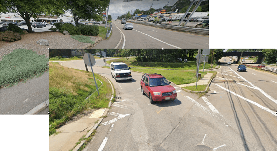
That is an absurdly large number. A quick perusal of Google Street View images shows no pedestrians on the current sidewalks and crosswalks in the area, and there’s precious little reason to believe many people are walking from the U-Haul or the Midas muffler shop in the southeast corner of the intersection to the Valvoline Instant Oil Change shop or the Austins liquor store in the northeast corner.
Current conditions at the intersection of Routes 9 & 27 in Natick (Google Streetview)
In truth, this is a profoundly pedestrian-hostile design. The diverging diamond interchange flips the direction of traffic, so that cars are running on the left hand side of the roadway, creating deadly confusion for pedestrians used to seeing traffic on the right. The basket-weave of ramps creates more conflicts for pedestrians, to cross from one side of Route 27 to the other (even with the separate pedestrian overpass) requires people walking to negotiate at least six crosswalks. Between a lack of destinations, an environment swarming with cars going in every direction, and a lack of amenities, it’s hard to imagine anyone walking here.
While the project rendering creates the impression that the area will be chock-a-block with pedestrians, the rendering makes cars virtually disappear. The illustration shows that once the project is built, Routes 9 and 27 will be only lightly trafficked (one wonders why MassDOT is planning to spend anything on an intersection that’s so under-used). We counted the number of cars, too–each red dot represents a vehicle. The illustration shows just 70 vehicles on routes 9 and 27, and on the myriad weaving ramps and connectors.
Red dots are vehicles, numerals are numbers of “pedestrian” dots in each block
If it’s really the case that about 50% more people are walking through this area at any given time than are driving, then maybe MassDOT should consider an entirely different design, one that prioritizes pedestrians.
But we know that all of the fictitious dot-people are just there to green-wash—or perhaps pedestrian-wash—what is in reality an entirely automobile-oriented project. The illustration is a classic example of the kind of deception practiced by highway departments around the country, generating distorted and misleading renderings to create the illusion that they’re designing “pedestrian-friendly” infrastructure.
As we’ve discussed before, many of these projects are performative, or are simply automobile infrastructure masquerading as pedestrian infrastructure. Building remedial protections for pedestrians in hostile, vehicle dominated environments, with few or no walkable destinations doesn’t create walkable communities.
And diverging diamond intersections like this one are among the most inimical to pedestrians. They’re designed with the purpose of speeding traffic and reducing or eliminating the number of times a driver must stop or yield at an intersection. By creating the expectation that one can go faster, and stop or yield less, the intersections inherently make things more dangerous for pedestrians and for cyclists.
Chuck Marohn took a close look at arguments that the diverging diamond creates a pedestrian-friendly setting. In his view, that’s a claim that would only fool a highway engineer. He’s got a video walk-through of a diverging diamond in Missouri that shows how hostile these intersections are to foot-traffic. His conclusion: the diverging diamond is an “apostasy when it comes to pedestrians and pedestrian traffic.” His judgment is echoed by Schroeder’s study of diverging diamonds reports that vehicles accelerating to freeway speeds are unlikely to yield:


People tend, understandably, to think they’ll be safer in an SUV—but what happens to our cities if everyone is driving a bigger vehicle?