A 3-D Approach to Public Investment
On a cold January afternoon, I drove my car from Austin to the outskirts of San Antonio, not to see the famous Riverwalk or the Alamo, but to see a crosswalk.
Literally, a crosswalk.
But not just any run-of-the-mill zebra crossing (fun fact, this is actually what regular crosswalks are called)… I drove to see the illusion created from a 3-D crosswalk.
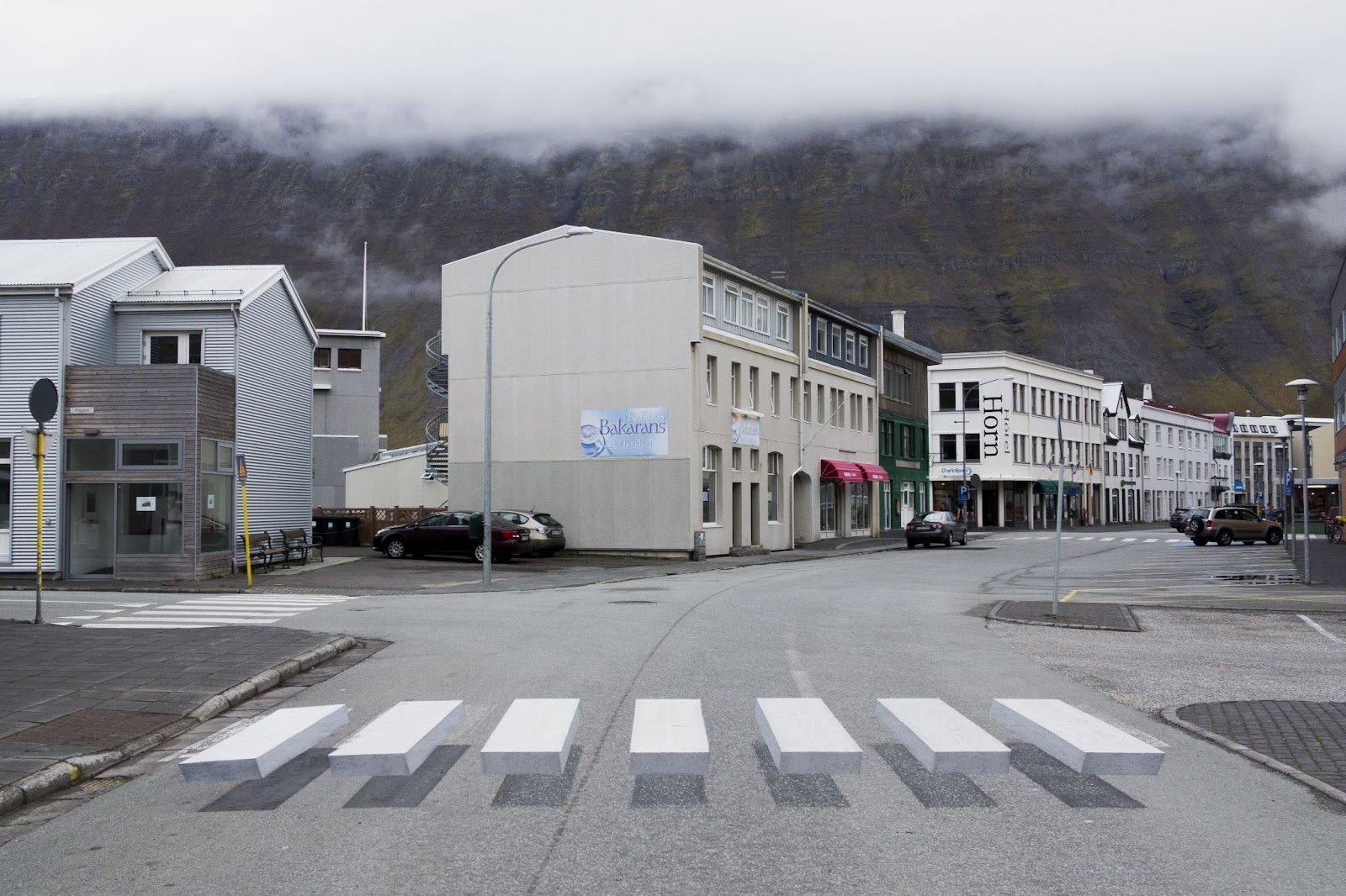
3-D crosswalks are relatively new experiments, being tried all around the world—from India, to Iceland, to Iran. They are created by painting extra shadows around the white stripes of regular crosswalks to make them appear, when viewed by oncoming traffic, as if blocks are hovering above the road.
Picture it like a white block bridge you have to hop across in a video game.
A 3-D crosswalk in Isafjordur, Iceland.
The idea is that drivers will pay more attention to 3-D crosswalks, thereby improving pedestrian safety.
I was eager to see this illusion first-hand. What would it look like from a driver’s point of view? According to a January 2020 KSAT 12 News report by Patty Santos and Joe Arredondo, the crosswalk in Windcrest (outside of San Antonio) was the first of its kind in Texas. “Now that is my favorite thing,” one boy said, glowing in the report’s accompanying video.
This crosswalk—which the community paid a little extra for to cover the cost of an artist and the additional paint—also fits with Strong Town’s four-step approach to public investment:
Humbly observe where people in the community struggle
Ask the question: What is the next smallest thing we can do right now to address that struggle?
Do that thing. Do it right now.
Repeat.
In a country where both Democrat and Republican presidents and congressional leaders talk about trillion-dollar infrastructure bills, it’s sometimes easy to forget that communities can take small, inexpensive action at the local level. But small actions, compounded over time, can transform communities.
This is not to say the ideas always work. Roughly two years after the initial KSAT 12 report, and after 20 minutes of exploring and repeatedly overlooking this area, I discovered the next part of the story for the Windcrest crosswalk. It now looks like this:
Windcrest, TX.
Even if you brought a set of red and blue glasses, you’re not making this one look 3D. A little bit of a dive into the Federal Highway Administration’s Manual on Uniform Traffic Control Devices (MUTCD) may help explain why.
"[3-D crosswalks do not] comply with the MUTCD. As a result of demonstrated safety concerns, the FHWA is no longer considering field experimentation with ‘3-D’ crosswalk designs.”
The statement goes on to explain, “The FHWA had previously approved field experimentation with ‘3-D’ markings until one such experiment showed unintended—and potentially dangerous—effects. A significant percentage of drivers swerved upon seeing the markings, perhaps perceiving them to be real raised objects on the roadway. While this type of driver reaction did decrease over time, the experiment showed that at least more than one in ten drivers might make an evasive or erratic maneuver upon experiencing this or similar installations for the first time."
Figuring out how to keep pedestrians safe in complex, auto-centric environments can be challenging. Urban planning does not have a one-size-fits-all solution, because urban landscapes are not uniform. For example, consider all the different circumstances in which one may place a crosswalk. One could be placed in a school zone, or on a faster city road. In an intersection where cars are turning left and right, or on a straightaway. In an area of high visibility, or in an area where line of sight is restricted. Different circumstances naturally should have different, tailored solutions.
Perhaps, in some contexts, 3-D crosswalks are a good idea and can be implemented in a way that increases pedestrian and driver safety—or perhaps not. While I love the crazy appearances of 3-D crosswalks, there are other mitigation techniques—including other artsy techniques that are being explored.
Austin, TX.
Austin, TX.
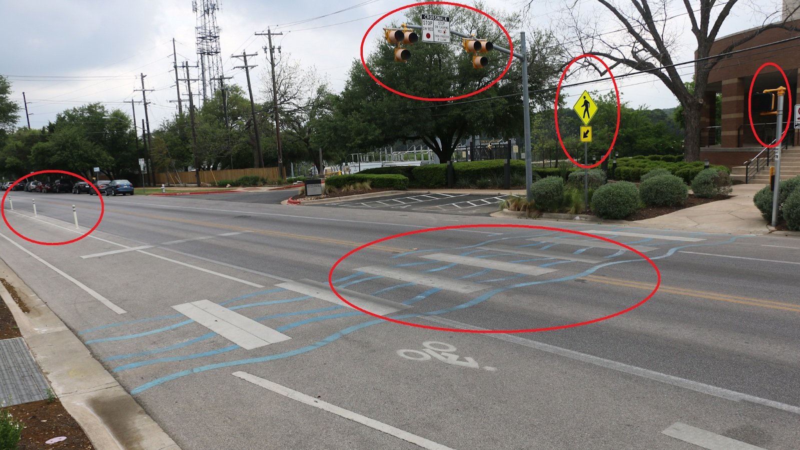
This road in Austin, for example, uses multiple methods to mitigate risk.
Narrow Road: While this street is wide, motor vehicle traffic is only two lanes. The remaining space is used as bike lanes (added visual separation from automobiles with vinyl poles) and on-street parking. The road design not only may lead drivers to naturally drive a little slower, but also leads to shorter automobile-lane crossing times for pedestrians.
Street Light: A red light is used when pedestrians are crossing this road. Similar techniques are used in other circumstances—for example, you’ve probably somewhere seen flashing lights that tell you what your vehicle speed is. You may have also seen flashing yellow lights—dryly, but appropriately called Rectangular Rapid Flashing Beacons (RRFB).
Pedestrian Sign and Walk Sign: Added signals for both drivers and pedestrians.
Crosswalk Art: Like the Windcrest crosswalk, this crossing may draw people’s attention. Perhaps this artsy crossing could even encourage some pedestrians to cross at the designated location. (Even when crosswalks are appropriate solutions, this assumes pedestrians will cross at designated crossing which we all know is not always the case.)
So what did actually happen to the 3-D Windcrest crosswalk? After reaching out to the City of Windcrest, I received a polite, helpful explanation. The Windcrest 3-D crosswalk disappeared during a road resurfacing, and it was not reinstated due to Texas Department of Transportation regulations.
To me, while it was disappointing not to see the 3-D illusion when it still existed in Windcrest, the most interesting part of this story is not the crosswalks themselves; it’s communities taking creative action in a quest to increase community safety and well being.
In order to make effective change, let’s think beyond only giant gestures as ways to improve our roads and communities. A few days spending hours at the gym will certainly get someone sore, but 20 minutes a day done consistently will make them healthier over time. Similarly, large investments in infrastructure have a purpose, but cannot replace the day-in day-out work communities can do on a community scale.
The more we can address the individual needs of our diverse, dynamic communities, the stronger and more resilient we will become.
Cameron Gallant is a travel enthusiast, songwriter, and the founder of Blobfish Books. He is fascinated by urban design and its influence on lifestyle. Cameron enjoys spontaneously exploring and learning from cities such as Kuala Lumpur, Shenzhen, and Stavanger, often on his trusty Rollerblades. He is also interested in walkable urbanism, city rail, and how maps can obfuscate as much as they can illuminate (e.g., map projections, intentional and unintentional design choices). Cameron lives in Austin, Texas, where he creates and where he volunteers with Future Problem Solving Program International.


