It Ain't Easy Being Seen
Reston, Virginia, where my wife and I live, is famous for its roughly 50-mile network of walking trails. It’s possible to actually run errands by walking along these trails, but they’re mostly for recreation. The trails run through forested areas between housing developments, so that while you’re rarely very far from developed areas, you feel like you’re in the wilderness. It’s a good example of the importance of design. A sidewalk or a path does not make a place “walkable.” A comfortable and safe walking experience does.
However, at times these trails cross local roads. A handful of highway crossings use tunnels or bridges, but smaller roads simply have surface crossings. People on foot do have a lot of visible road to determine a safe crossing point, but there are no stop signs for motorists, and some of the crossings even lack crosswalks.
A lot of “pedestrian safety” rhetoric focuses on the responsibility of pedestrians to “be seen”: wear bright colors or reflectors, or even grab a flag and wave it around while crossing. (The first time I saw this, I assumed it was a parody of bad approaches to safety, but alas, it is for real.)
As users of the road, people who are walking should, of course, observe some basic crossing etiquette. They obviously have some responsibility for avoiding a collision. But more of that responsibility should fall on motorists, who are moving much faster and can inflict far more damage if they make a mistake. Beyond this, however, focusing on design itself is a way to move beyond assigning blame or identifying fault with road users. Too often, we all inhabit substandard spaces. We might not all bear the same responsibility, but we are in this together.
To illustrate this, I’d like to show you some photos I took of two crossings I frequently use, both while walking across the trails and while driving along the roads (note that I didn’t take the latter photos while sitting in the driver’s seat!). I’m very familiar with navigating these crossings on foot and in a car.
Here’s the first crossing. The first picture here is my point of view on foot, about to cross.
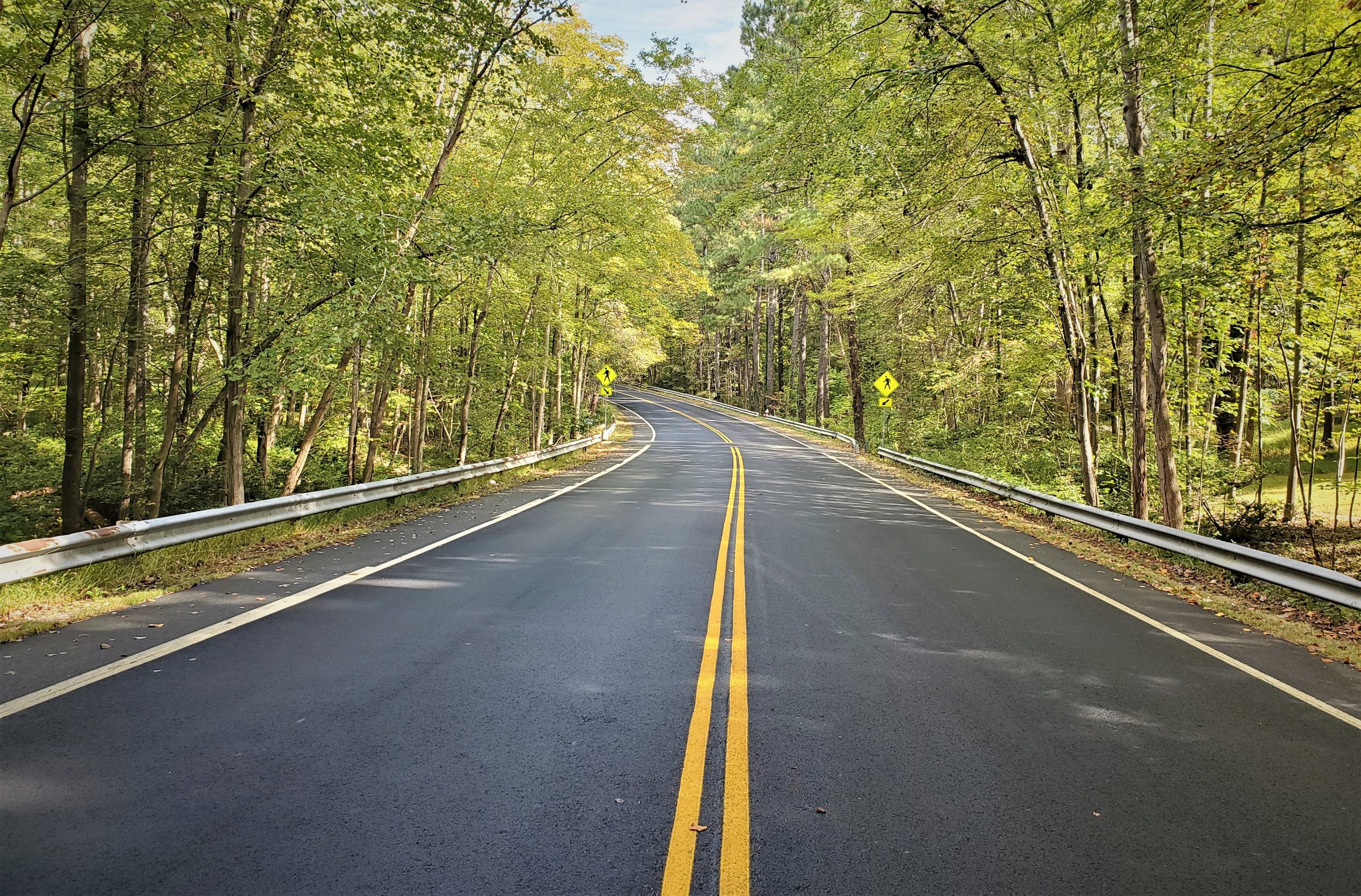
Now here is my view of this crossing in a car, bearing down at 30 or 40 miles per hour.
From behind the wheel, your focus is either on the horizon, or on the driveway just ahead and to the left of the crosswalk, where a car might be looking to turn into the road. The crossing, even with the crosswalk and the pedestrian sign, is almost invisible.
Here’s the second crossing, which is even dodgier. This is my perspective on foot:
And this is my perspective in a car:
It’s striking to me just how different the crossings look from these different perspectives. On foot, the crossing itself occupies your whole field of vision. In the second crossing, the wooden stairs intensify the sense that the crossing is a central piece of infrastructure.
But in a car, it takes effort and familiarity to even notice it. As a person on foot, you might think that you, and the crossing, are visible to a motorist simply because you feel visible. But you’re not. Those pedestrian-crossing signs, towering over you on foot, look tiny through a windshield. I’m not sure I’ve ever even noticed them while driving.
In fact, even with my deep familiarity with this landscape, I sometimes breeze right past these very crossings while driving around Reston, before realizing that I’ve done so. I’ve found myself noting, “Oh, that’s where I always walk!” This indicates, probably, that I’m going too fast. But the fast roads and the perfunctory crossings induce that kind of driver behavior. On these little strips where peaceful walking trails meet overbuilt neighborhood roads, there’s a tragedy waiting to happen.
Drivers need to keep that in mind.
Check out our other top content and case studies on walkability over at the Strong Towns Action Lab!
But this is also a design problem. Maybe miles and miles of guardrails are unnecessary here, making the already relatively straight and wide road feel like a track, channeling a driver’s perspective straight ahead. Maybe the edge of the road should narrow around crossings; in other words, the road itself should communicate that this is an area to slow down and be cautious. Perhaps something cheap, like brighter or more reflective paint, or temporary speed bumps, is in order. Increased police presence at “problem intersections” probably isn’t ideal, nor is simply waiting for the inevitable collision. A “problem intersection” is a design problem, not a police problem.
As those pictures of perfectly ordinary road crossings show, there is only so much a walker can do to be seen, and only so much a driver can do to see. Too often walkers or motorists are blamed and shamed for tragedies that we have effectively built into our road designs. We too often treat bad design as a state of nature, and rely on willpower and police enforcement to overcome it.
The good news? As you’ll already know if you follow Strong Towns’ work, better design, in cases like this, is also usually simpler and cheaper than whatever we have today. It doesn’t just make road users safer. It makes our communities stronger.
Addison Del Mastro writes on urbanism and cultural history. He tweets at @ad_mastro and writes daily at Substack.


On this episode of the Strong Towns Podcast, Chuck discusses safe streets advocacy with Amy Cohen, the co-founder and president of Families for Safe Streets.